ROLES // RESEARCH, PRODUCT DESIGN, FRONT-END
APP
EXPERIENCE
APP
EXPERIENCE
BRAND
IDENTITY
Life is confusing enough, your app shouldn't be.
Wrapping your head around new information is always a great way to keep your creative senses sharp. Having previously helped redesign Docker's marketing site, this was my second time working with this awesome client. I was even more excited to dive in a little deeper and to understand just what they did on a micro-level. In addition to a strict brand guide in place this left me with some extra playtime to spice up the front-end code 
PLATFORMS
Desktop, Tablet, Phone
PLATFORMS
HD Monitors, Desktop, Tablet, Phone
LINK
PAIN POINTS
PAIN POINTS
PAIN POINTS
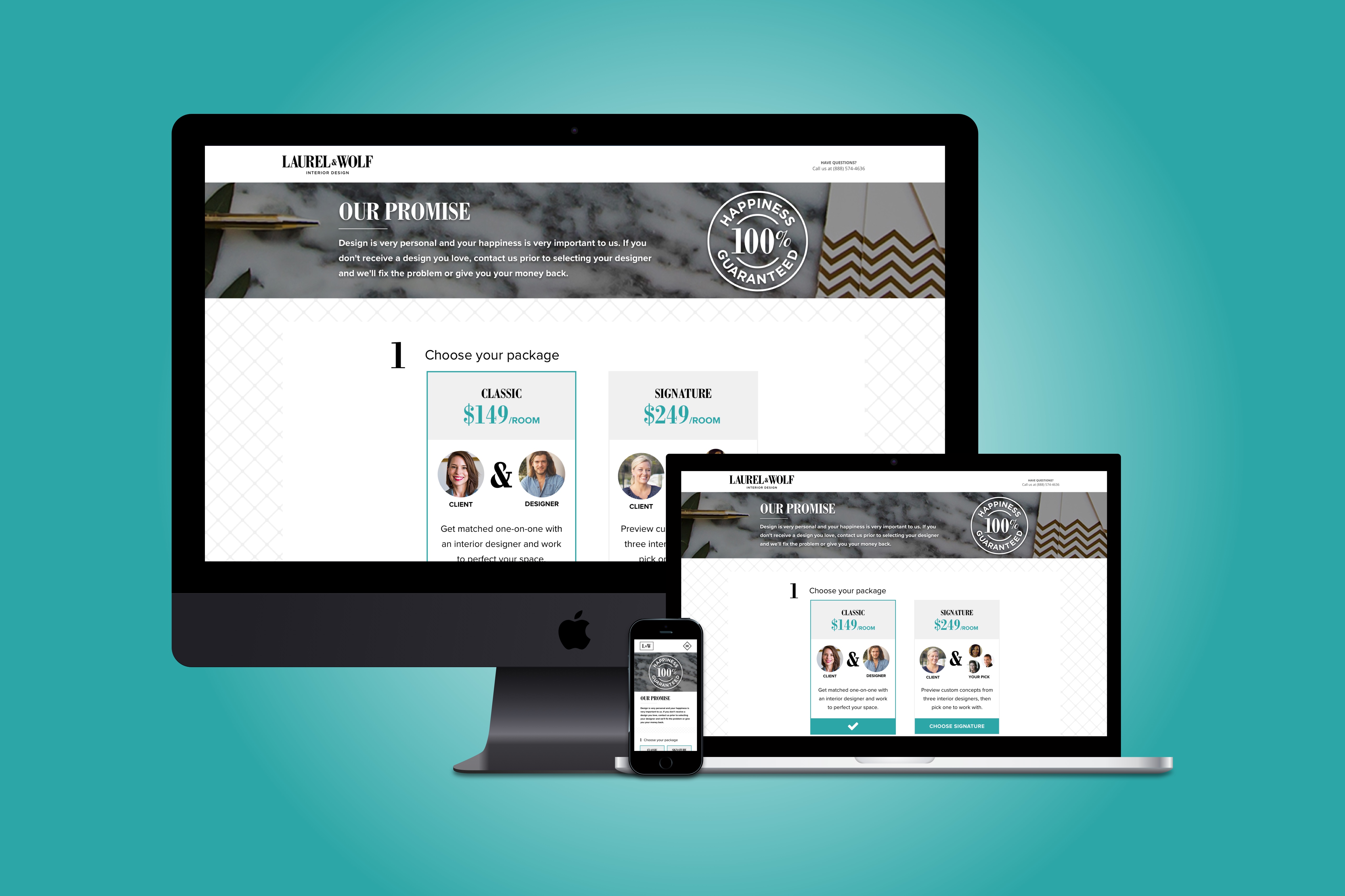
Understanding your design objective is just as important as knowing what the heck your product does.
For this case study, I focused on creating an easy to navigate layout for new and returning users.
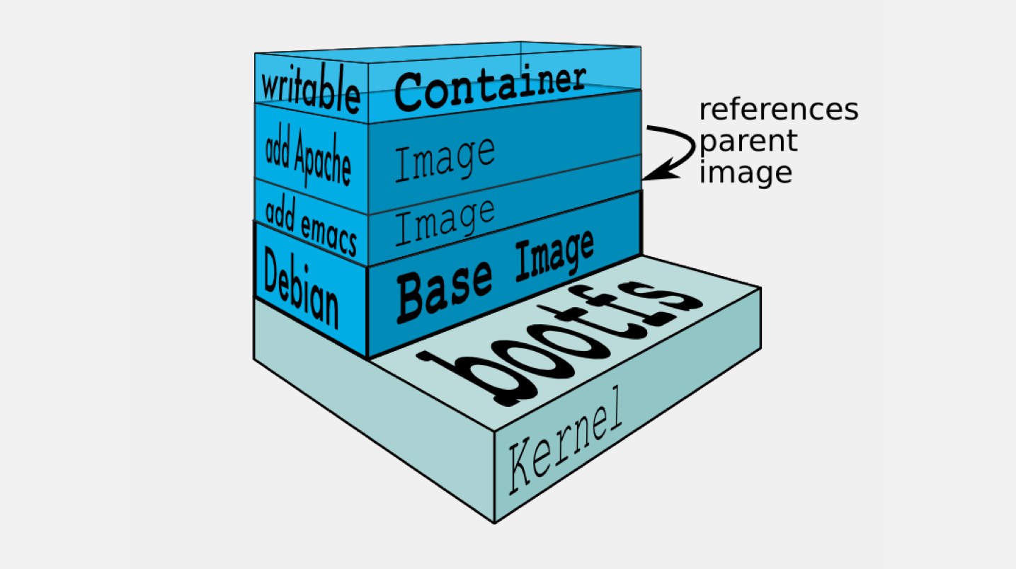
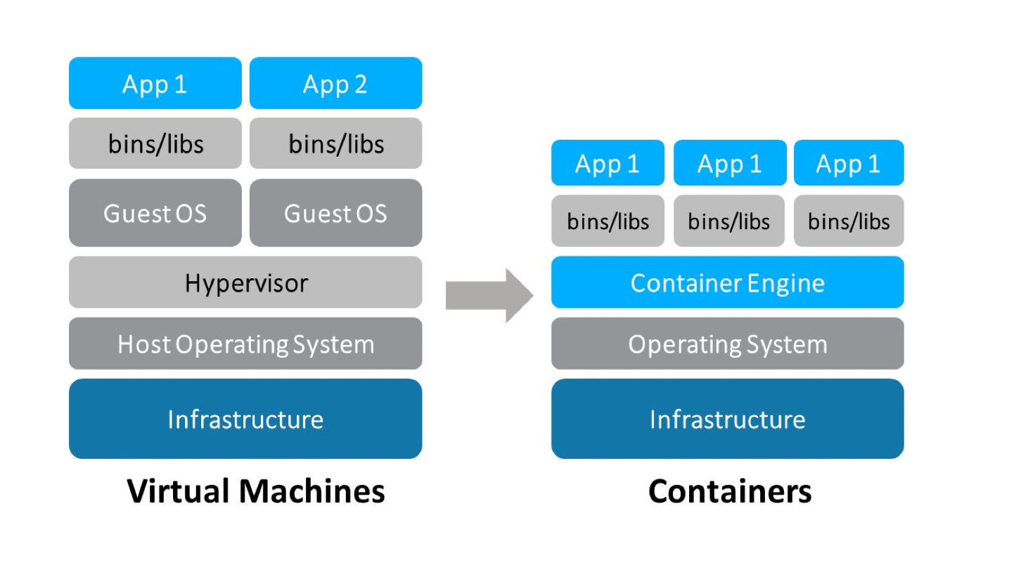
Onboarding users who are new to the deep sea of virtual machines and containers can easily become confusing - creating a simple, yet intuitive, environment was clutch to our success.
What was unique about this project was the strict brand guide rules. Because I didn't have to dive into design explorations, this left me with ample time to really dig deeper into understanding the micro-details (virtual machine explorations are no joke) AND have some fun with my front-end development 
^ A visual representation of me understanding virtual machines 
THE GOALS
THE GOALS
THE GOALS
STAKEHOLDER + DESIGN GOALS
PRODUCT DESIGN GOALS
PRODUCT DESIGN GOALS
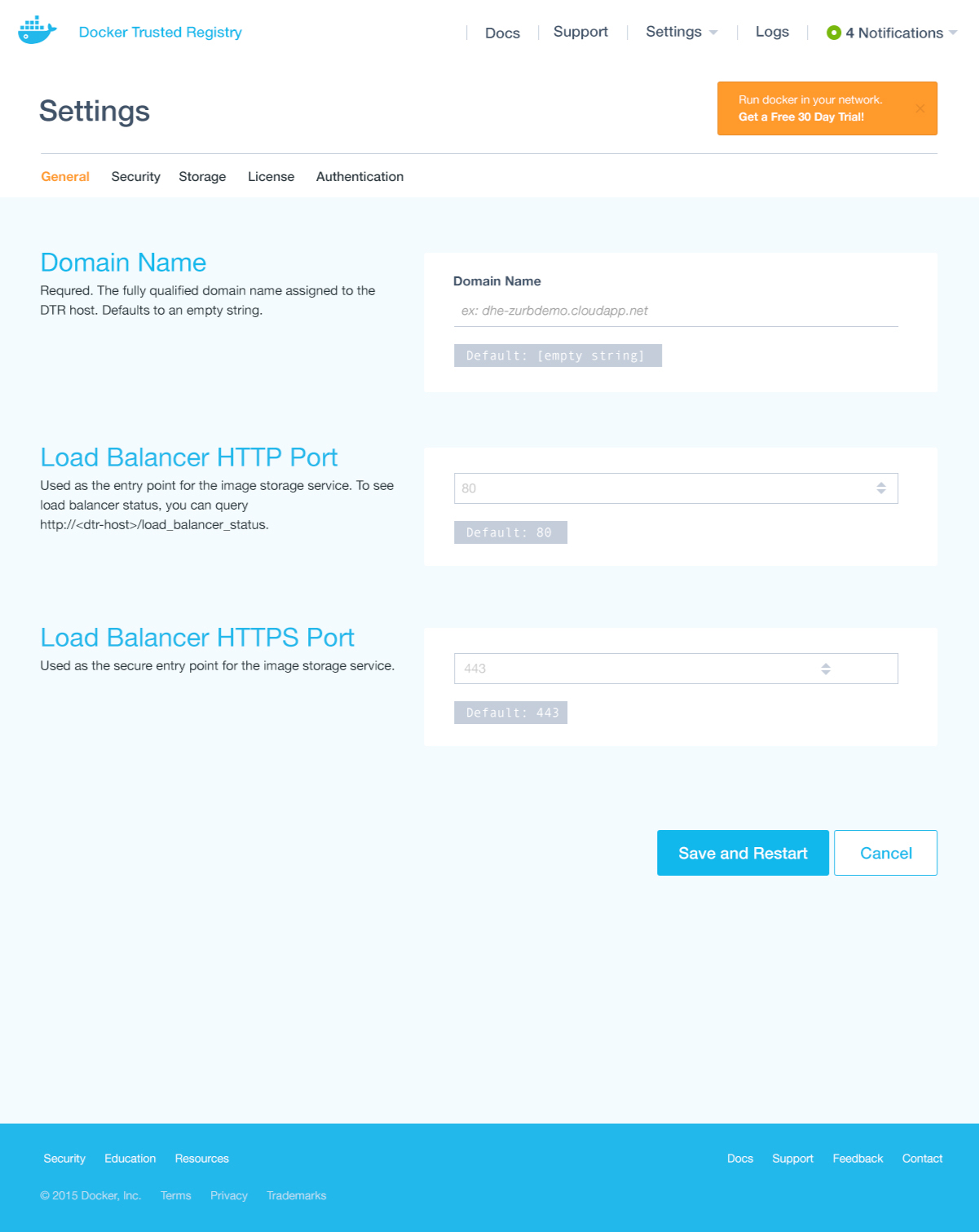
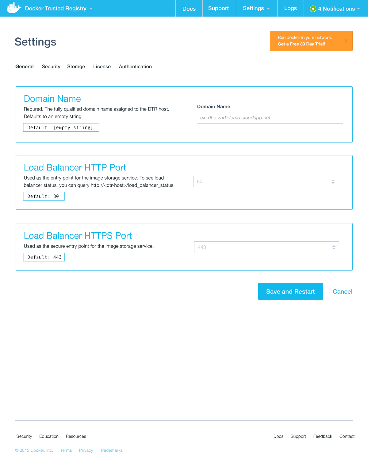
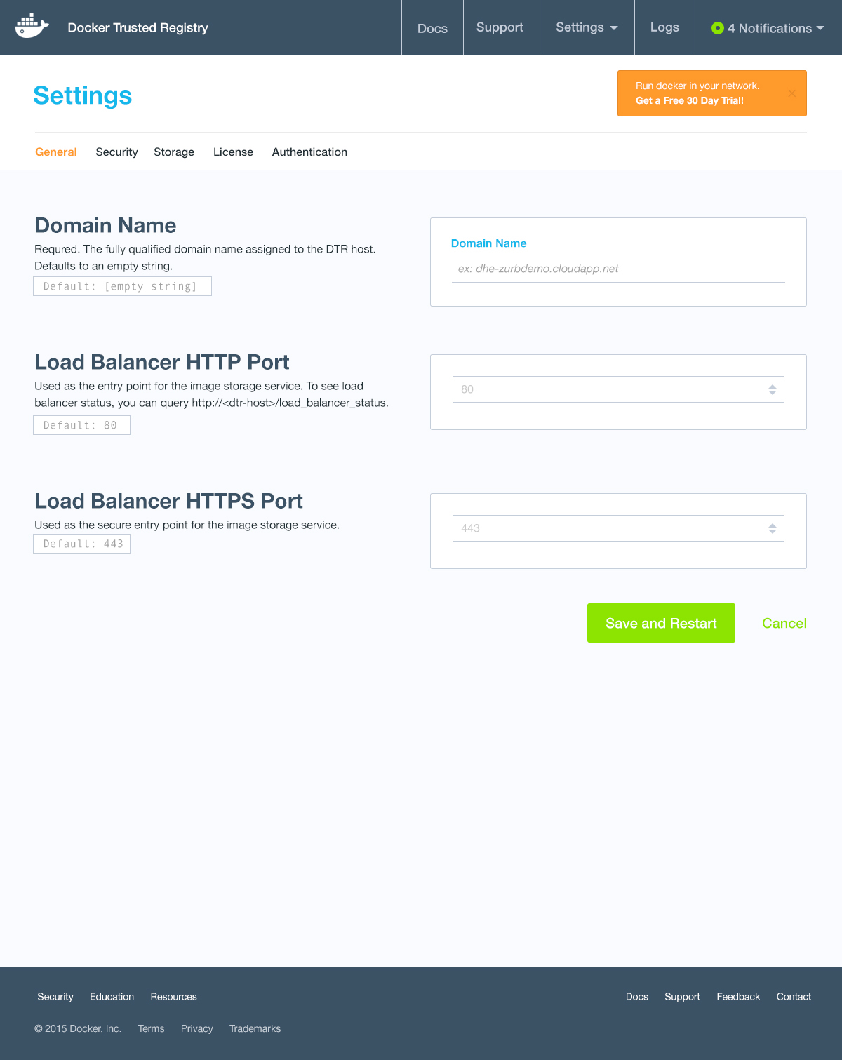
Visually appealing user interface layouts
Keeping responsive consistency of user interface elements via browsers, tablets and smart phones.
Design a simple on-boarding process
Presenting complicated features in an easy to understand manner for new and returning users.
Create a high-fidelity prototypes
Providing a cohesive user experience between different proprietary applications in an intuitive manner.
IDEATION SKETCHES
THE COMPETITORS
OPPORTUNITY SKETCHES
Like vibrations, processes flux and flow depending on what takes priority and time restrictions.
I've learned that sometimes all the necessary steps, well, aren't necessary. Because my client knew exactly what they wanted, and my team had done work for Docker prior, jumping directly into Ideation Sketches helped me keep the momentum strong from the get-go.
Original user journeys and and flows were provided to me when I first started. It was clear that - one, this is definitely some back-end jargon and two - I needed to quickly expand my front-end brain past the comfort zone of SASS.
MICRO-LEVEL
In order to fully comprehend what a "container platform" means - I needed to immerse myself in the current back-end tools developers were already using.
Creating an inventory of items really helped me create a stronger understanding for our information. Having access to internal engineers at Docker HQ, I was able to really grasp what pain points users continuously ran into.
Once I laid out all elements our clients realized their application was hemorrhaging with unnecessary actionable items!
Micro-Level: CTA Flow Assessment 1/2
Micro-Level: CTA Flow Assessment 2/2
Macro-Level: User Flow
Macro-Level: Diction
MACRO-LEVEL
From micro-understandings I was then able to look at the challenge macroscopically and created a flow chart. Although, we weren't designing for what was going on behind the scenes, we needed to understand every aspect of our application. Some stakeholders find it unnecessary to take the time to really deep dive into user experience research -
Leaving no stone unturned can be the difference between good design and great-memorable design.
As this project lasted a few weeks, I was able to really formulate open dialogue between back-end engineers at Docker. By keeping this casual transparency I was able to even dig into the tiniest details such as wording and understand what the user wanted - What types of syntax would easily translate across multiple languages, programmers, even continents?
DEEPER DIVE
USER FLOWS
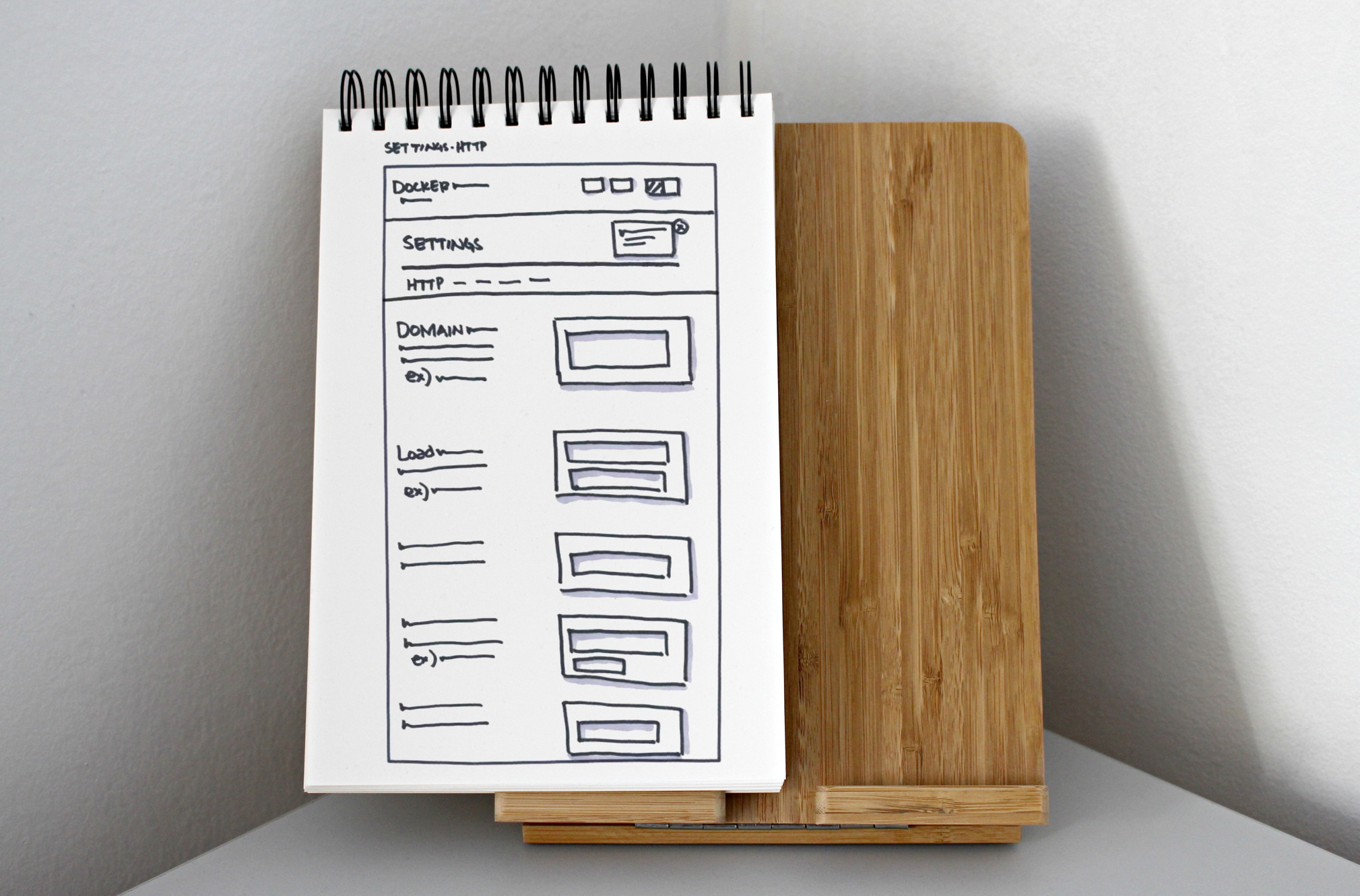
LO-FI SKETCHES
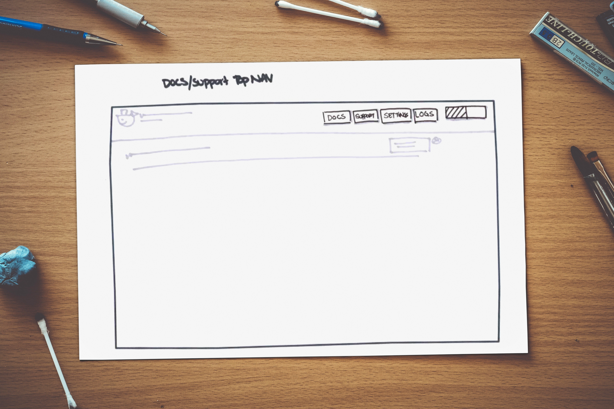
Once I got through understanding the application on a deeper UX level, I jumped right into designing our user interface elements. For this project, designing a non-intrusive way to help first-time users onboard, along with a consistent header and footer that could be used for different applications, were some elements I focused on. I then took those elements and sketched them in an overall reusable UI layout.
By creating components I can then reuse these interface building blocks and “Frankenstein” them into pages - this not only helps create a solid design pattern throughout your site but also helps alleviate tech feasibility in the long run.
Deeper Dive: Onboarding Elements
Deeper Dive: Navigation Exploration
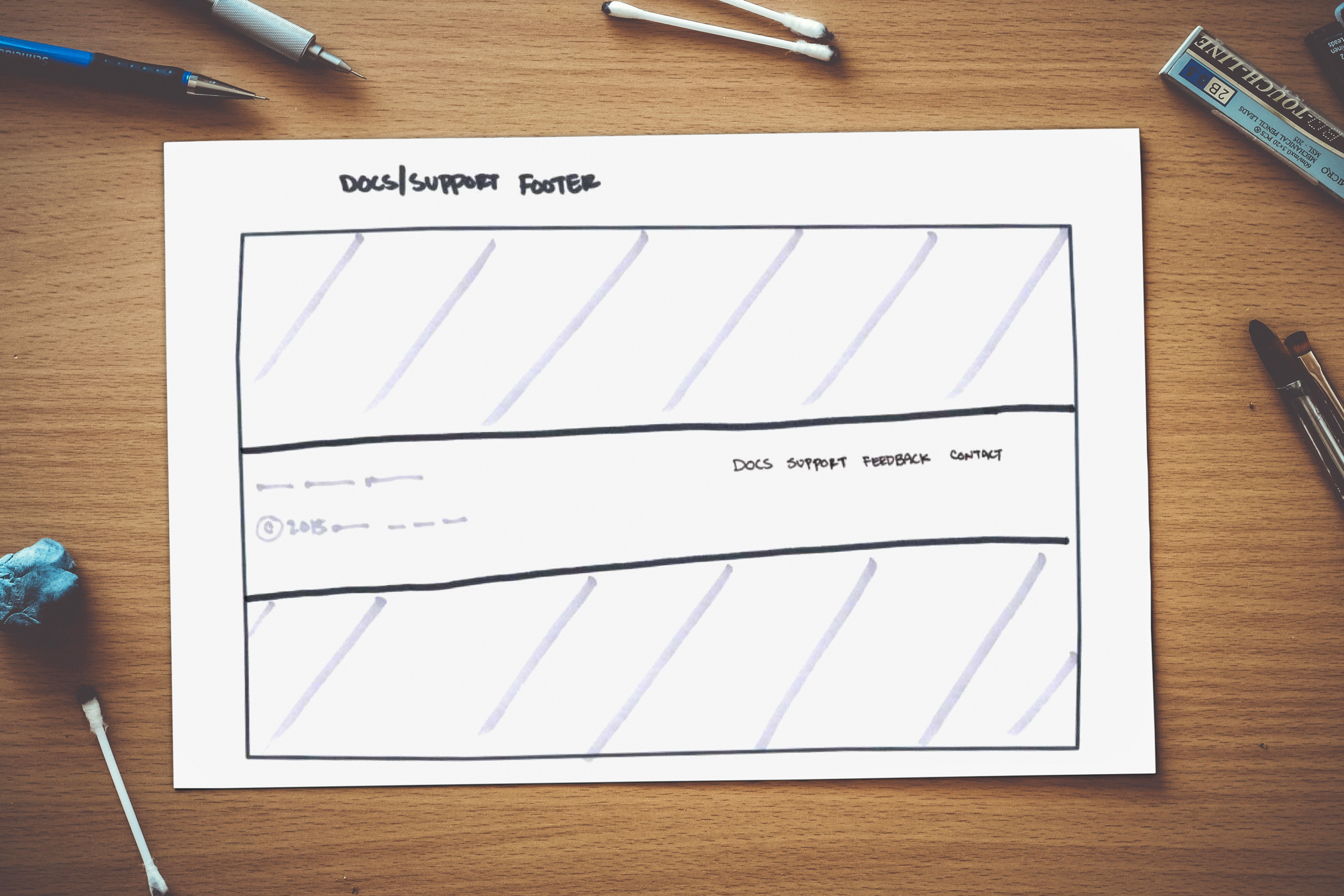
Deeper Dive: Footer Exploration
Deeper Dive: Potential Layout
VISUAL EXPLORATIONS
FURTHER EXPLAINED
VISUAL EXPLORATIONS
ROUND 1
Because I established the overall layout quickly and Docker's brand guide was very strict I was able to dive right into visual explorations, skipping over hi-fi wires and moodboards, and create an additional fourth visual. Although I couldn't adjust their current brand guide, I did make suggestions for a tertiary color such a different shades of purple.
As you can see below, four completely different visual explorations have been created, but all four utilize reusable component-based building blocks #designsystems4thewin
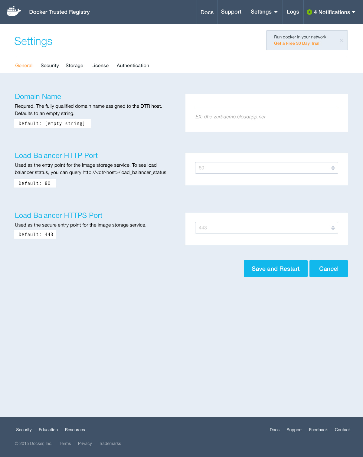
Visual Exploration V1
Visual Exploration V2
Visual Exploration V3
Visual Exploration V4
VISUAL EXPLORATIONS
OVERALL RESULTS
OVERALL RESULTS
VISUAL EXPLORATIONS
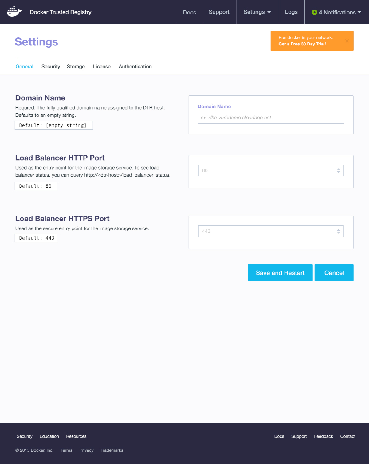
ROUND 2
From four visuals, stakeholders came back with some great feedback that I was able to solidify into one exploration. Taking certain elements from the other three explorations, I was able to create a design that we all were ecstatic about!
Visual Exploration R2 - Final
FRONT-END DEVELOPMENT
OVERALL RESULTS
OVERALL RESULTS
FRONT-END DEVELOPMENT
We made it, friends 
With our design visuals locked I was able to spend extra time on the front-end code embellishing on some awesome user interactions that were not originally within scope.
This project was a blast and I'm super proud of how it all came together! In the end, I was able to finish a day ahead of schedule, create impactful/reusable designs and my clients were thrilled with the final results.
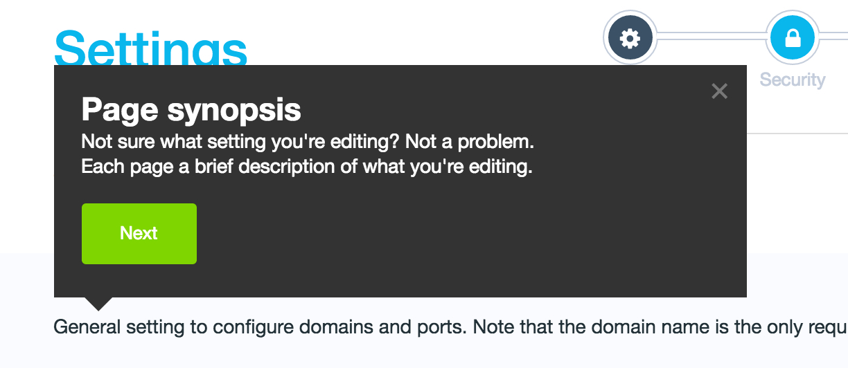
ON-BOARDING
I implemented a Joyride feature (navigates users throughout the page) as an additional way to on-board new users.
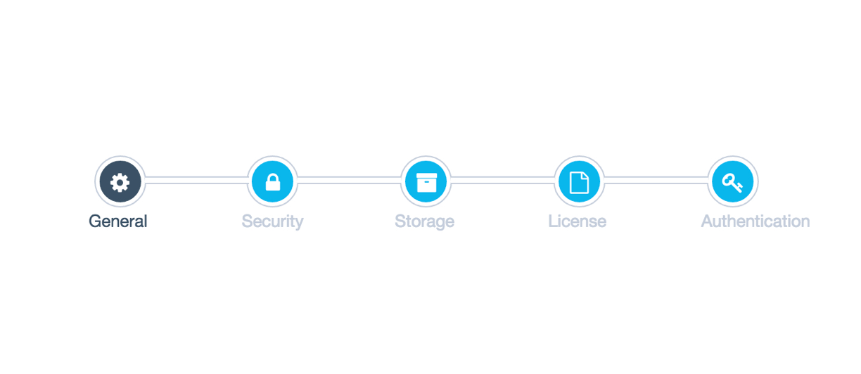
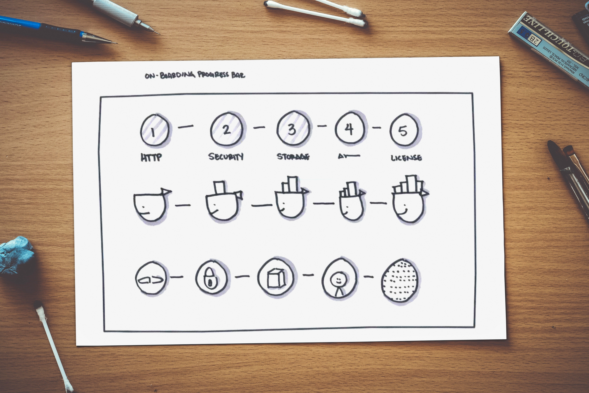
PROGRESS BAR
In addition to Joyride, I created a progress bar that allows users to know what phase they are on when setting up.
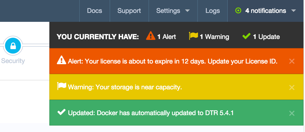
NOTIFICATIONS
One of my favorite add-ons for this project! I created a simple notifications drill down that allows users to easily view and edit alerts.
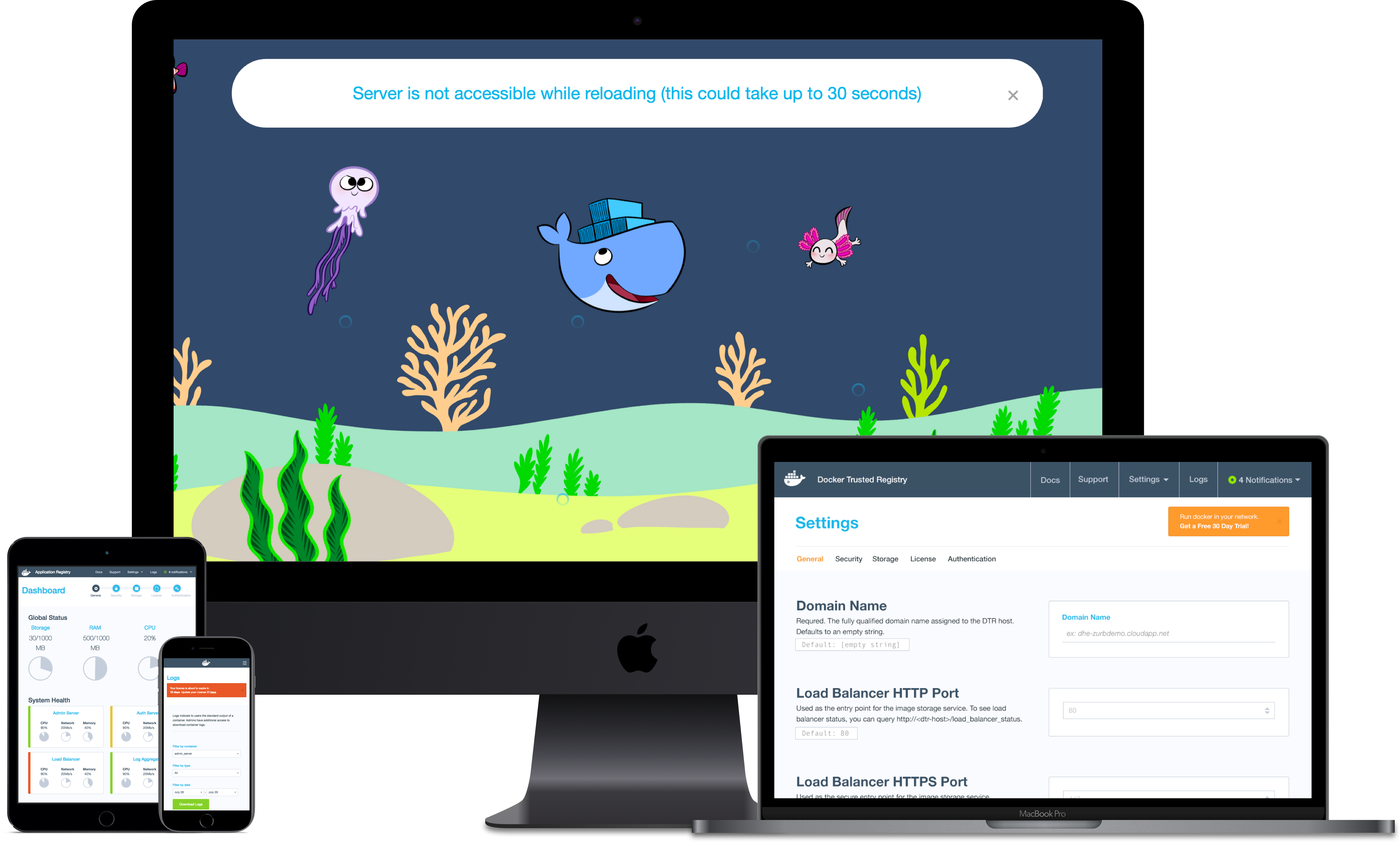
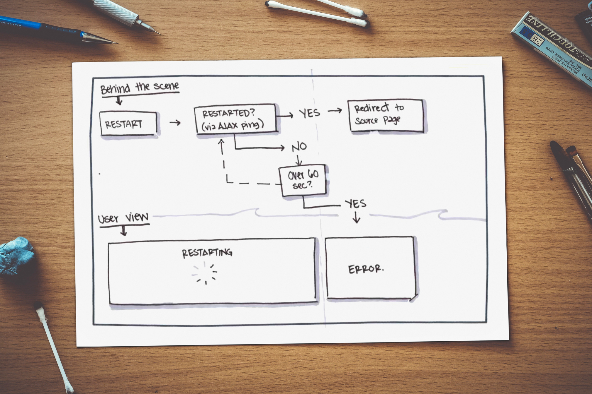
RELOAD STATE
With some time to spare, I wanted to add something special to this project that would really knock Docker's socks off. Creating a fun javascript-based reloading state was a super fun element and impressed our clients.
Want to view the full font-end demo?
Send me a quick hi@shainasilver.com and I'll forward you a link
You made it to the bottom! Horrah! Let's take a mindful moment to remind ourselves how wonderful life is_ namaste
Selected Works
Video Player RedesignDesign Lead, Research, Testing
Express CheckoutResearch, Product Design, A/B Testing
Brand IdentityResearch, Product Design, Front-End
App ExperienceResearch, Product Design, Front-End
Made with  , a dash of
  , and copious amounts of
  2024 © S Silver