ROLES // RESEARCH, PRODUCT DESIGN, FRONT-END
BRAND
IDENTITY
BRAND
IDENTITY
BRAND
IDENTITY
Having a solid brand identity while maintaining unique micro-product voices is not an uncommon challenge many clients face.
Although I designed a handful of micro-sites for this client, for this case study I've focused on the main landing page and the solutions I came up with. I've hand selected specific images from this project that best communicate each phase of my process.
PLATFORMS
Desktop, Tablet, Phone
PLATFORMS
HD Monitors, Desktop, Tablet, Phone
PAIN POINTS
PAIN POINTS
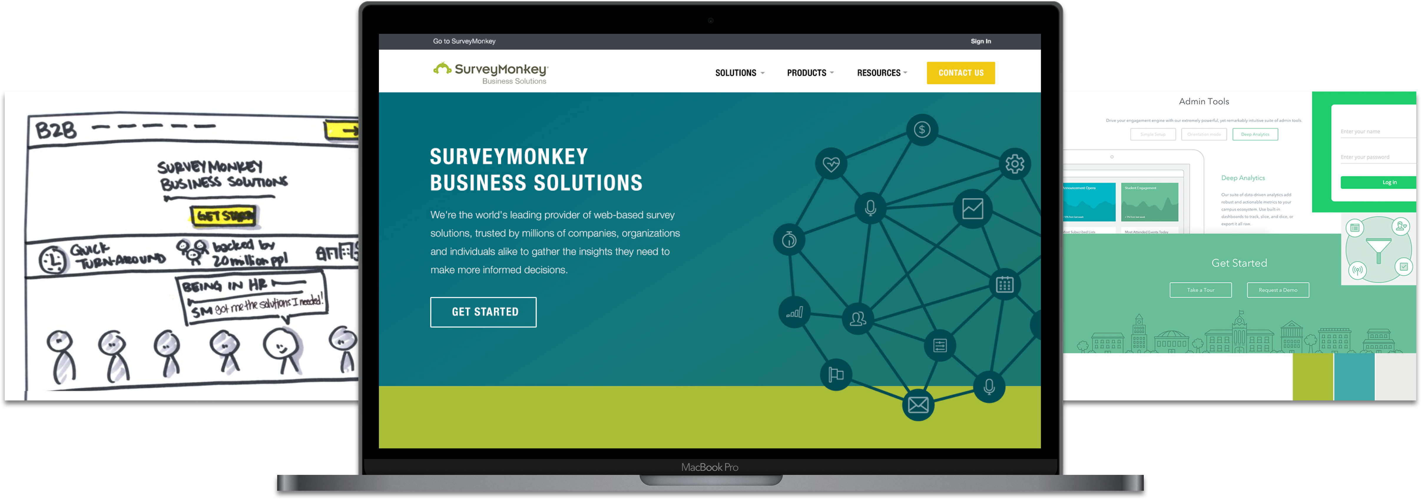
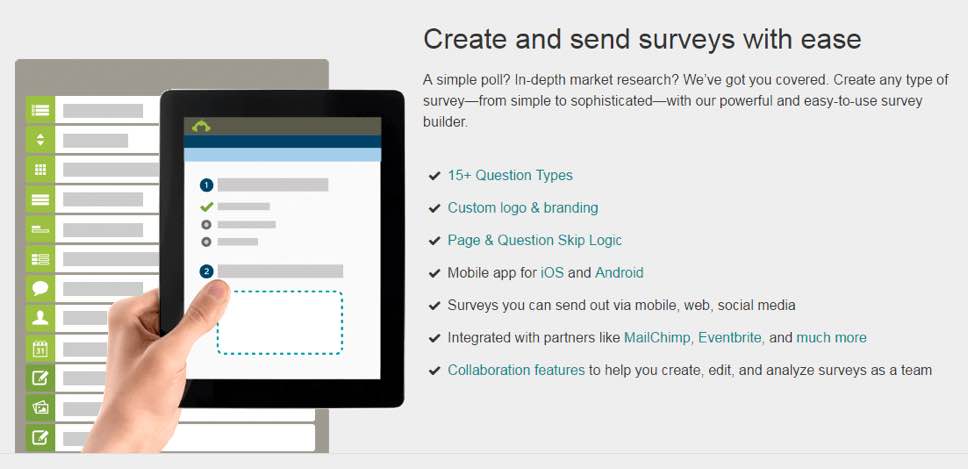
Who doesn't love an epic marketing site?
Creating a marketing site can be tons of fun, but can also be challenging. When originally introduced to this project the main task was to focus on redesigning one product site for SurveyMonkey. After developing initial audits and research, I discovered a larger issue: a lack of overall branding identity... 
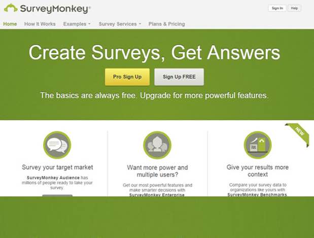
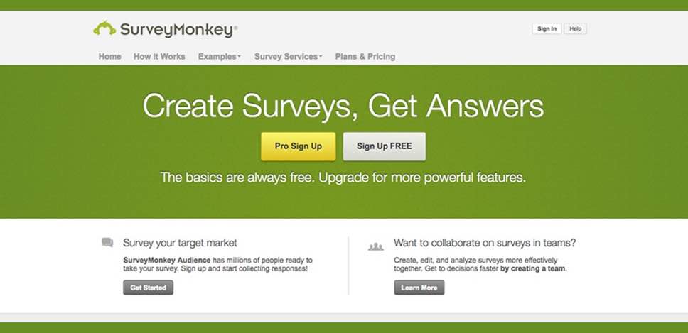
When originally auditing SurveyMonkey it became immediately clear that I would be unable to focus my efforts on one micro-site without shining a light on the numerous variations each page contained. It’s not uncommon when companies get to a certain size that different teams adjust their part of the site to what feels right to their stakeholders and user needs.
Unfortunately, this comes at a price.
Reflecting a disconnected voice -Consistency, brand identity, and a clear user journey take their toll
THE GOALS
THE GOALS
THE GOALS
STAKEHOLDER + DESIGN GOALS
PRODUCT DESIGN GOALS
PRODUCT DESIGN GOALS
Reusable, componential designs
Responsive consistency of user interface elements via browsers, tablets and smart phones.
Keeping continuity throughout all products
Clearly articulating the benefits of each products' values to first time and returning users.
Coded components for future hand-off
Providing a consistent user interface based on visual designs with clear call-to-actions, search and navigation.
OPENING SKETCHES
OPENING SKETCHES
OPENING SKETCHES
For me, design always starts at the grassroots: pen and paper. Pen and paper allow me to crank out numerous sketches in little to no time (no hard feelings are to be had when a sketch doesn't make the cut).
I open up the problem with opening sketches. Opening sketches give me the ability to design big! I can sketch possibilities that are literally the sky's limit and help shape what emotional value stakeholders are aiming for. By opening up the problem I have the ability to understand stakeholder boundaries and begin to create a story that flows with business needs and user goals.
Some clients have a difficult time understanding where this first round of sketches come from in the beginning, but with some patience and some shared laughs - stakeholders begin to understand the holistic process of connecting with users.
Sometimes as humans of certain crafts such as sales, marketing, and evening coding - we forget that a website/app is much more than pixels on a digital canvas -
For me, design always starts at the grassroots: pen and paper. Pen and paper allow me to crank out numerous sketches in little to no time (no hard feelings are to be had when a sketch doesn't make the cut).
I open up the problem with opening sketches. Opening sketches give me the ability to design big! I can sketch possabilities that are literally the sky's limit and help shape what emotional value stakeholders’ are aiming for. By opening up the problem I have the ability to understand stakeholder boundaries and begin to create a story that flows with business needs and user goals.
Some clients have a difficult time understanding where this first round of sketches come from in the beginning, but with some patience and some shared laughs - stakeholders begin to understand the holistic process of connecting with users.
Sometimes as humans of certain crafts such as sales, marketing, and evening coding - we forget that a website/app is much more than pixels on a digital canvas -
IT'S AN OPPORTUNITY TO CONNECT WITH USERS AT AN EMOTIONAL LEVEL.
IT'S AN OPPORTUNITY TO CONNECT WITH USERS AT AN EMOTIONAL LEVEL.
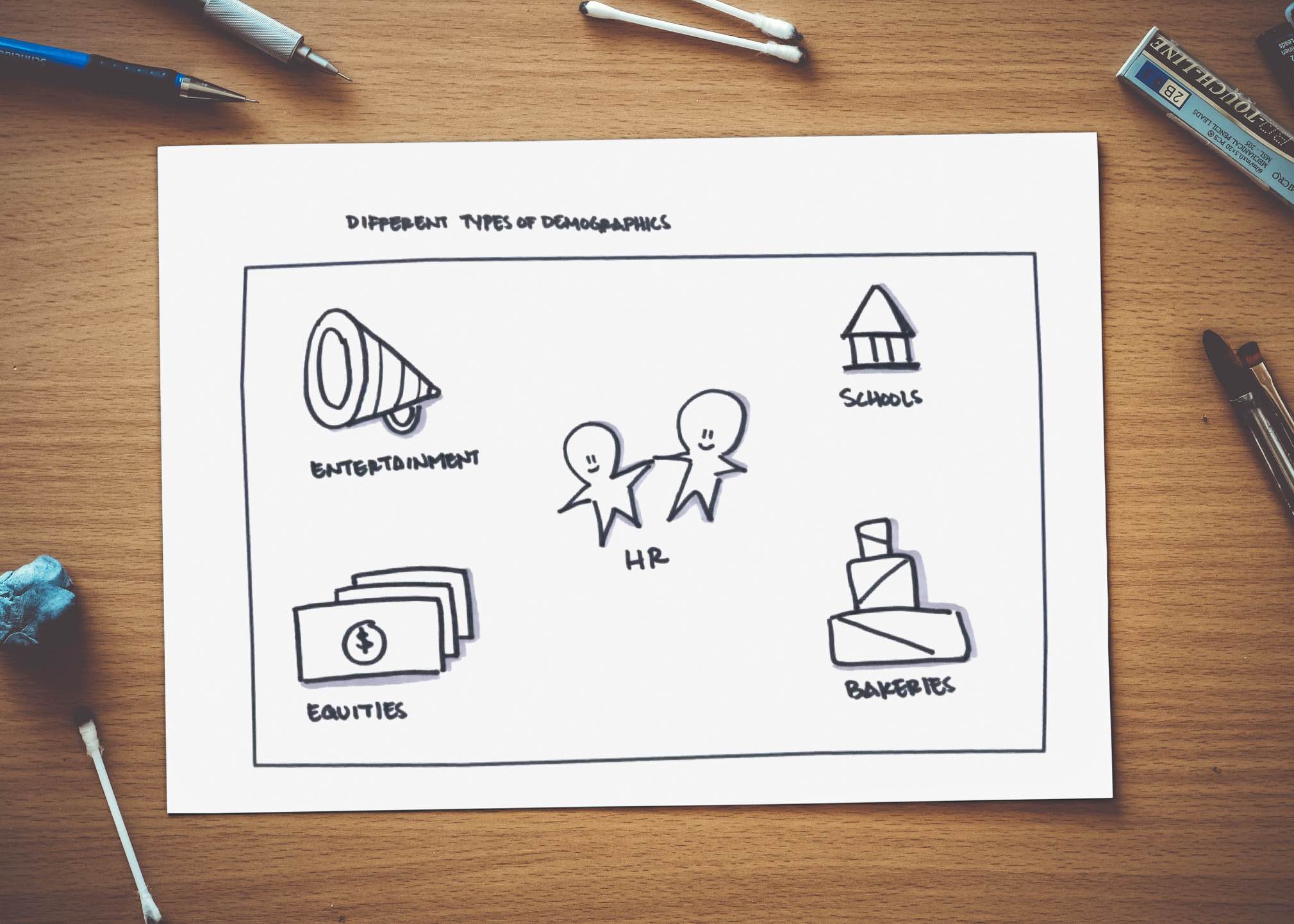
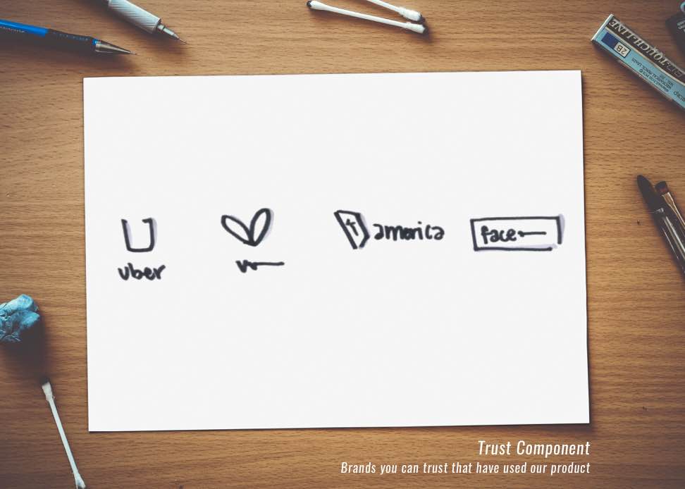
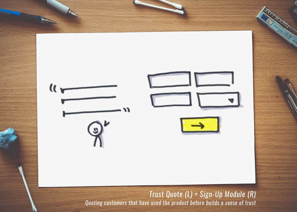
Different Types of Demographics
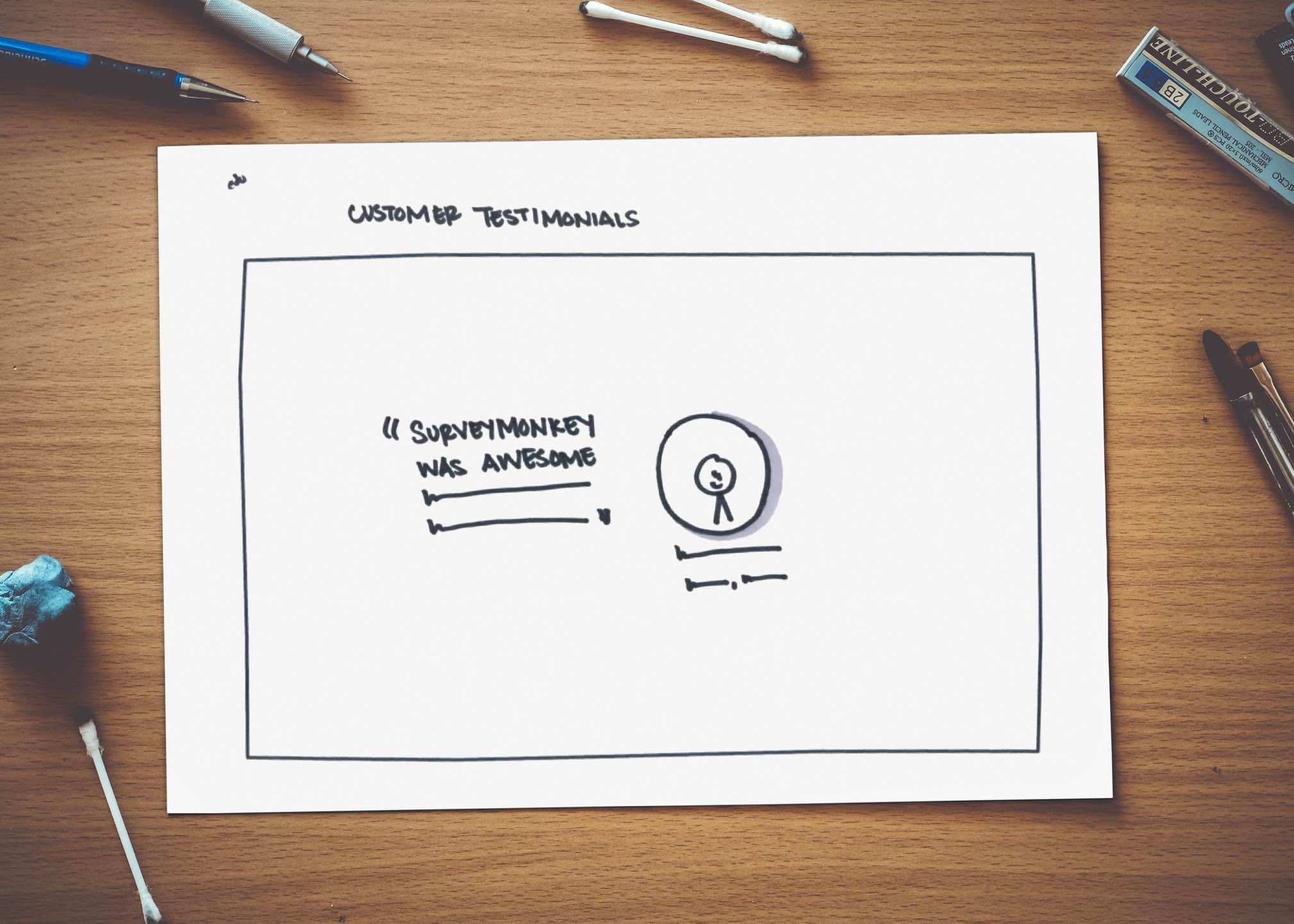
Customer Testimonials
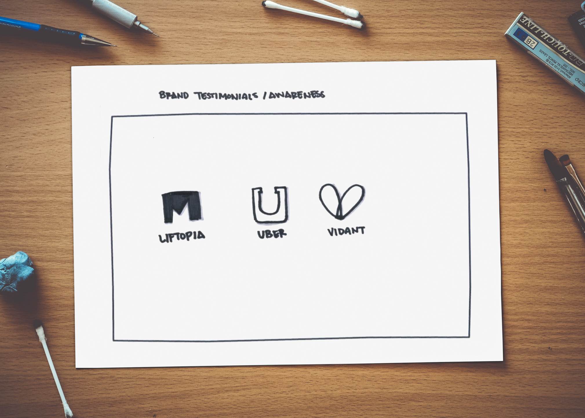
Brand Testimonials / Awareness
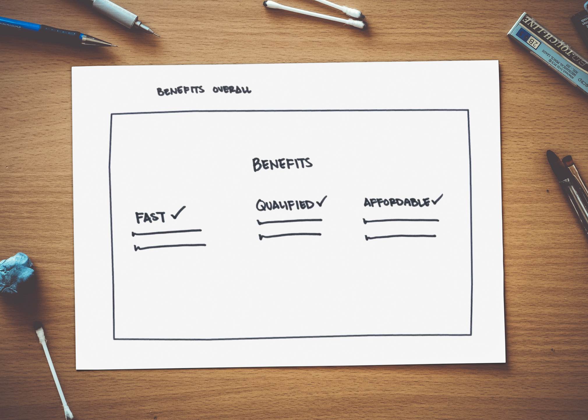
Benefits
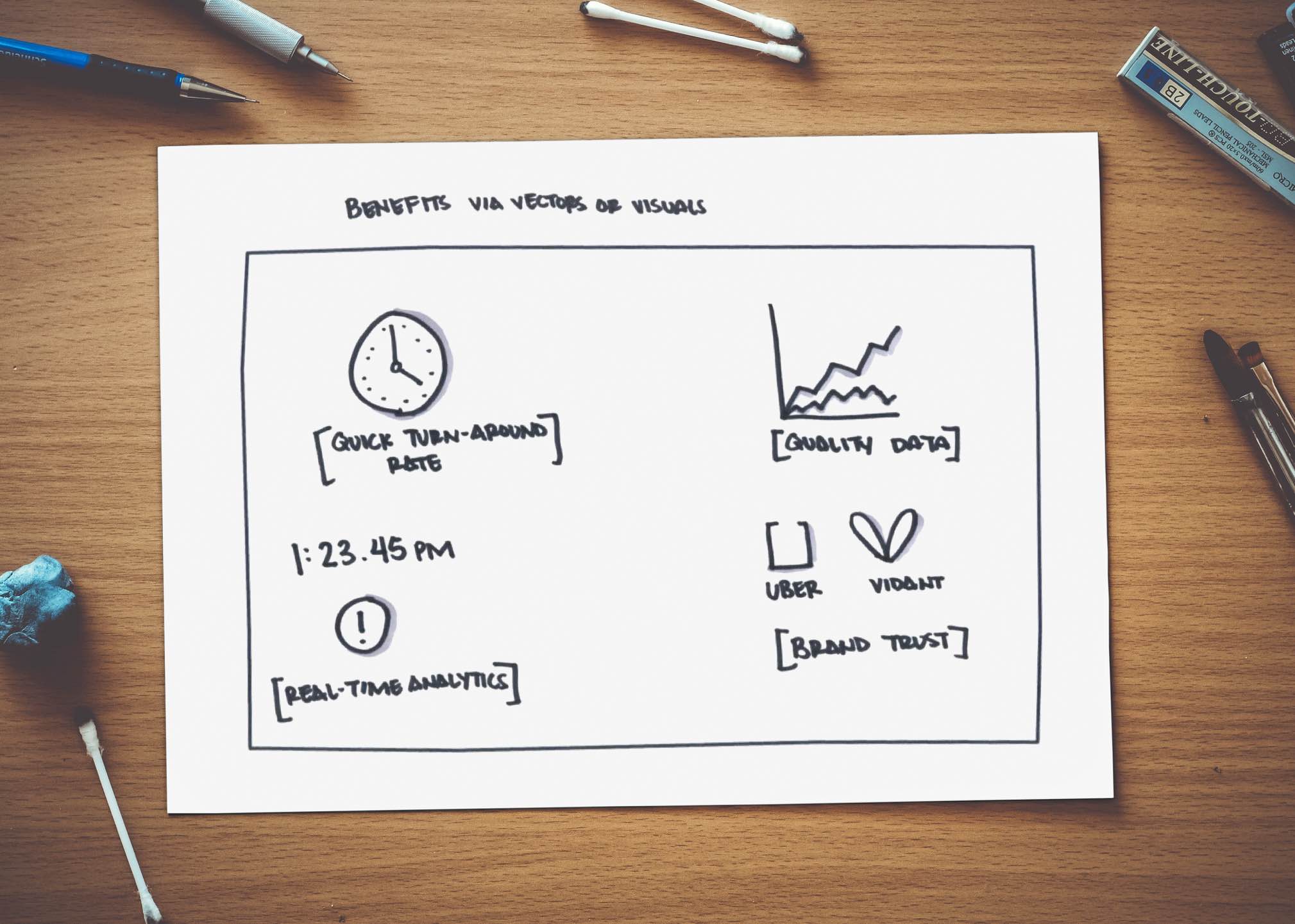
Benefit Visuals
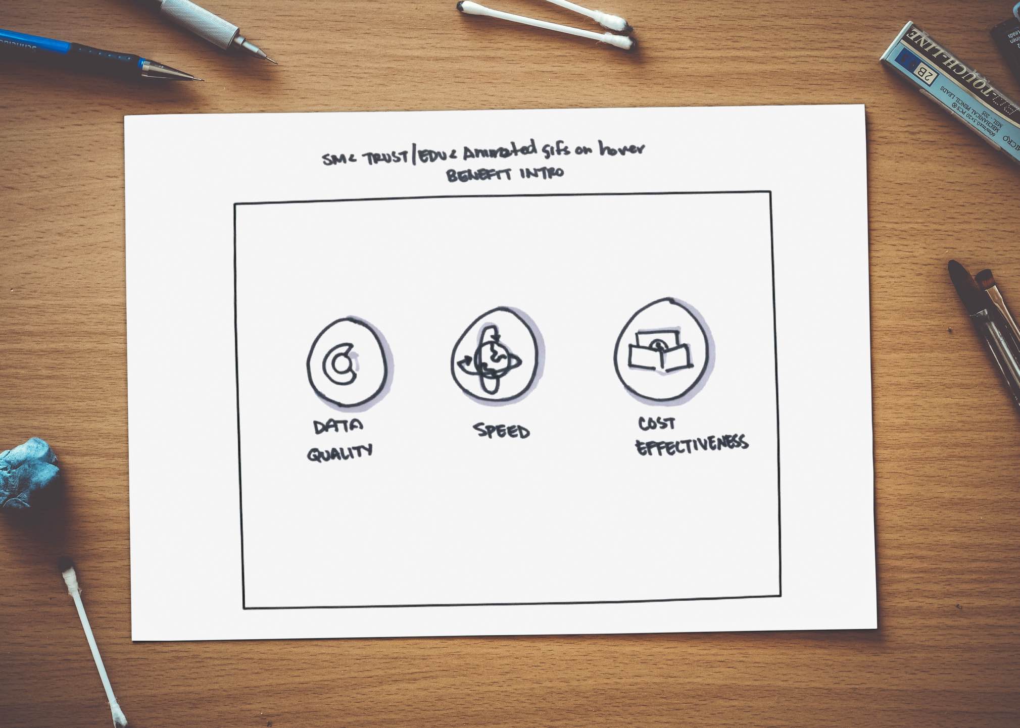
Trust & Education
I try to time-box myself a 45-minute limit up to 60 sketches. I tend to do roughly 2 rounds of this before narrowing down and walking through with stakeholders.
LO-FI SKETCHES
LO-FI SKETCHES
LO-FI SKETCHES
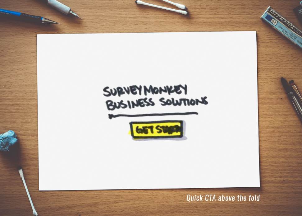
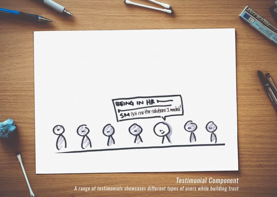
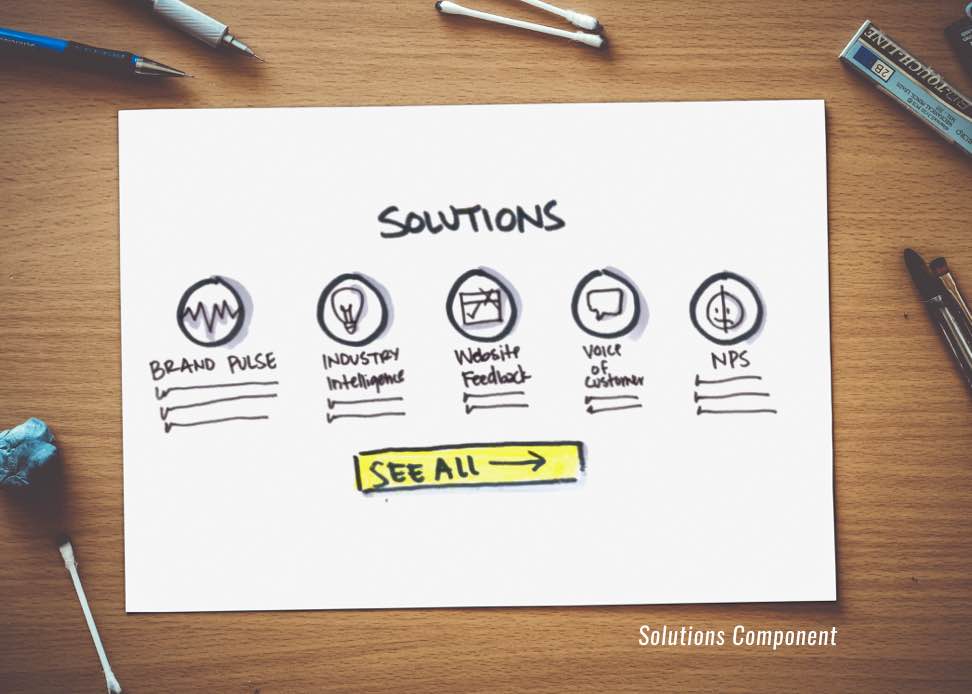
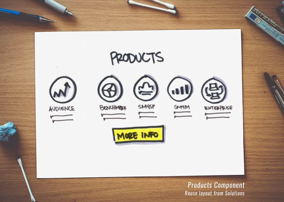
With opening sketches finalized, as a team (stakeholders + design) we are able to narrow our focus with what goals we are trying to connect with our users. From abstract ideas we take our fidelity up a notch and bring these mind-gems into hand-drawn user interface sketches, AKA Lo-Fi Sketches!
Utilizing the same concept of quick pen to paper ideations - Lo-Fi Sketches allot me the freedom to quickly create componentized modules. This means instead of trying to create a full page in one go, I break down each section into smaller, easily identifiable pieces that have well-defined interfaces.
For this particular project, creating easily movable components was key and later helped define SurveyMonkey’s Design System.
By creating components I can then reuse these interface building blocks and “Frankenstein” them into pages - this not only helps create a solid design pattern throughout your site but also helps alleviate tech feasibility in the long run.
By creating components I can then reuse these interface building blocks and “Frankenstein” them into pages - this not only helps create a solid design pattern throughout your site but also helps alleviate tech feasibility in the long run.
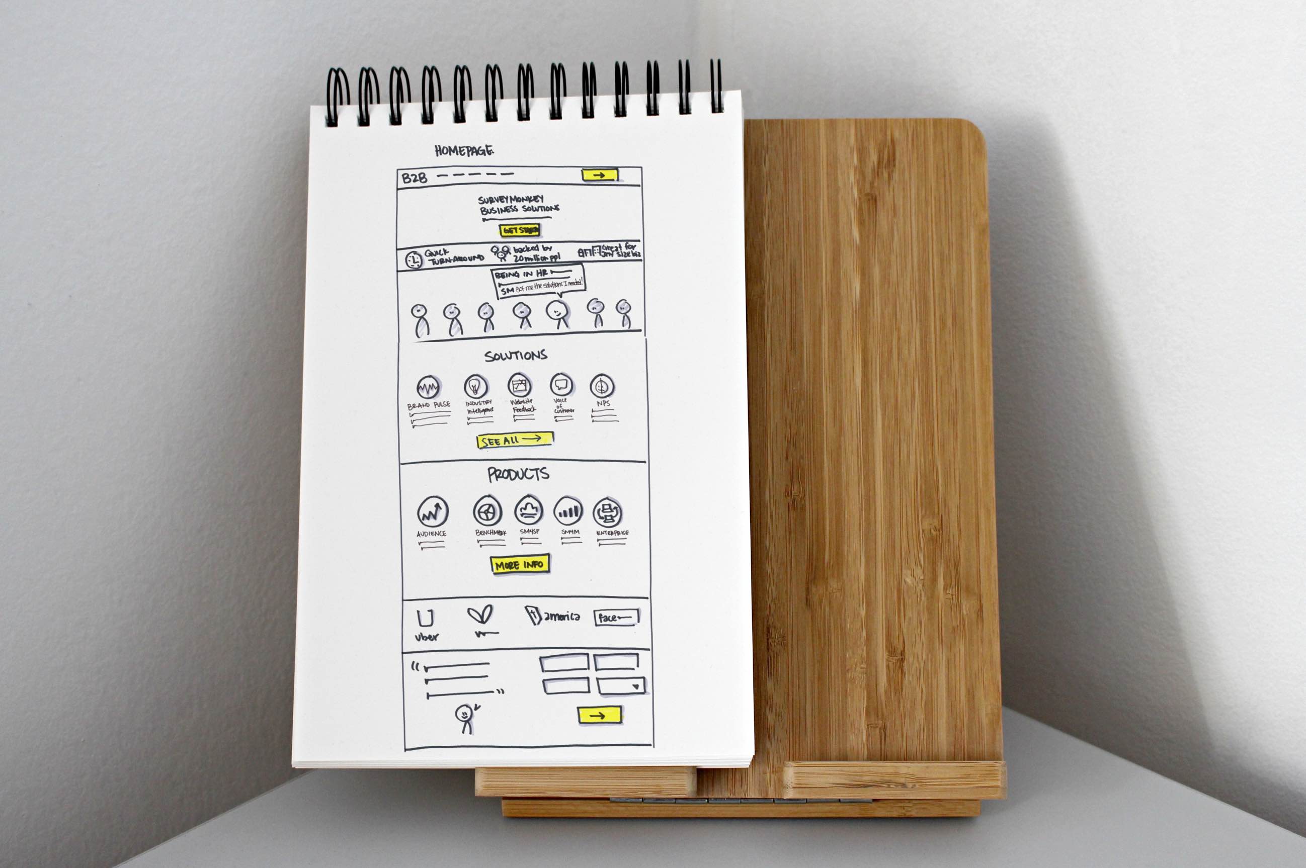
Final Lo-Fi Layout
Final Lo-Fi Layout
HI-FI WIREFRAMES
THE MOCKS
HI-FI WIREFRAMES
With our lo-fi sketches solidified, I was able to move successfully into hi-fi wireframes  . Using tools such as Omnigraffle Sketch, I can rock out iterations quickly while keeping my stakeholders looped in every step of the way with weekly check-ins. Keeping transparency is key.
I find during this phase, clients start to really trust their product designer. Up until now, they have only been seeing designs via hand sketches. There's something about hard edges and pixel perfect lines that get everyone excited!
For this project, this phase took a hot second. SurveyMonkey stakeholders wanted the main landing page just right for desktop and mobile, and I completely understood their concerns -
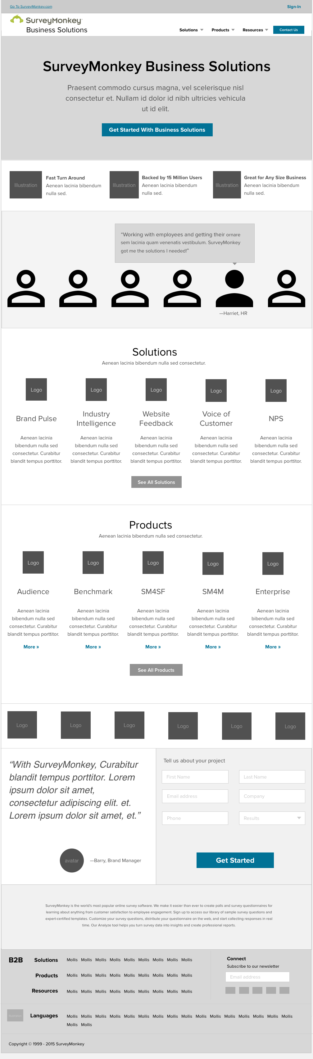
Final Hi-Fi Wireframes
Your main landing page really sets precedents for the rest of your site. If an user has a hard time navigating the intro of a site bounce rates can sky rocket into the lap of a leading competitor.
MOODBOARDS
MOCKS EXPLAINED
MOODBOARDS
Once our wireframes have been established we jump into our visual design phase. I create three distinct moodboards. Stakeholders select one distinct visual design direction from the three. With SurveyMonkey, an existing brand guide was provided with some pretty strict rules.
Examples: Certain greens and limitations on specific font-use were definitely factors.
I find when restrictions are in place, this creates an even better challenge! 
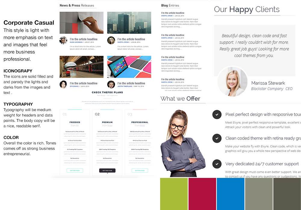
Moodboard V1: Corporate Casual
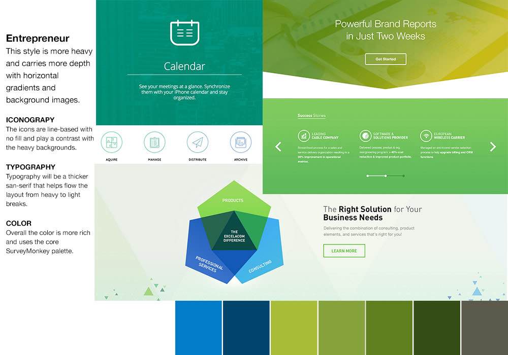
Moodboard V2: Entrepreneur
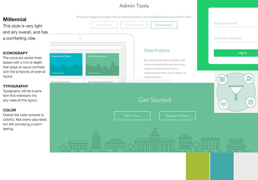
Moodboard V3: Millenial
VISUAL EXPLORATIONS
FURTHER EXPLAINED
VISUAL EXPLORATIONS
ROUND 1
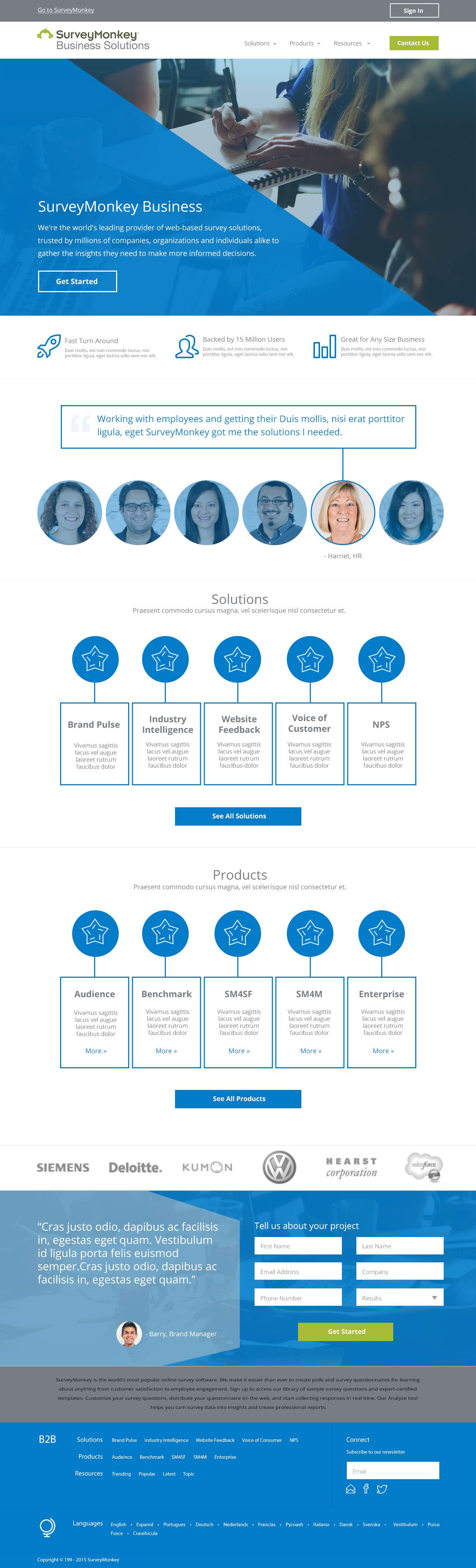
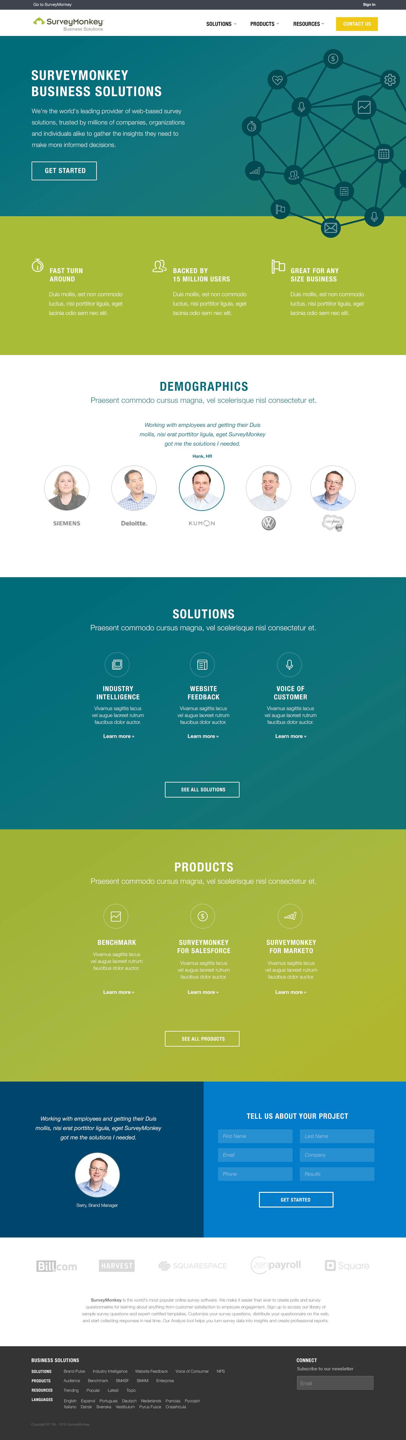
With the one moodboard direction selected, I am able to jam on creating three different design explorations.
This phase can get a little challenging, but the key is to test the waters with all different techniques ranging from, but not limited to: iconography, type, and flat vs gradients.
The key is to remember that every exploration tells its unique story. Although three completely different visual explorations emerge, all three are defined by specific and well-thought intended aesthetics based on strong component-based architecture that was earlier defined in our hi-fi wireframes phase.
Although three completely different visual explorations emerge, all three are defined by specific and well-thought intended aesthetics based on strong component-based architecture that was earlier defined in our hi-fi wireframes phase.
Visual Explorations V1
Visual Explorations V2
Visual Explorations V3
VISUAL EXPLORATIONS
OVERALL RESULTS
OVERALL RESULTS
VISUAL EXPLORATIONS
ROUND 2
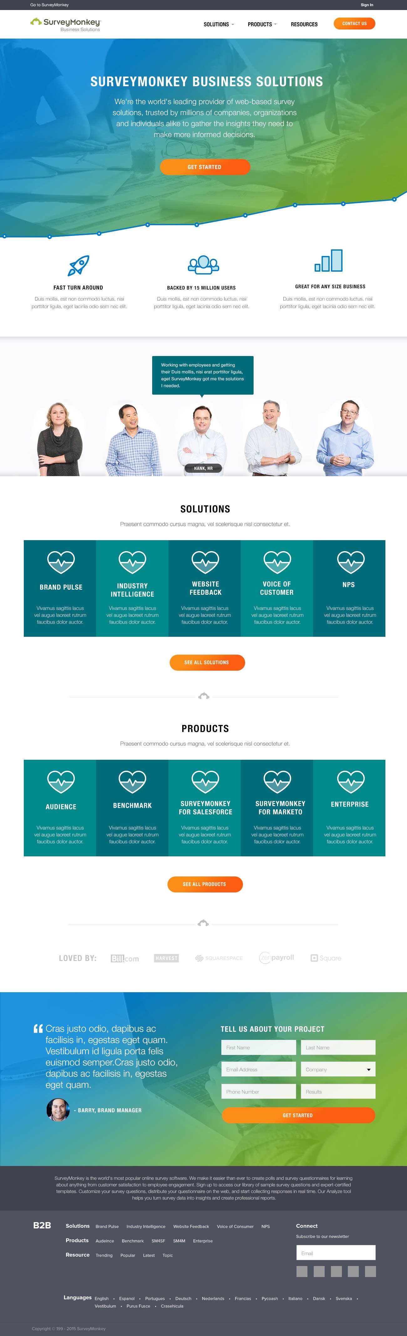
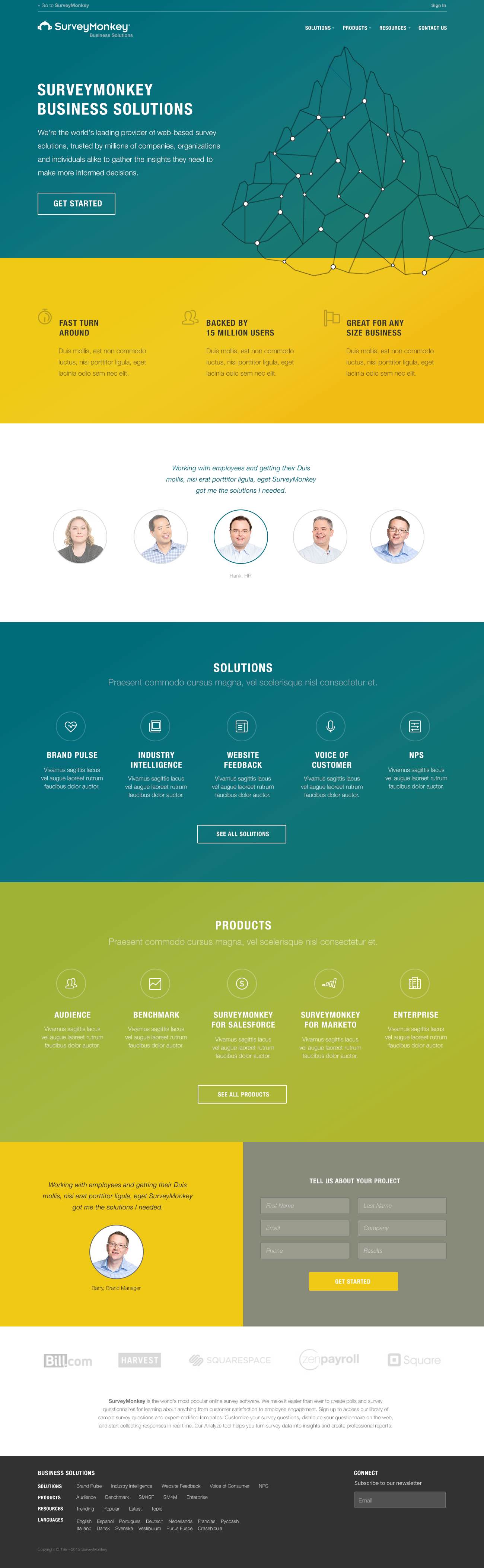
From three visual explorations, stakeholders and I narrow down to one main exploration.
Some tweaks like colors, specific iconography used and overall layout composition are updated through the course of a few iterations.
Visual Exploration R2 - Final
Some tweaks like colors, specific iconography used and overall layout composition are updated through the course of a few iterations.
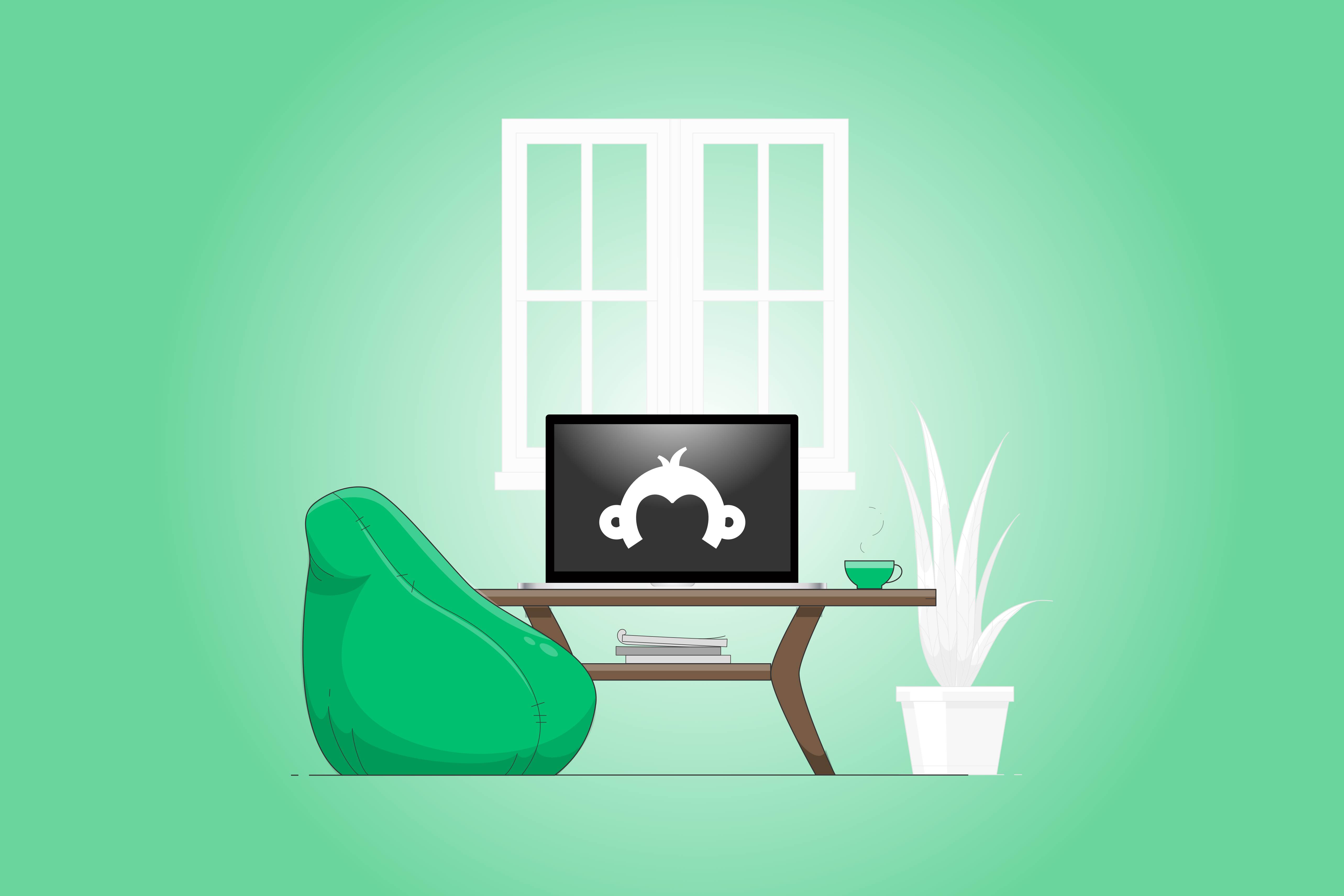
FRONT-END DEVELOPMENT
OVERALL RESULTS
OVERALL RESULTS
FRONT-END DEVELOPMENT
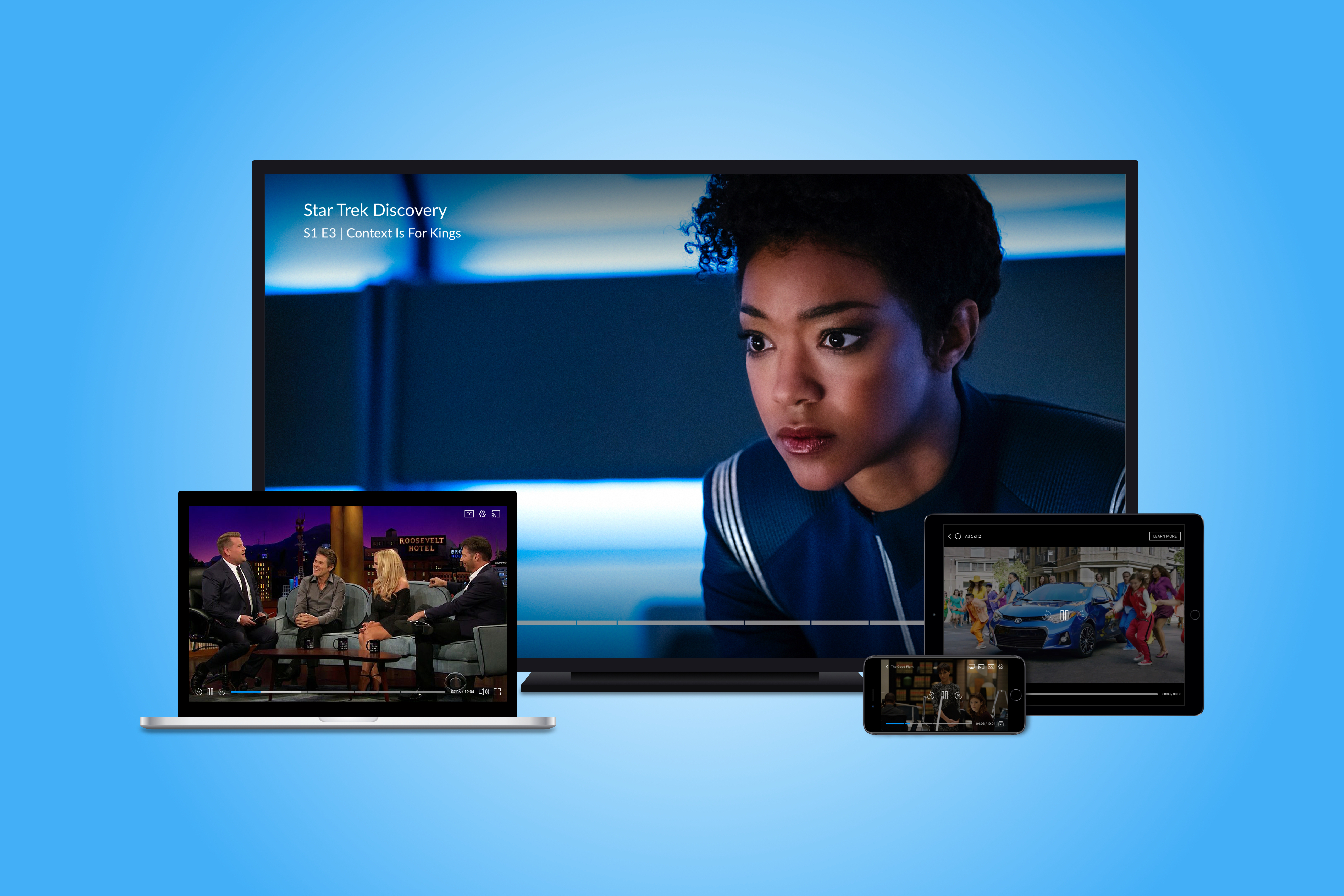
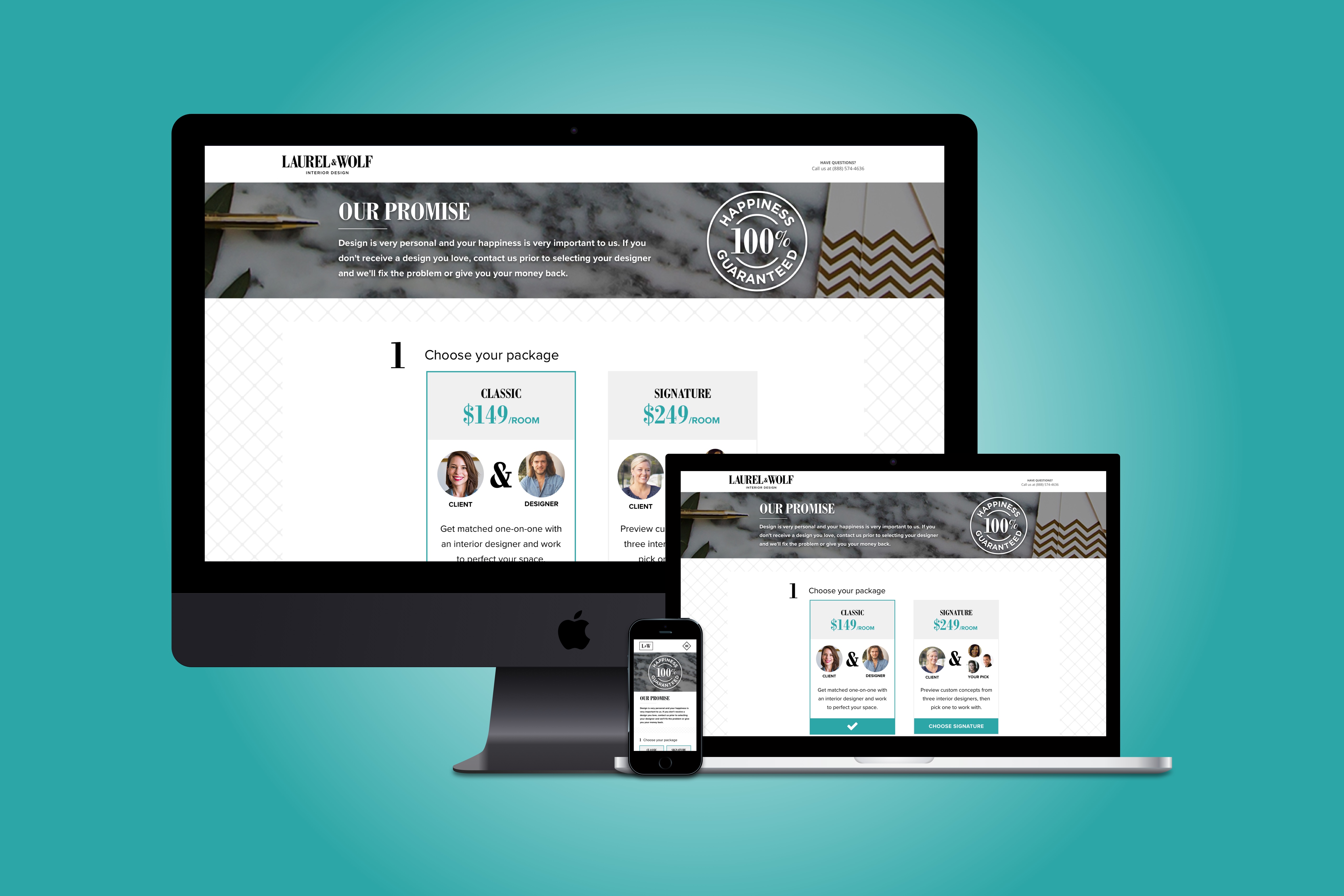
We made it, friends 
From hand sketched wishes to to our final phase dreams via front-end development. In the front-end phase I bring all our user interactions to life in browser (I'm looking at you too, responsive design).
Once I've completed the front-end code and QA for all devices, browsers, and media I ship their style guide and clickable prototype to clients.
You can checkout some of my components that made it live to SurveyMonkey's site here.
Want to view the full font-end demo?
Send me a quick hi@shainasilver.com and I'll forward you a link
Want to view the full font-end prototype?
Send me a quick hi@shainasilver.com and I'll forward you a link
You made it to the bottom! Horrah! Let's take a mindful moment to remind ourselves how wonderful life is_ namaste
Selected Works
Video Player RedesignDesign Lead, Research, Testing
Express CheckoutResearch, Product Design, A/B Testing
Brand IdentityResearch, Product Design, Front-End
App ExperienceResearch, Product Design, Front-End
Made with  , a dash of
  , and copious amounts of
  2024 © S Silver