ROLES // RESEARCH, PRODUCT DESIGN, A/B TESTING
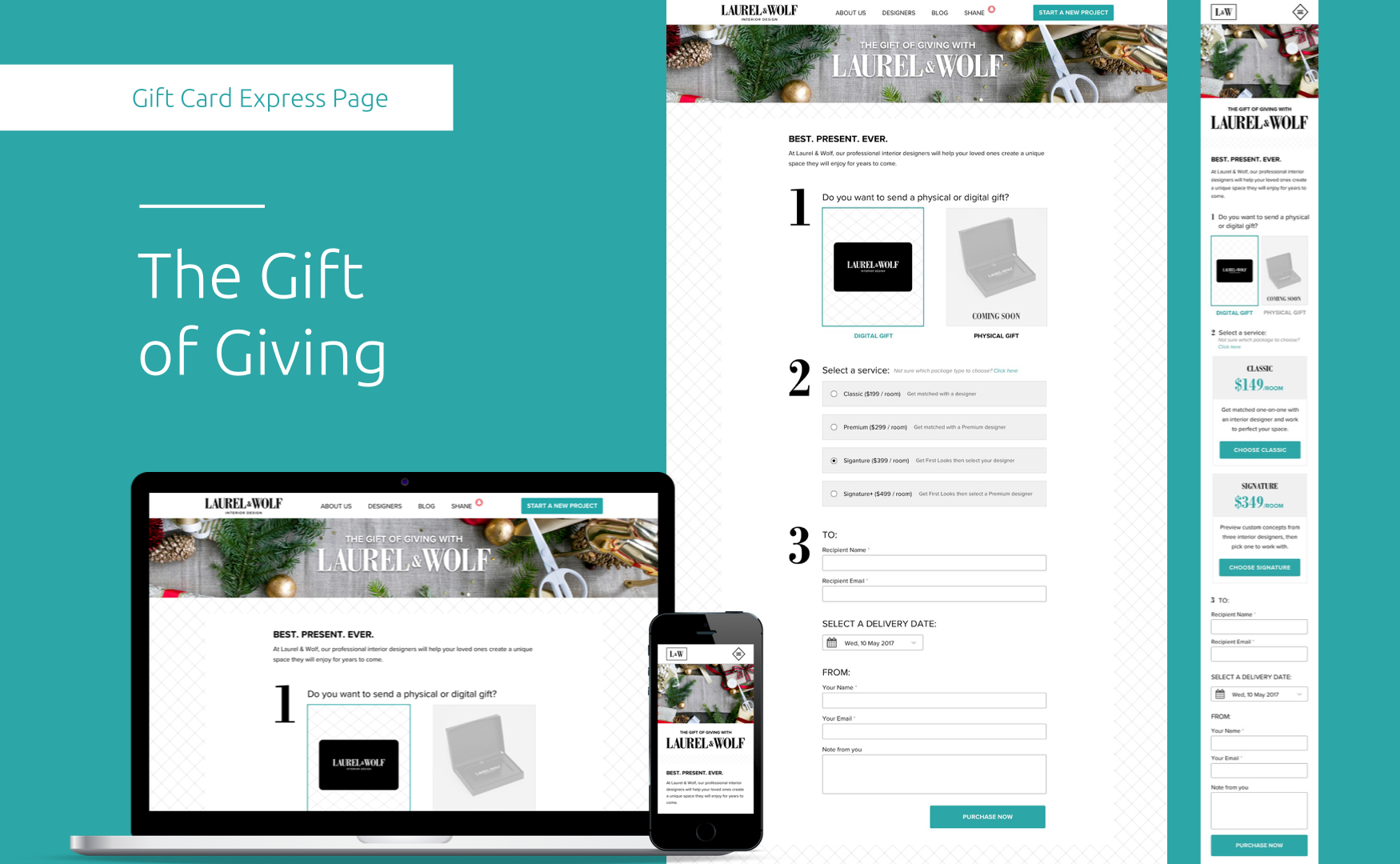
EXPRESS
CHECKOUT
EXPRESS
CHECKOUT
EXPRESS
CHECKOUT
EXPRESS
CHECKOUT

After the success of our rebrand my product team, lovingly called the ORCA POD, was challenged to create an unique user flow that allowed returning and new customers the ability to quickly purchase a L&W Package.
The overall goal was to answer: Do first time users prefer to checkout using an express one-page layout or prefer to make their purchase within an onboarding experience?
PLATFORMS
HD Monitors, Desktop, Tablet, Phone
PLATFORMS
HD Monitors, Desktop, Tablet, Phone
PLATFORMS
HD Monitors, Desktop, Tablet, Phone
PAIN POINTS
PAIN POINTS
PAIN POINTS
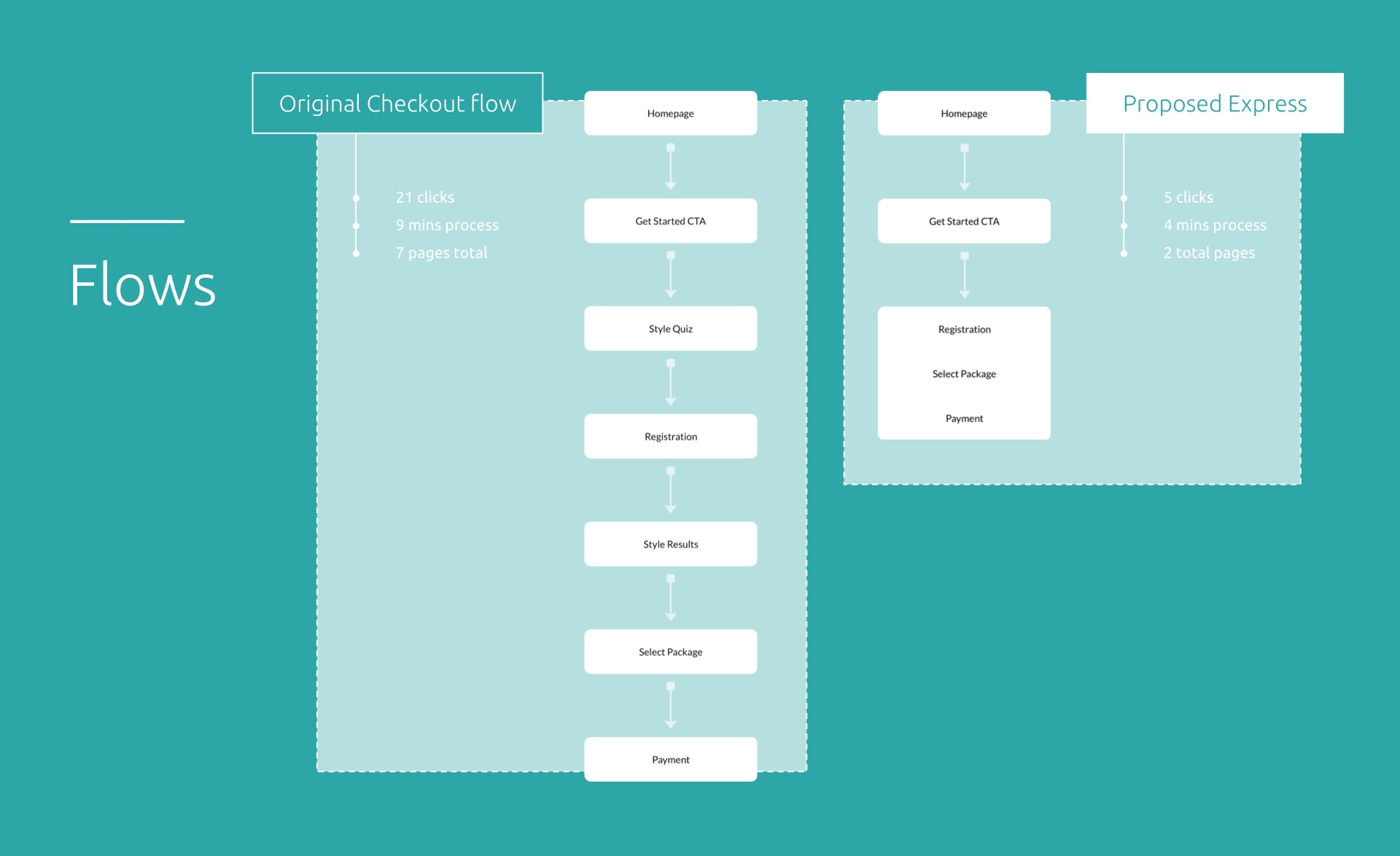
According to test results, it takes approximately 21 clicks/taps* for first-time customers to hit the purchase page.
* 7 - 8 pages. This is too much effort for any customer wanting to purchase a design package with our current experience.
According to test results, it takes approximately 21 clicks/taps* for first-time customers to hit the purchase page.
* 7 - 8 pages. This is too much effort for any customer wanting to purchase a design package with our current experience.
CURRENT USER FLOW
1 Homepage
2 Get Started CTA
3 Style Quiz
4 Registration
5 Style Results
6 Select Package
7 Payment
CURRENT USER FLOW
1 Homepage
2 Get Started CTA
3 Style Quiz
4 Registration
5 Style Results
6 Select Package
7 Payment
THE GOALS
THE GOALS
THE GOALS
STAKEHOLDER HYPOTHESIS
STAKEHOLDER HYPOTHESIS
STAKEHOLDER HYPOTHESIS
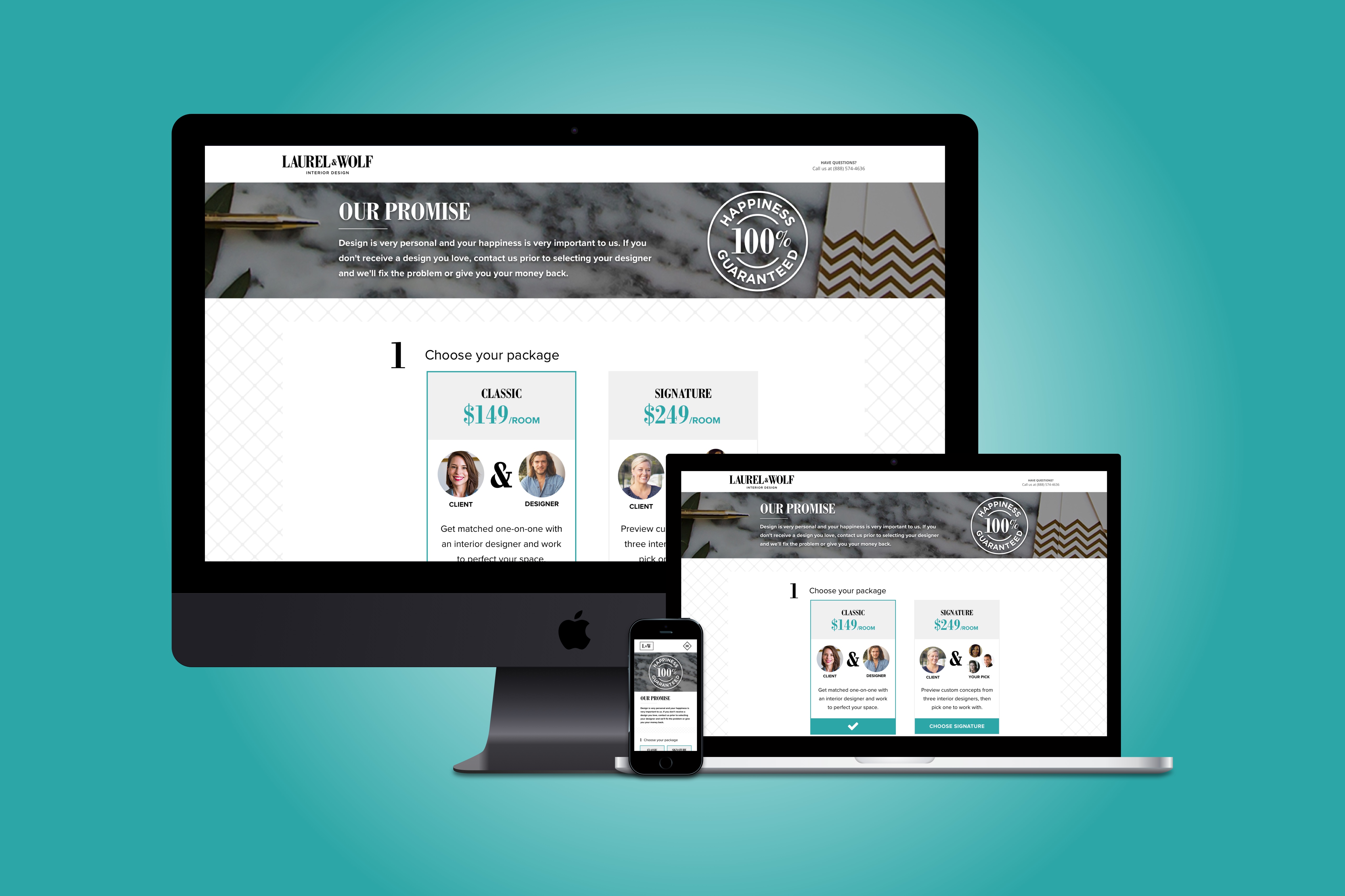
Creating an express/one page checkout process will add value to users and increase purchase rates for business goals.
PRODUCT DESIGN GOALS
PRODUCT DESIGN GOALS
PRODUCT DESIGN GOALS
Stays consistent with brand
Passes accessibility testing
Layout and flow understood from user testing
Hierarchy is clear across all platforms via responsive layout
Cut-down click thru rate from initial “Get Started” to purchase
THE COMPETITORS
THE COMPETITORS
THE COMPETITORS
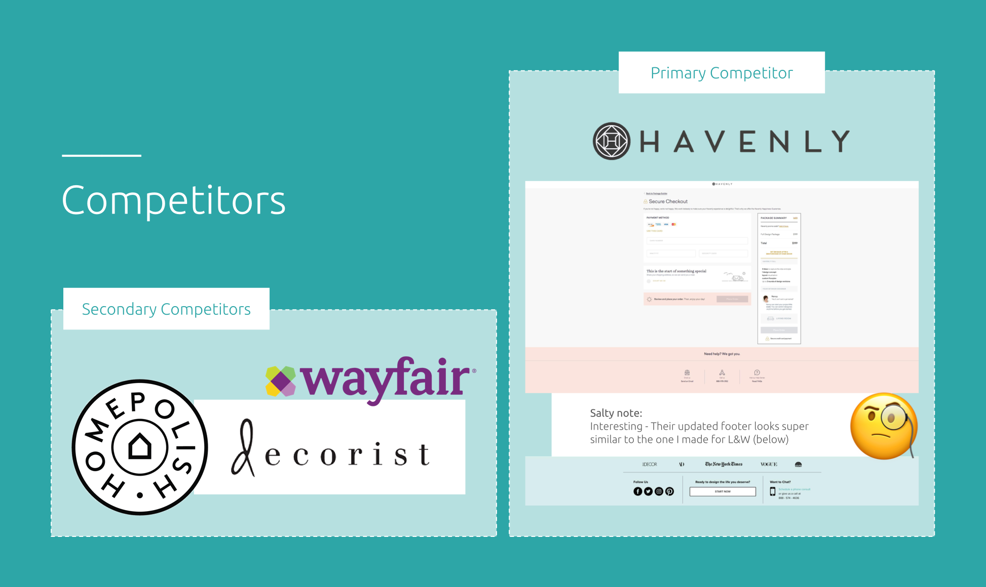
Checking out our direct competition, the analysis was consistent and quick to determine: none of our leading competitors had proposed an express checkout.
I advised my team to be cautious as we proceeded. Removing our educational onboarding experience to a less-known industry could backfire. Education is key.
USER FLOWS
USER FLOWS
USER FLOWS
Understanding our current first-time user flow is essential to successfully creating, and further testing, our proposed updated express wall experience.
“How can we encompass trust, continue educating, register, select their package, AND have users pay us... all in one page?” - Greg Friedman, Product Manager
“Girl, I got you.” - Me
“How can we encompass trust, continue educating, register, select their package, AND have users pay us... all in one page?” - Greg Friedman, Product Manager
“Girl, I got you.” - Me
“How can we encompass trust, continue educating, register, select their package, AND have users pay us... all in one page?” - Greg Friedman, Product Manager
“Girl, I got you.” - Me
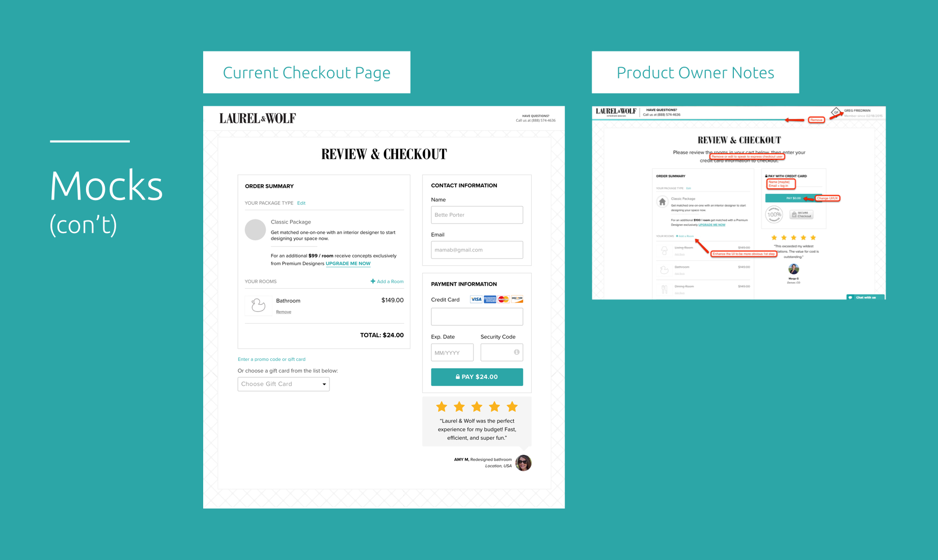
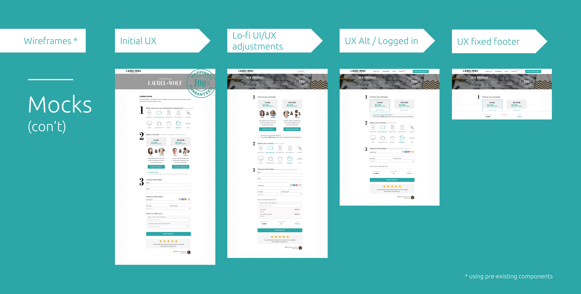
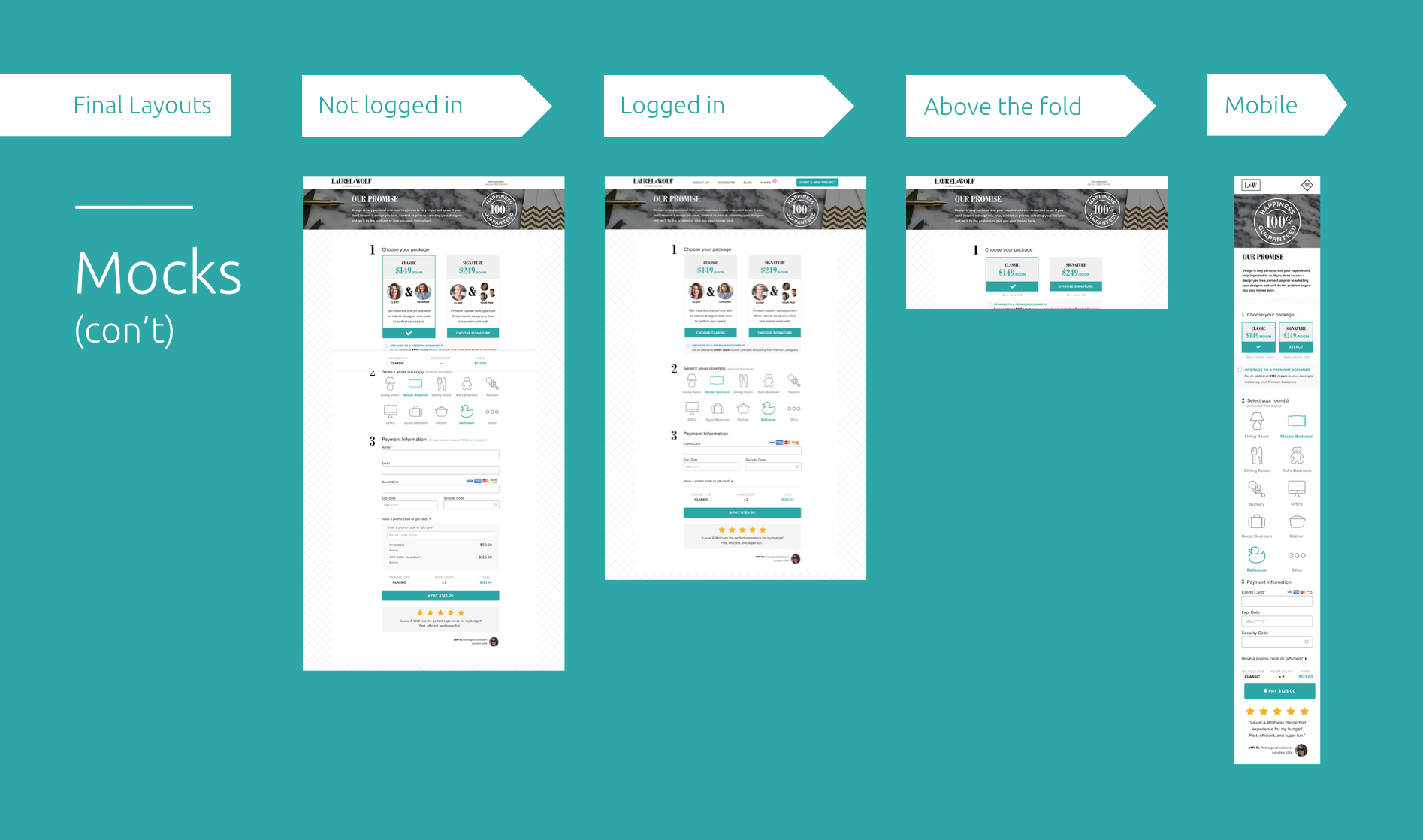
THE MOCKS
THE MOCKS
THE MOCKS
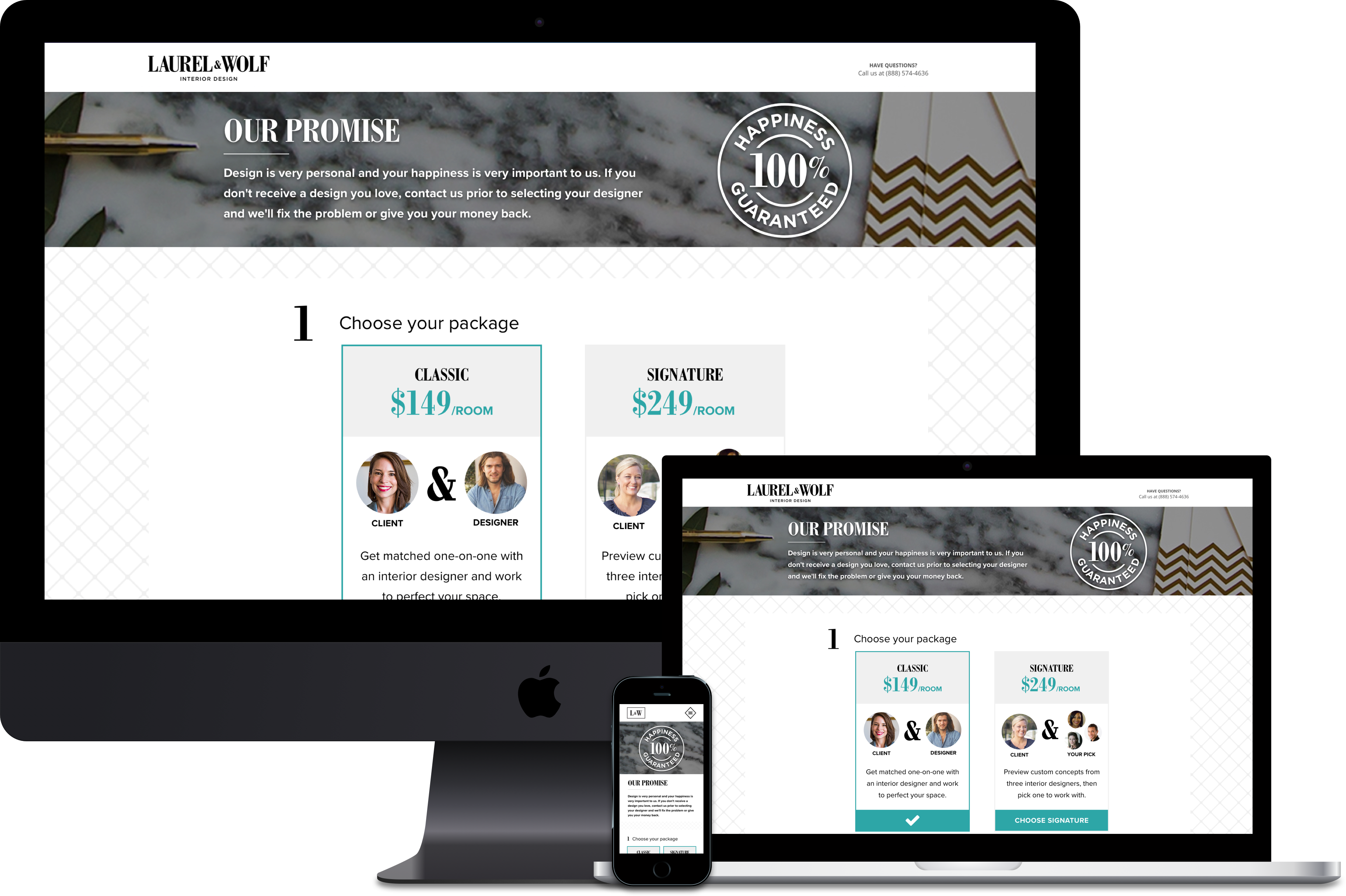
This case study utilizes pre-existing components previously created for our Design System, an overhaul effort successfully accomplished and executed by myself and my awesome counterpart, Dani Dell.
Because of this, I was able to skip lo-fi sketches* (a rare, but beautiful, evolution that comes from creating a DS) and dive right into component optimization, interface adjustments, page layout, and interactions across all platforms.
* Hand-sketches are always part of my foundational process
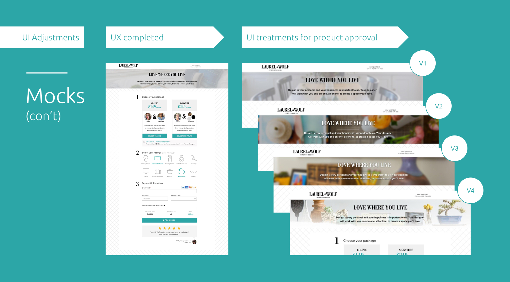
“If UX is the architect of your experience then UI is the interior designer of your site.”
“If UX is the architect of your experience then UI is the interior designer of your site.”
- Shane Silver
- Shane Silver
Just as important as it is to have a structurally-sound layout, creating a well thought out interface can give a guiding voice users will resonate with, gain trust, and continue through the purchase funnel.
Getting the right visuals and aesthetics can be demanding, but worth the patience and test results!
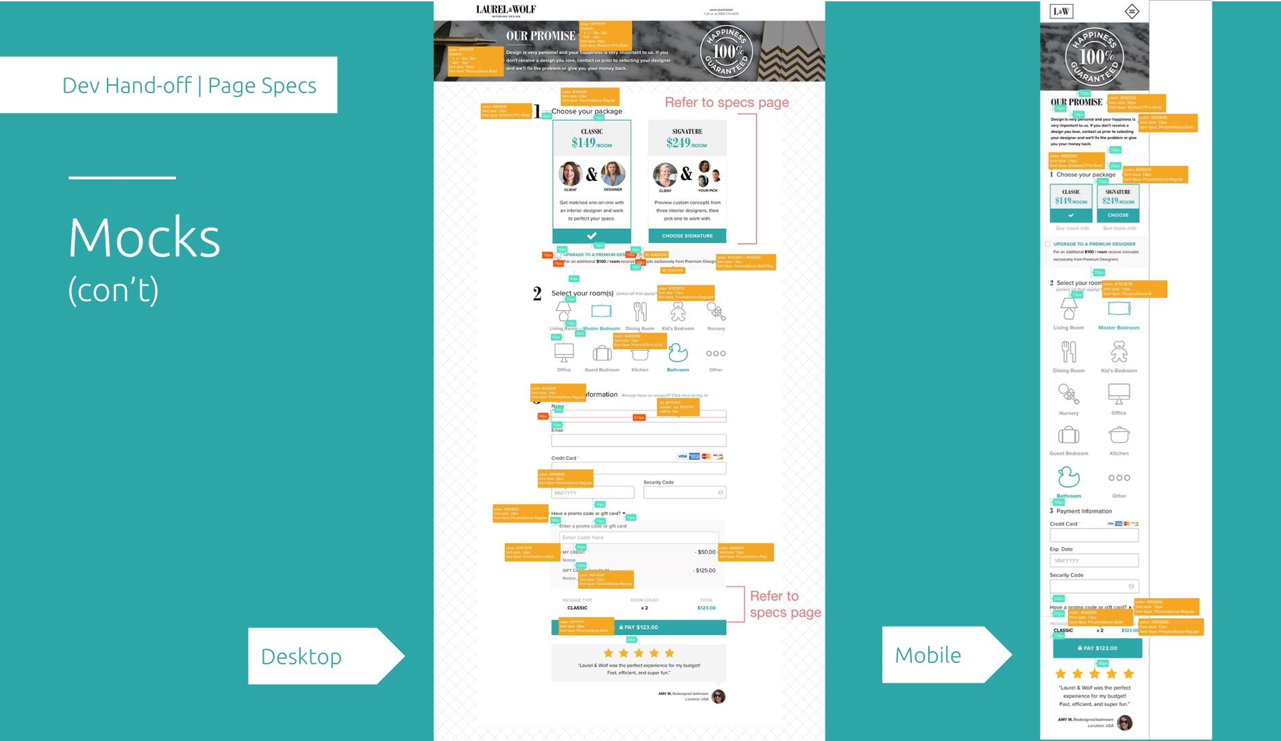
MOCKS EXPLAINED
MOCKS EXPLAINED
MOCKS EXPLAINED
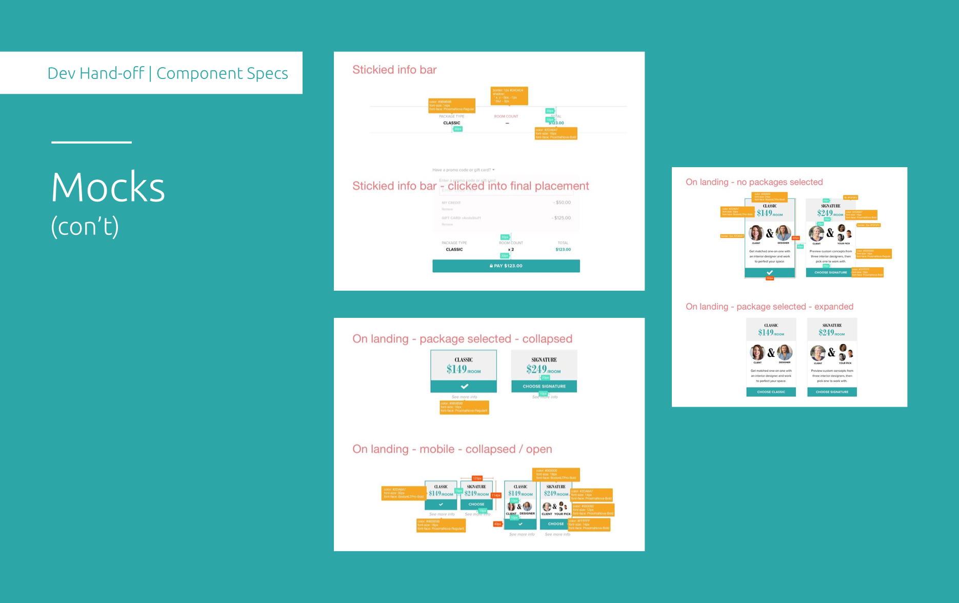
Keeping devs in the loop from kick-off to hand-off is my secret sauce to my great projects 
Coming from a dev background, I understand the importance of keeping your team (product, dev, QA) in the loop every step of the way. Tech feasibility can make or break a project if not clearly defined. Transparency leaves little room for error and also creates a chill work environment. Our dev team preferred having their specs directly on the mocks (I'm also versed in Zeplin).
FURTHER EXPLAINED
FURTHER EXPLAINED
MOCKS EXPLAINED
Utilizing your main platform and understanding the needs of the user are a constant balancing act.
In this case, L&W’s main platform was Desktop. Being hired on as our mobile app designer, creating with mobile in mind always comes first. Understanding where the fold lays and how we can utilize mobile first-experiences that will easily translate are just a few of the intricacies I loved challenging myself with.
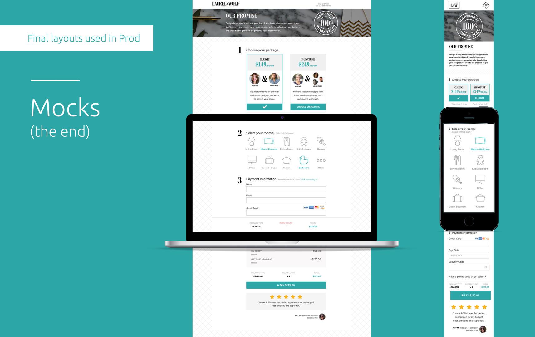
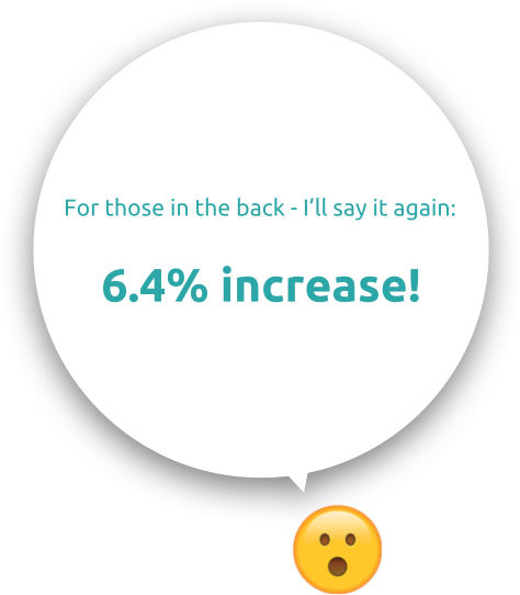
OVERALL RESULTS
OVERALL RESULTS
OVERALL RESULTS
OVERALL RESULTS
Overall, a 6.4% increase for purchasing design packages within one quarter.
A significant win from A/B Testing, we made this feature a permanent fixture on the site known as our Express Checkout option, alongside our onboarding.
“Oh schanps! Our hypothesis was a success! Dude, that’s crazy!”
“  ”- Me
”- Me
“Oh schanps! Our hypothesis was a success! Dude, that’s crazy!”
“ ”- Me
Overall, this was a successful project for my team. I definitely had my reservations as I was weary that our user flow was significantly adjusted.
Going from 21 clicks to 5 clicks can definitely create a faster purchase funnel (business goals) but at what cost to the user?
Vocalizing these concerns, I did my due diligence of researching, competitor analysis, and push back when I thought necessary to create the most effective experience.
We thoroughly tested and continuously refined the page.
Utilizing components from my Design System, this layout was further optimized for our holiday Gift Card traffic (Happy Hanukkah, y’all) and later became our primary checkout flow.
You made it to the bottom! Horrah! Let's take a mindful moment to remind ourselves how wonderful life is_ namaste
Selected Works
Video Player RedesignDesign Lead, Research, Testing
Express CheckoutResearch, Product Design, A/B Testing
Brand IdentityResearch, Product Design, Front-End
App ExperienceResearch, Product Design, Front-End
Made with  , a dash of
  , and copious amounts of
  2024 © S Silver