ROLES // DESIGN LEAD, RESEARCH, TESTING
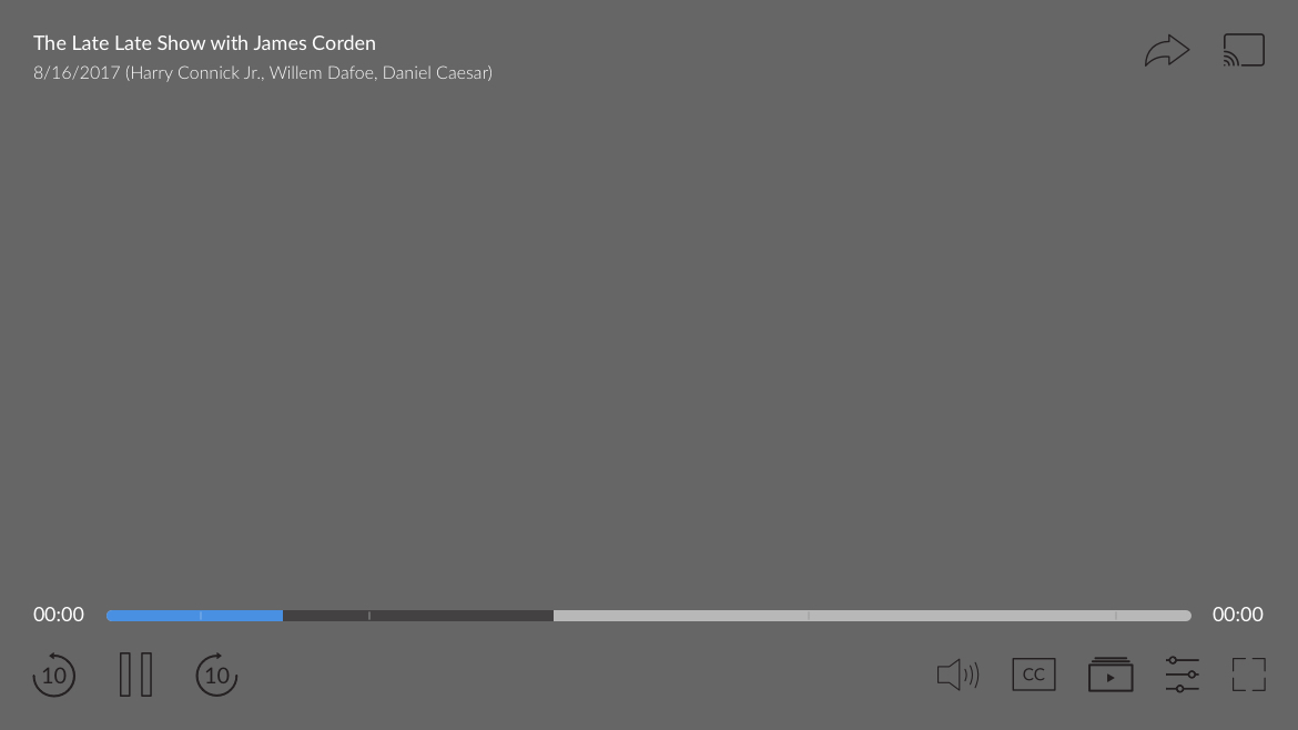
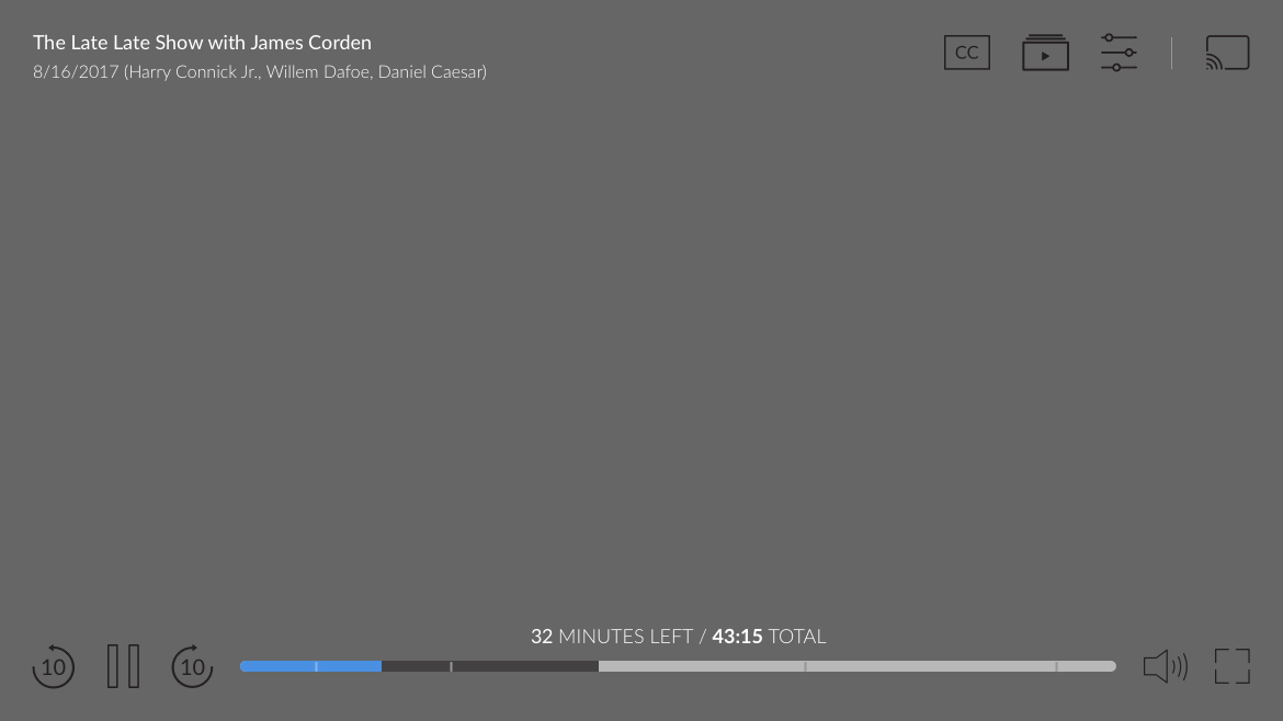
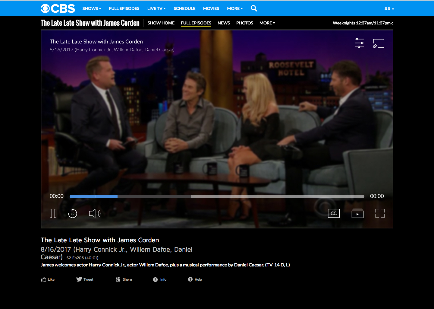
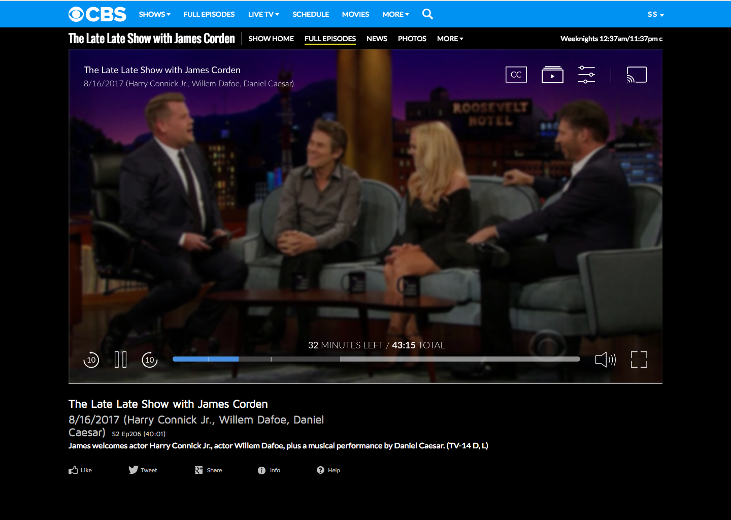
VIDEO PLAYER
REDESIGN
VIDEO PLAYER
REDESIGN
VIDEO PLAYER
REDESIGN
VIDEO PLAYER
REDESIGN
VIDEO PLAYER
REDESIGN
"No one cares about the UX or the UI of the video player - they [the user] only want quality streaming..." - CBSi Developer
^ Literally my reaction to hearing this
Now that I have your attention, why start this case study with this tone? I want you, the observer, to understand the mentality and transparency I was up against when first on-boarded to this project.
Yes, this was something that was actually said to me upon one of my first team syncs with my assigned video player developer. Although, shocking to hear this first hand - this did not discourage me, but only fueled my need as a designer to create an updated, more intuitive, experience for users across all platforms.
As this project took our team a year and a half * (approximately 239 iterations, yes I counted) to launch, I have adjusted this case study to only highlight the essential parts within this story arc.
* A year and half? That's bananas - I talk more about this in my Pain Points section below.
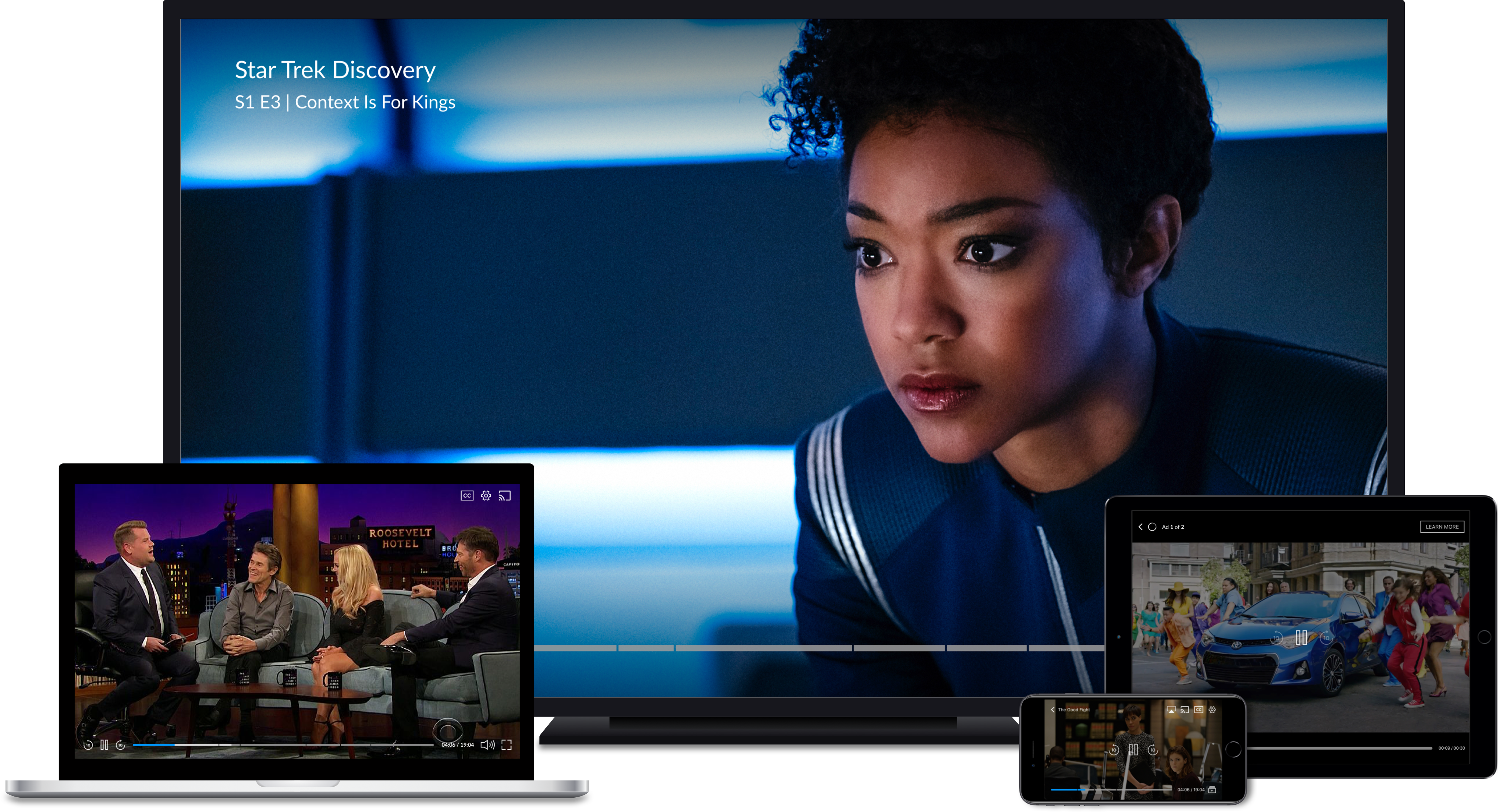
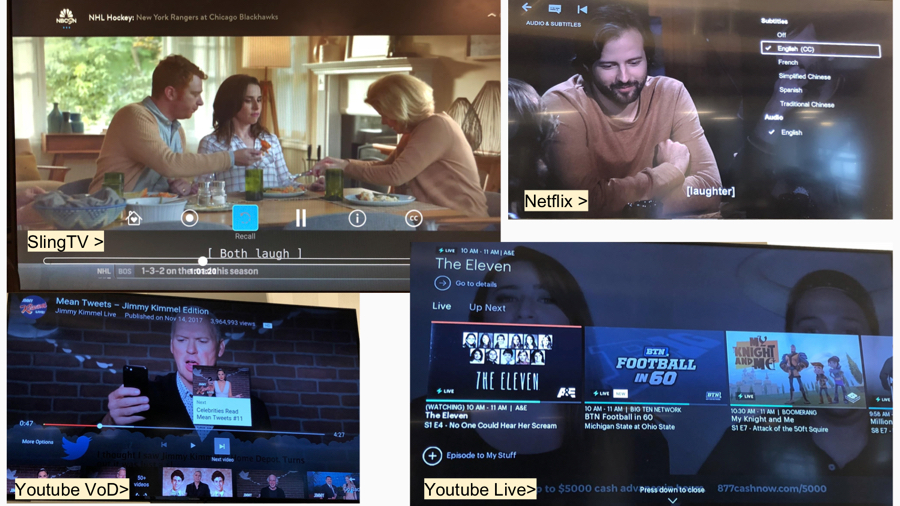
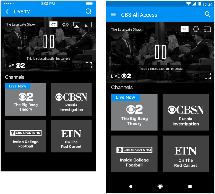
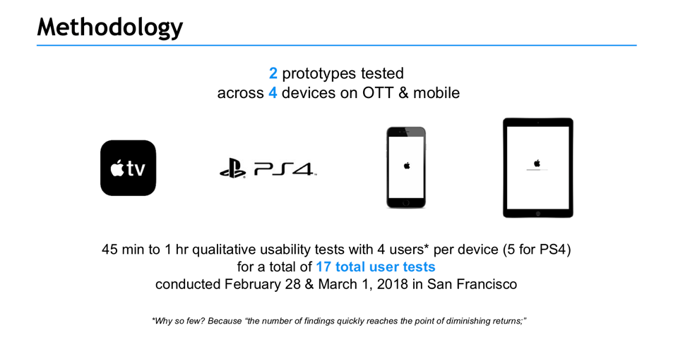
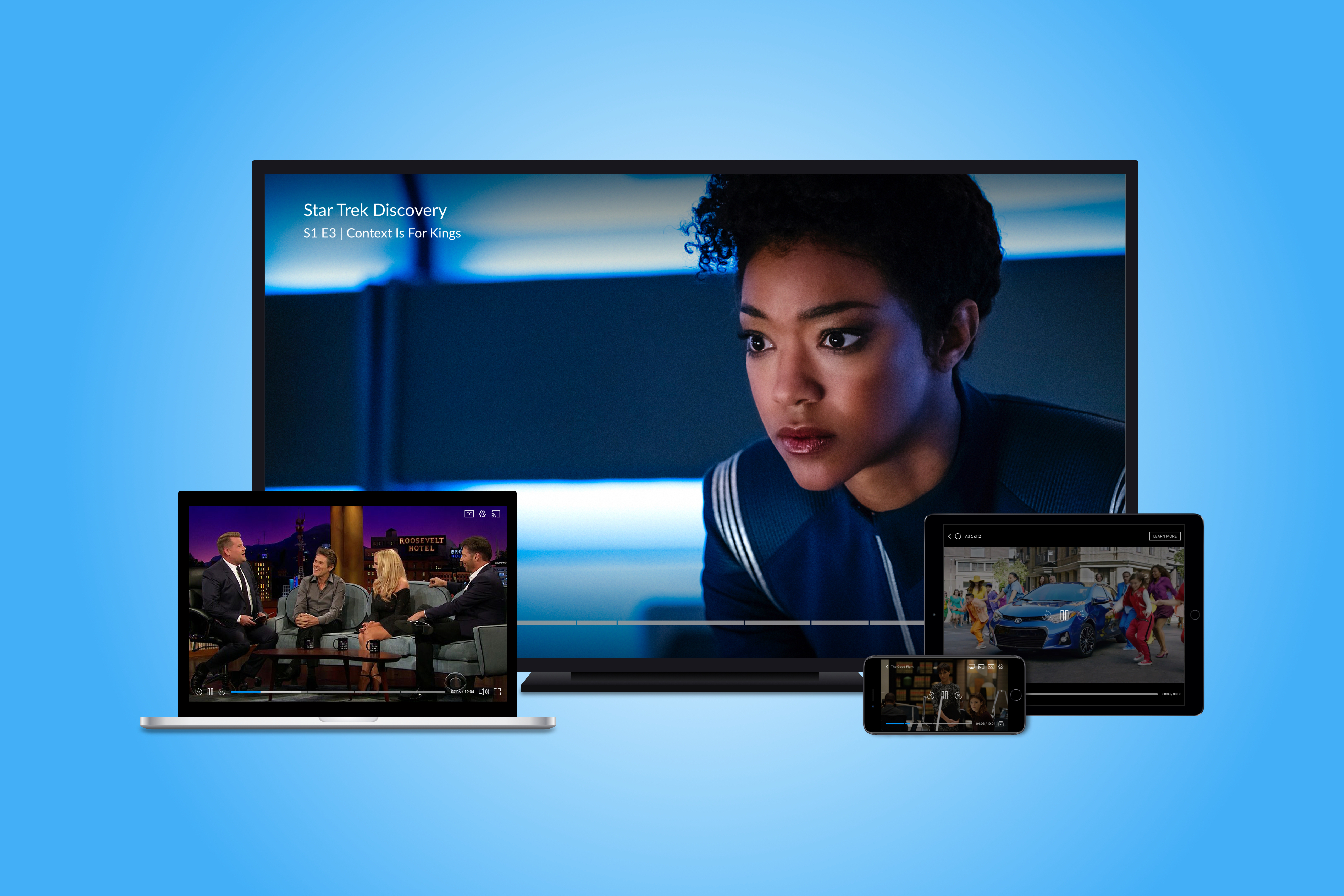
PLATFORMS
Phone, Tablet, Desktop, OTT Platforms
PLATFORMS
Phone, Tablet, Desktop, OTT Platforms
LINK
PAIN POINTS
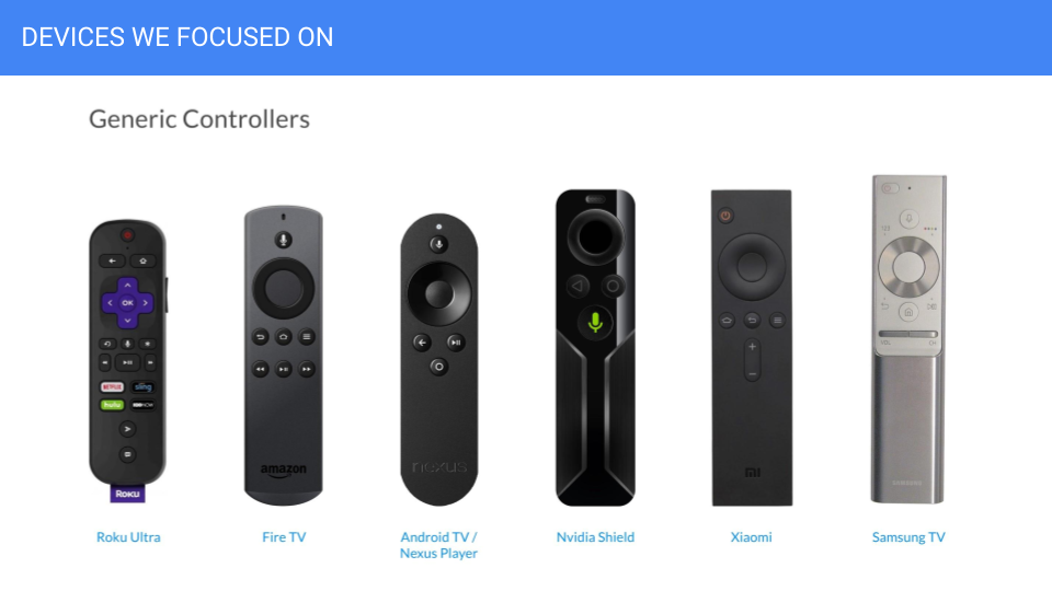
THE VIDEO PLAYER
THE VIDEO PLAYER
THE VIDEO PLAYER
THE VIDEO PLAYER
THE VIDEO PLAYER
It had been over 7 years since the CBS video player had been updated by developers and/or design, which never included UX *
With the player slated to be converted from Flash to Javascript, this was the perfect opportunity to review and properly research, design, and test such an essential component to the All Access' SVOD service.
Continuous streaming issues, user complaints, and overall lack of UX created a stale time capsule that was not accessible or competitive with today's SVOD services.
* This would later be the first design to launch that had proper UX process for All Access.
THE TEAM PROCESS
THE TEAM PROCESS
THE TEAM PROCESS
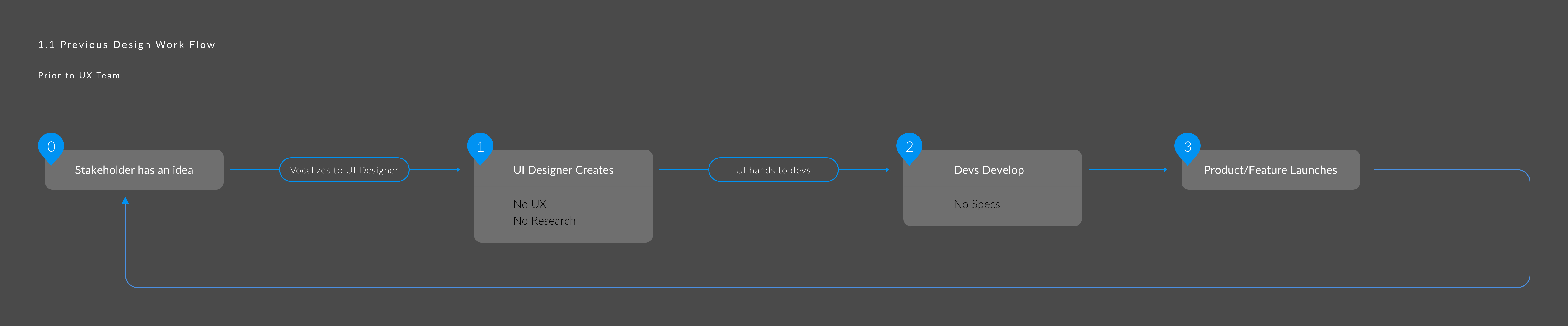
Keeping positive vibes up and my black onyx near - I took this as an opportunity to create a healthy process that allowed our team clear transparency and open communication throughout the entirety of this project. As the fourth, and final, member to the newly created UX Team, I was quick to observe that the design department had a severe lack of process.
Lack of design process
Lack of brand/style guide
No slated personas
No testing process
Up until this point, stakeholders would verbally dictate (no tickets were created) their needs to UI Designers. UI Designers would then design and hand-off to developers. With this one-way approach, implementing a new team lead to many unhealthy ego-driven decisions from product owners and designers who were unwilling to adjust their process to include UX.
Up until this point, product owners would verbally dictate (no tickets were created) their needs to UI Designers. UI Designers would then design and hand-off to developers. With this one-way approach, implementing a new team lead to many unhealthy ego-driven decisions from product owners and designers that were unwilling to adjust their process to include UX.
THE GOALS
THE GOALS
THE GOALS
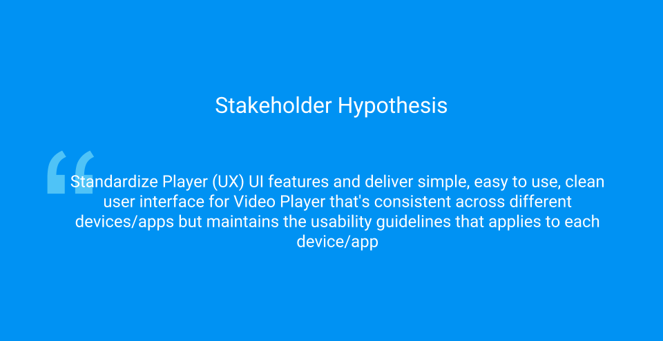
PRODUCT OWNER HYPOTHESIS
PRODUCT OWNER HYPOTHESIS
PRODUCT OWNER HYPOTHESIS
PRODUCT OWNER HYPOTHESIS
PRODUCT OWNER HYPOTHESIS
“Standardize player (UX) UI features and deliver simple, easy to use, clean user interface for Video Player that's consistent across different devices/apps but maintains the usability guidelines that applies to each device/app."
Main Objective: Premium Video Destination
Provide the best playback experience in the market
- Instant playback
- Reduced interruptions
- Intuitive and consistent user interface
- Device guidelines
- Accessibility friendly
- Standards
- Binge friendly
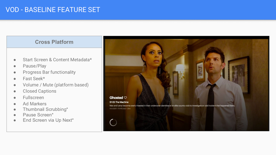
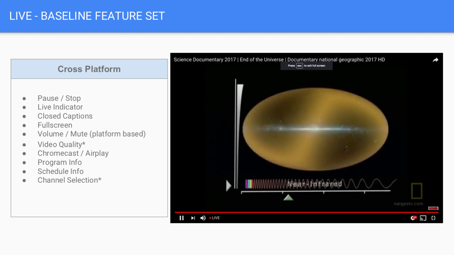
PRODUCT DESIGN GOALS
PRODUCT DESIGN GOALS
PRODUCT DESIGN GOALS
THE VIDEO PLAYER
Similar to product owners, plus:
- Simplified interface
- Across platform unification
- Increase user satisfaction via analytics
- Per platform - guideline standards
-- Agnostic design that can be adjusted and optimized per platform
THE TEAM
As Design Lead, I knew the unconscious mentality of the design department would never allow my new video team the potential we were capable of. Sitting down closely with my product owners and UI designer, I quickly set the course.
* This mind-set was so powerful and effective, the UX Team just participated in our first meditation together as our first team building exercise!
- Daily check-ins with our product owners who were located in our San Francisco office
Kick-offs that included developers from the beginning
Creating and executing tests at the UX level
Designing a flexible process that allowed both UX and UI to work together, not as isolated positions but, as Product Designers
Creating a safe and open environment that allowed for creative freedom
- Expanding and teaching the team about the latest trends (ex. colors as a functional elements) and tools (transitioning UI from Photoshop to Sketch)
- Continuous presentations with stakeholders to gather their input throughout our process
- A further effort to establish better communication across-departments
- Lastly, include a conscious and mindful space* that allowed the team to be as they are.
I truly feel that in order for humans to create at their full potential a healthy, positive space must be created
OPPORTUNITY TESTING
OPPORTUNITY TESTING
OPPORTUNITY TESTING
Final scope and requirements were not flushed out yet and this gave us a rare opportunity to take an unique approach to Opportunity Test. Always trying to harness my design craft and be flexible with my process, I created Opportunity Testing based off of my process with Opening Sketches.
Opening sketches give me the ability to design big! I can sketch possibilities that are literally the sky's limit and help shape what emotional value stakeholders product owners are aiming for. By opening up the problem I have the ability to understand product owner boundaries and begin to create a story that flows with business needs and user goals.
Already knowing some pain points from our current player and receiving feedback from users via the BI Team such as:
- Progress bar is too thin - Hard to click
- There is no forward or rewind button
- Better way to utilize the video player real-estate?
I had a short window to create, user test, execute lo-fi wireframes, and quickly target the demographic based off previous analytics.
Although, All Access did not have established personas - we did know our demographic's age range:
34 - 55 years old
To save time and money - we conducted in-house user testing with employees not associated with product or design and gathered the results. We then presented to product owners our findings. This also helped product owners get a better sense of what to expect when working with our newly established team.
^ Results from our Opportunity Testing
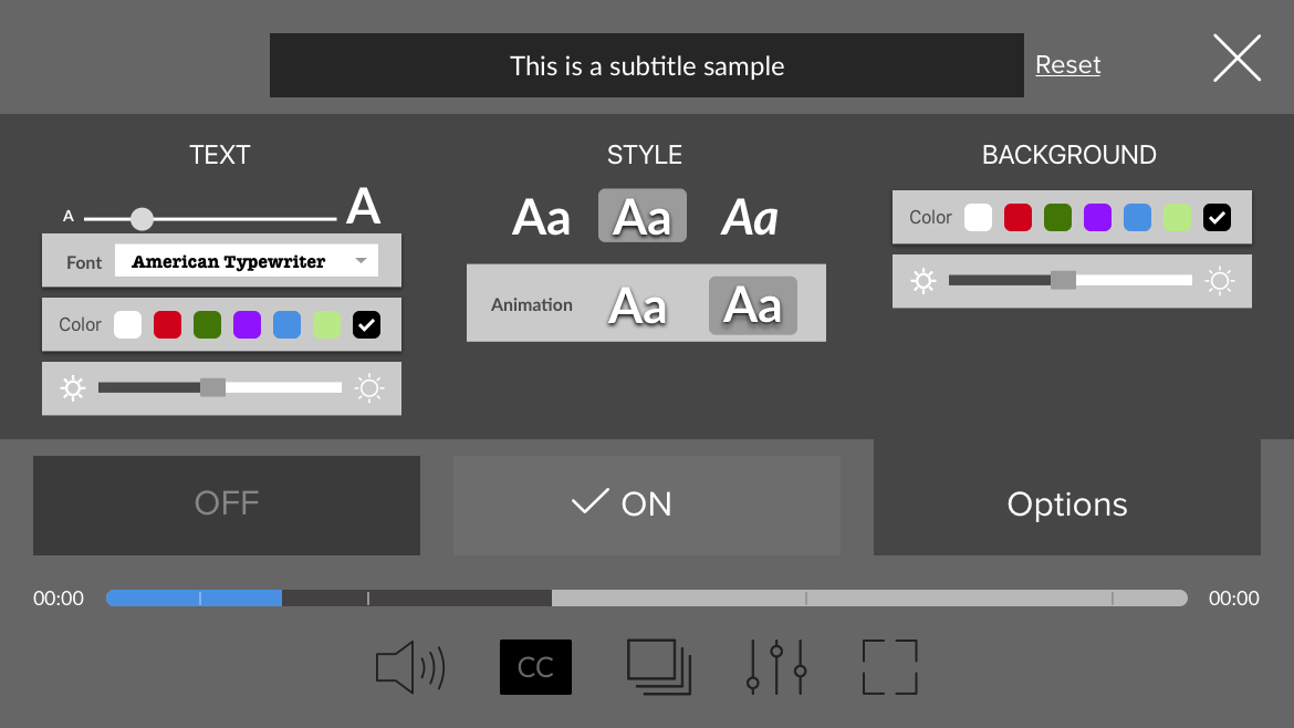
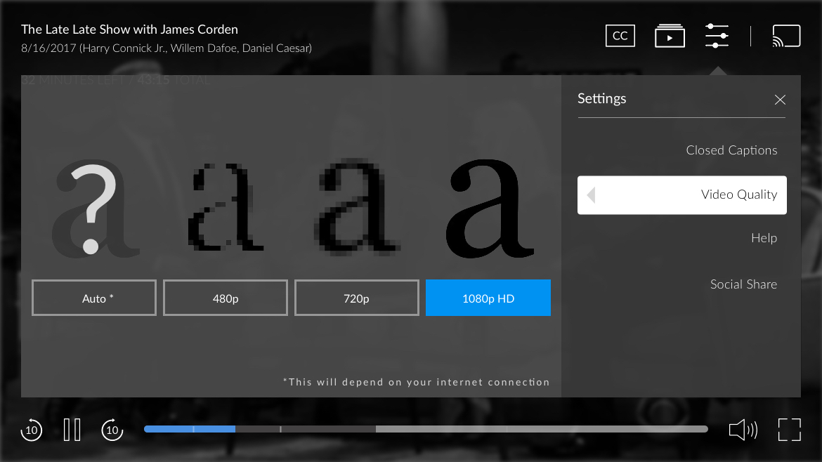
USER ACCESSIBILITY
USER ACCESSIBILITY
"A design is only useful if it’s accessible to the user: any user, anywhere, anytime. We often mistake the concept of accessibility as involving people with disabilities. However, we’re all disabled in many contexts and circumstances. Accessibility is all about people."
-Mads Soegaard
With an outdated video player as our canvas - it was a must for both product owners and myself to update the player to include accessibility. Although our company did not have a direct persona, we used this to our advantage and designed for a diverse array of users that fit within our age demographics.
Agnostically designing, it was important to develop interactions and components that held to HIG and Material Design standards (ex button treatments) in addition to keeping ARIA in mind. I was able to verify if my designs passed accessibility with Sketch plugins in addition to in-person testing.
Here are a few accessibility examples I focused on:
Reusable components that standardized accessibility structure
Components that could be reused that standardized accessibility structure for MVP
Header tags to aid screen readers for visual impairment
Colors as functional elements that highlight and/or contrast
Full-width panels that gave visual focus (user's intent)
Hand sketches showing tappable areas for mobile icons
Early lo-fi phone concept for closed caption that utilize larger tappable areas
(Super) early lo-fi phone concept for closed captions options - utilizing pre-exsisting components
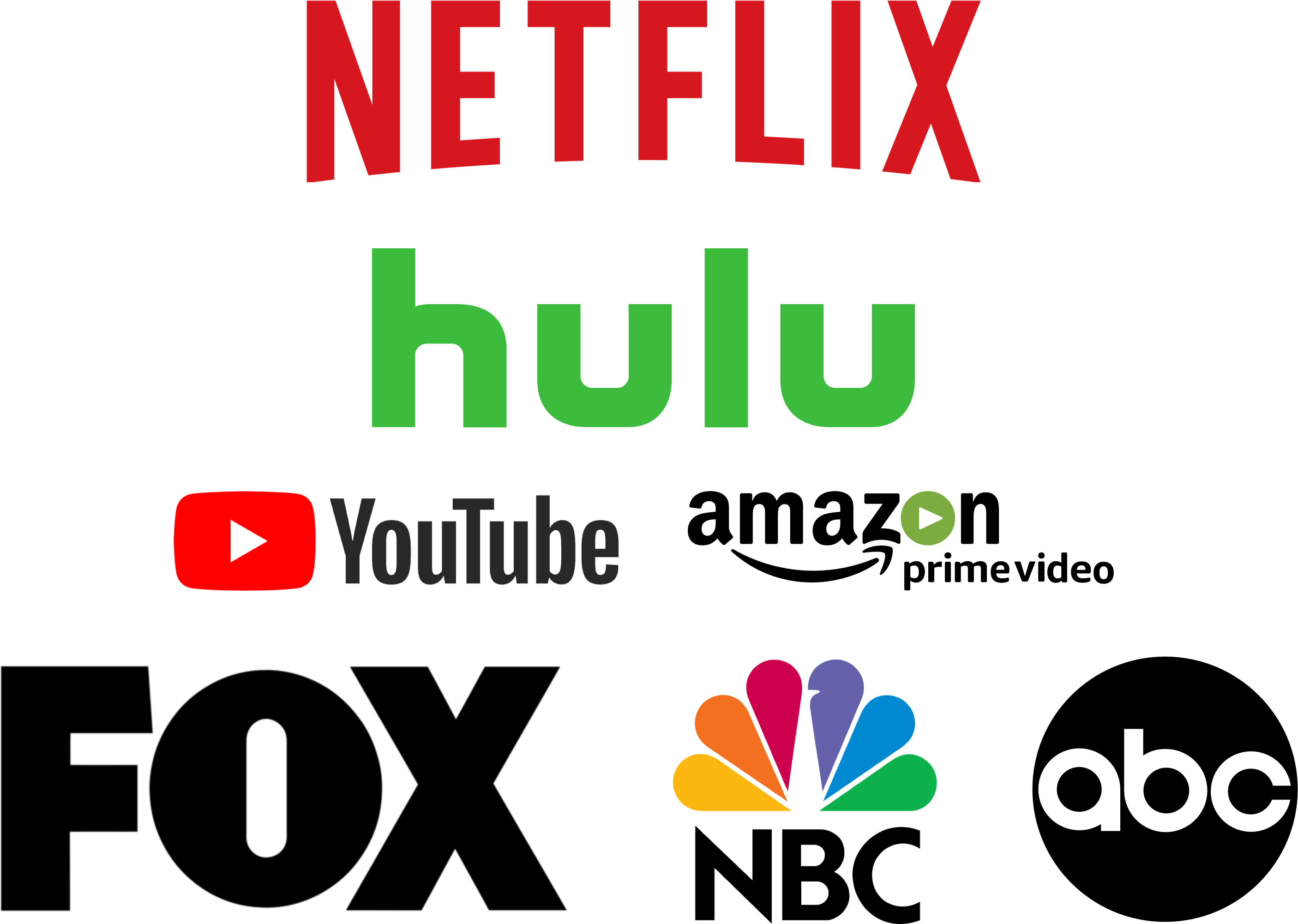
THE COMPETITORS
THE COMPETITORS
THE COMPETITORS
The SVOD world is full of awesome competitors. Here are a few primary and secondary competitors All Access observed and researched for this project.
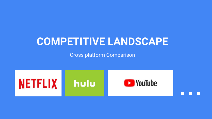
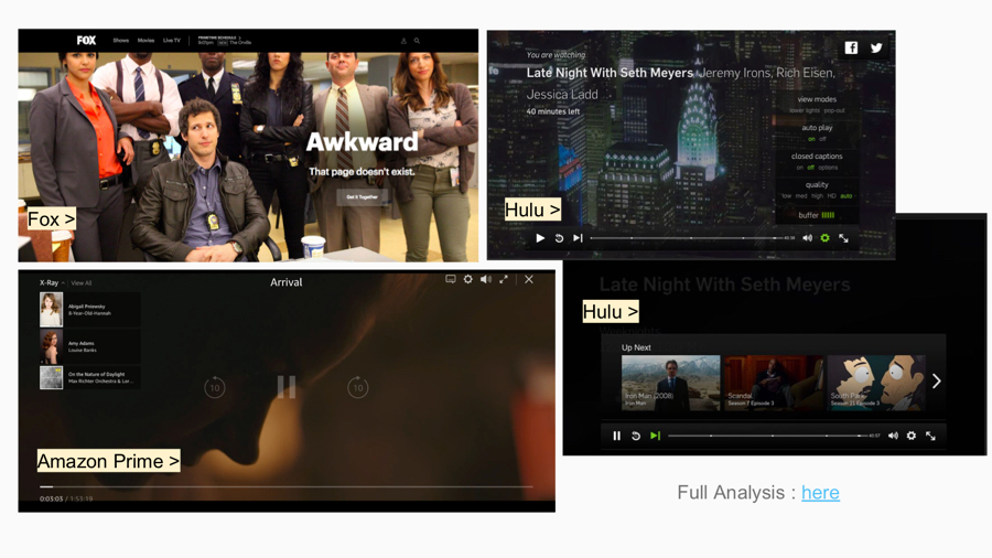
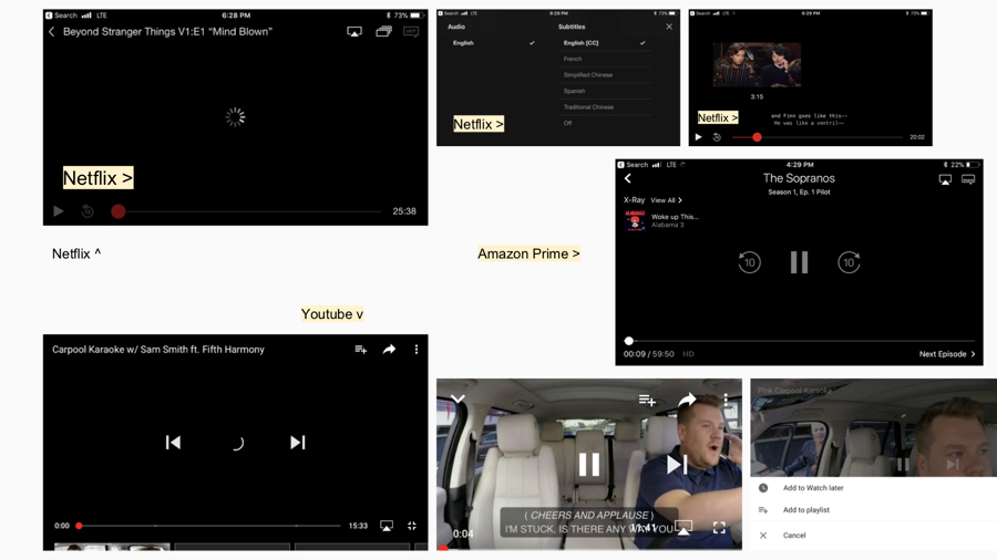
^ A condensed version of the intial audit
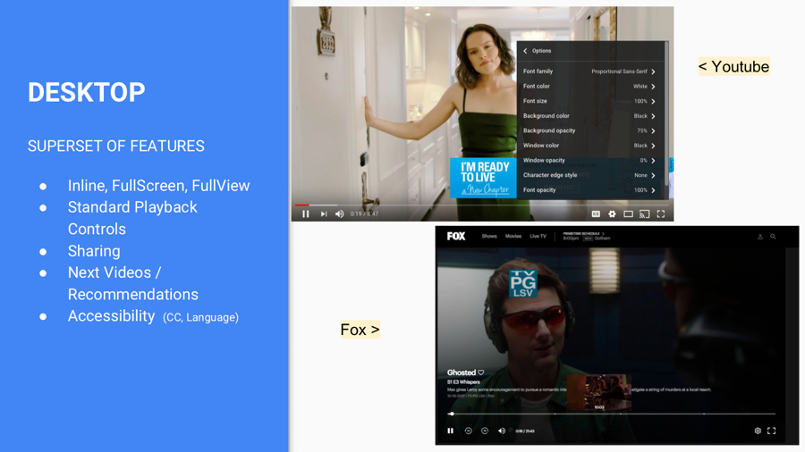
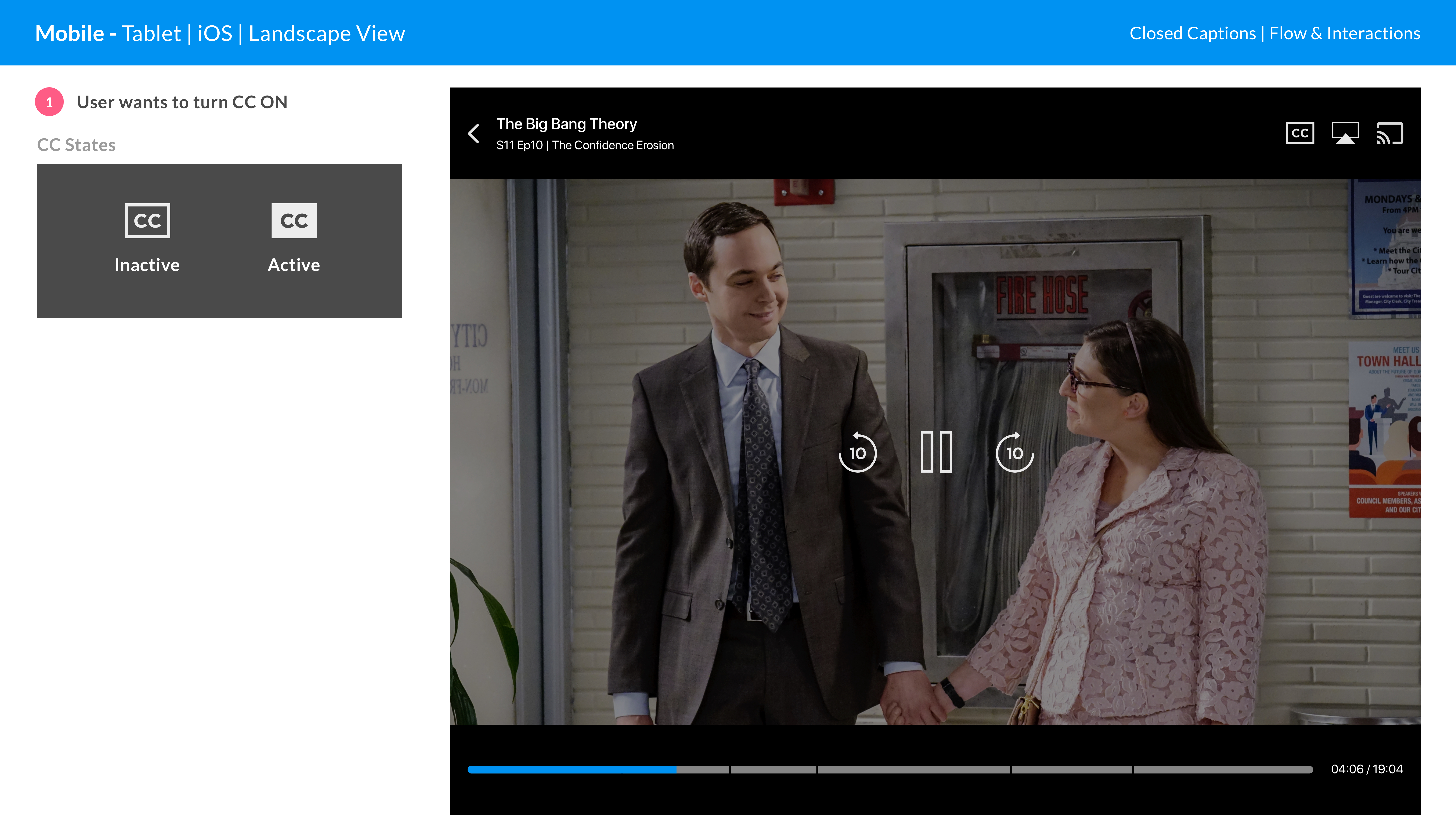
USER FLOWS
USER FLOWS
USER FLOWS
USER FLOWS
Understanding pain points and how we can alleviate them at wired level is essential to successfully creating, updating, and further testing our proposed experience.
As the scope of this project was immense, keeping a lean user flow per feature and platform helped our team stay organized and focused. We were easily able to view adjustments and focus on areas that users commonly complained about, such as the Closed Captions adjustment.
The below flows are some examples for desktop.
Understanding our current first-time user flow is essential to successfully creating, and further testing, our proposed updated express wall experience.
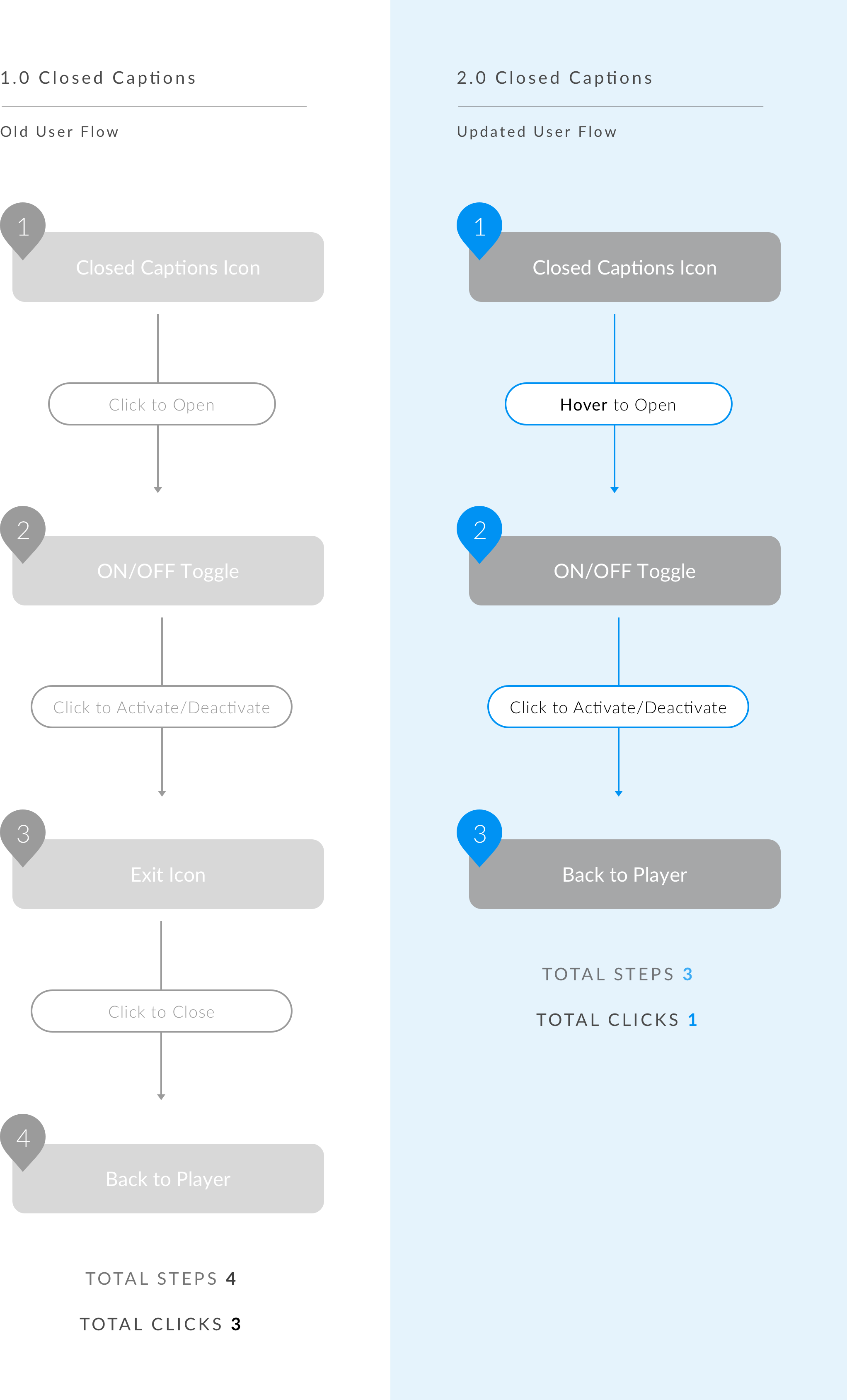
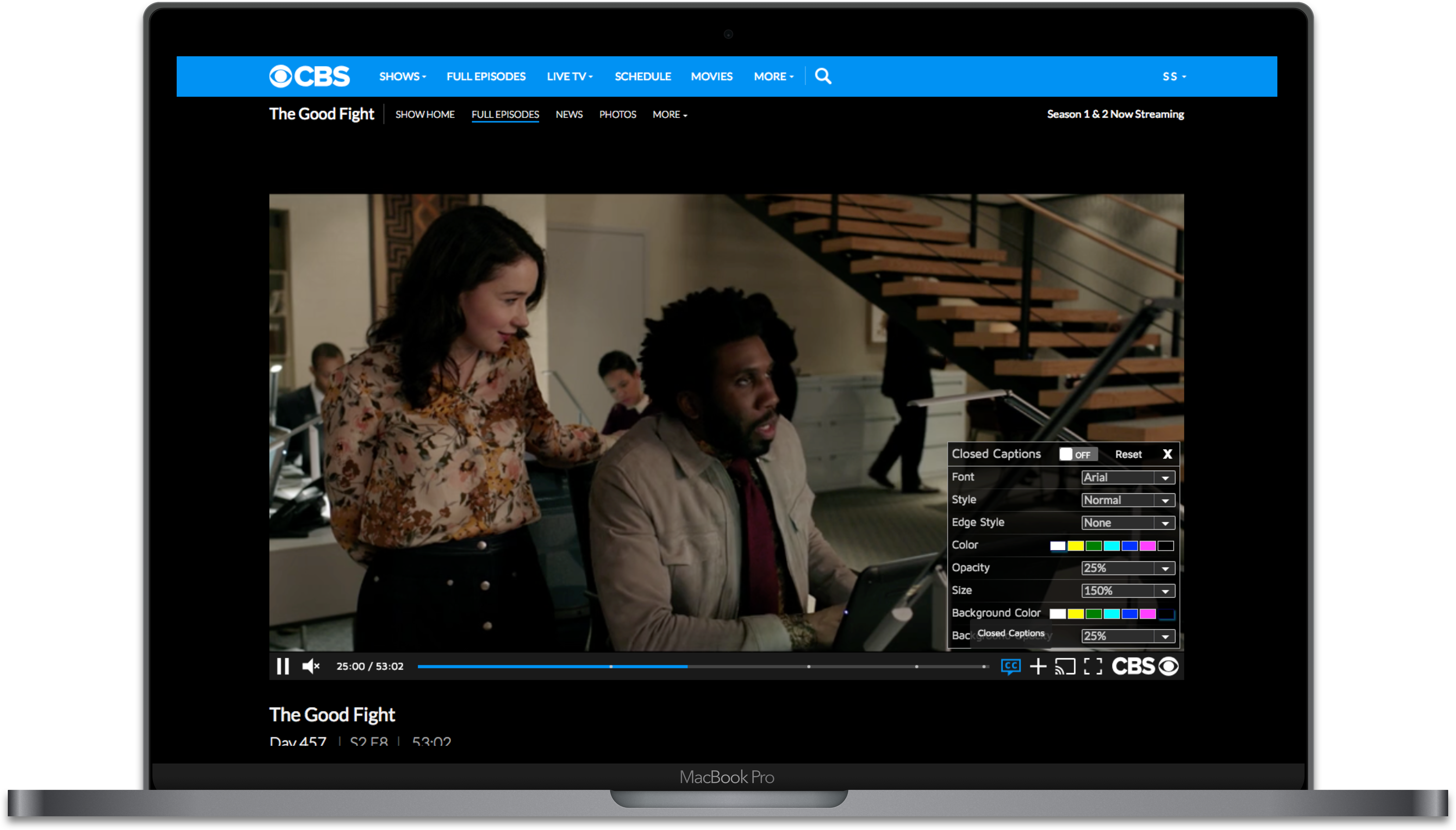
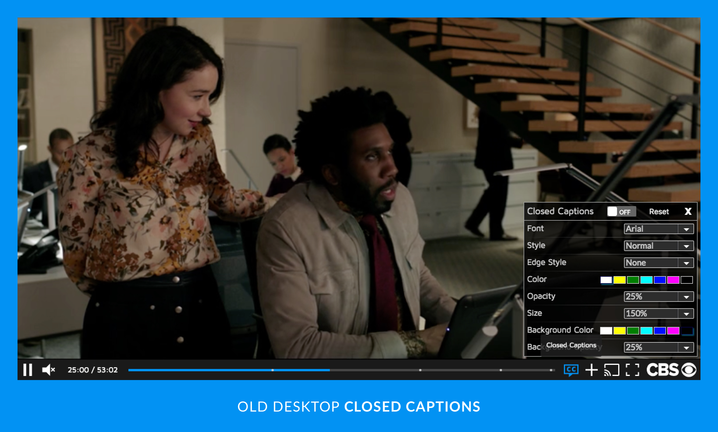
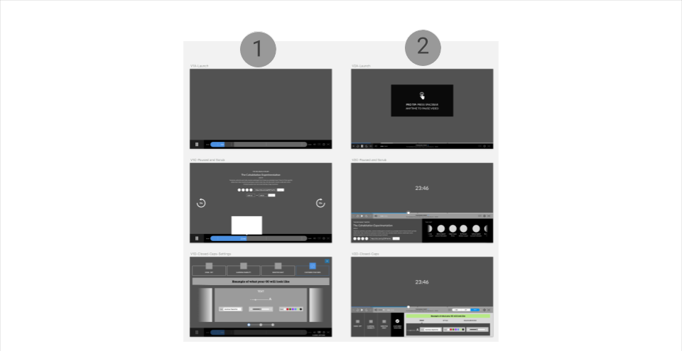
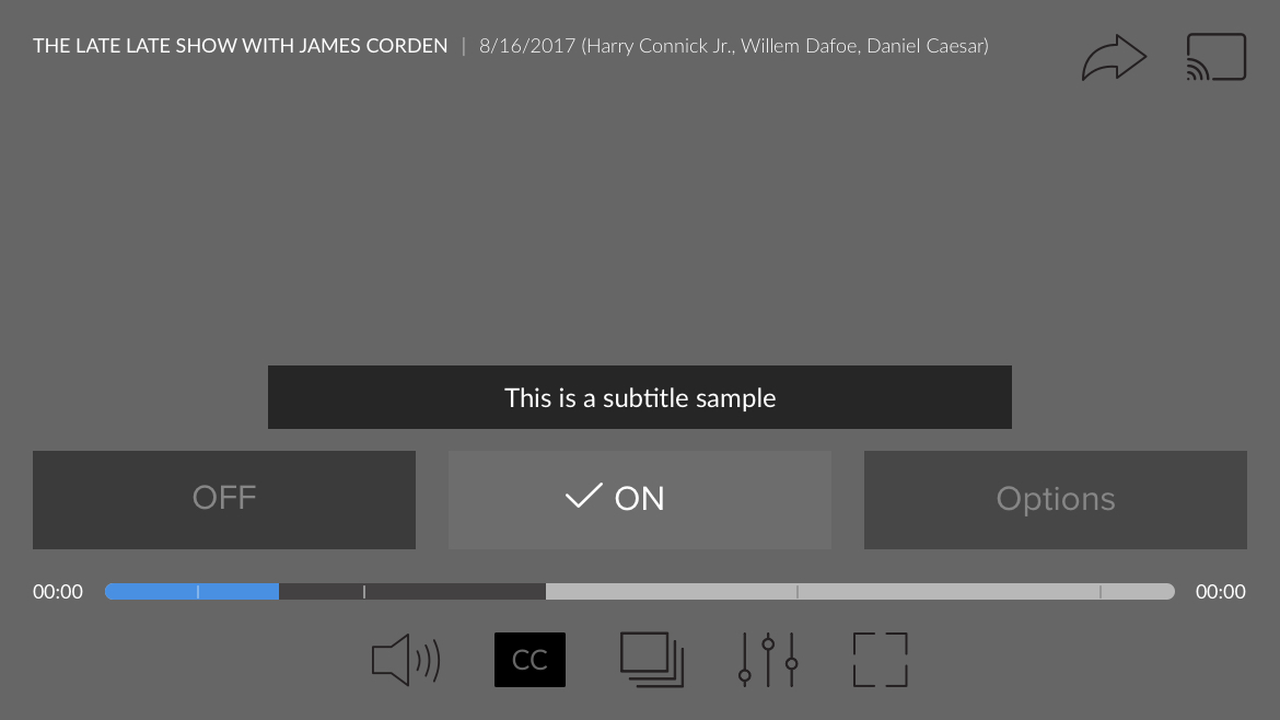
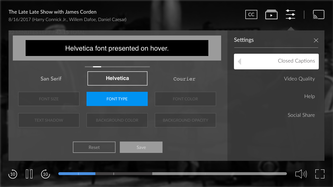
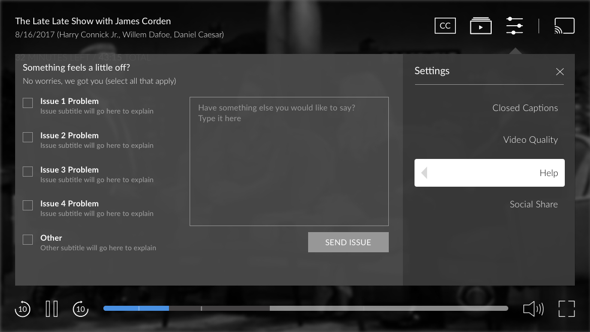
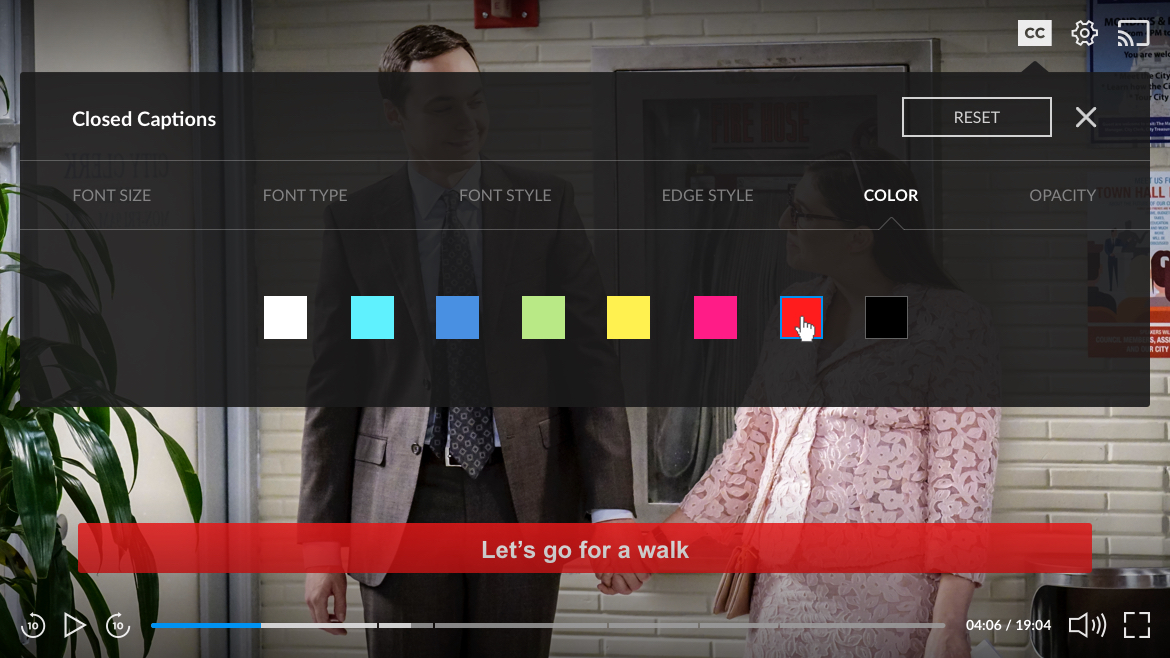
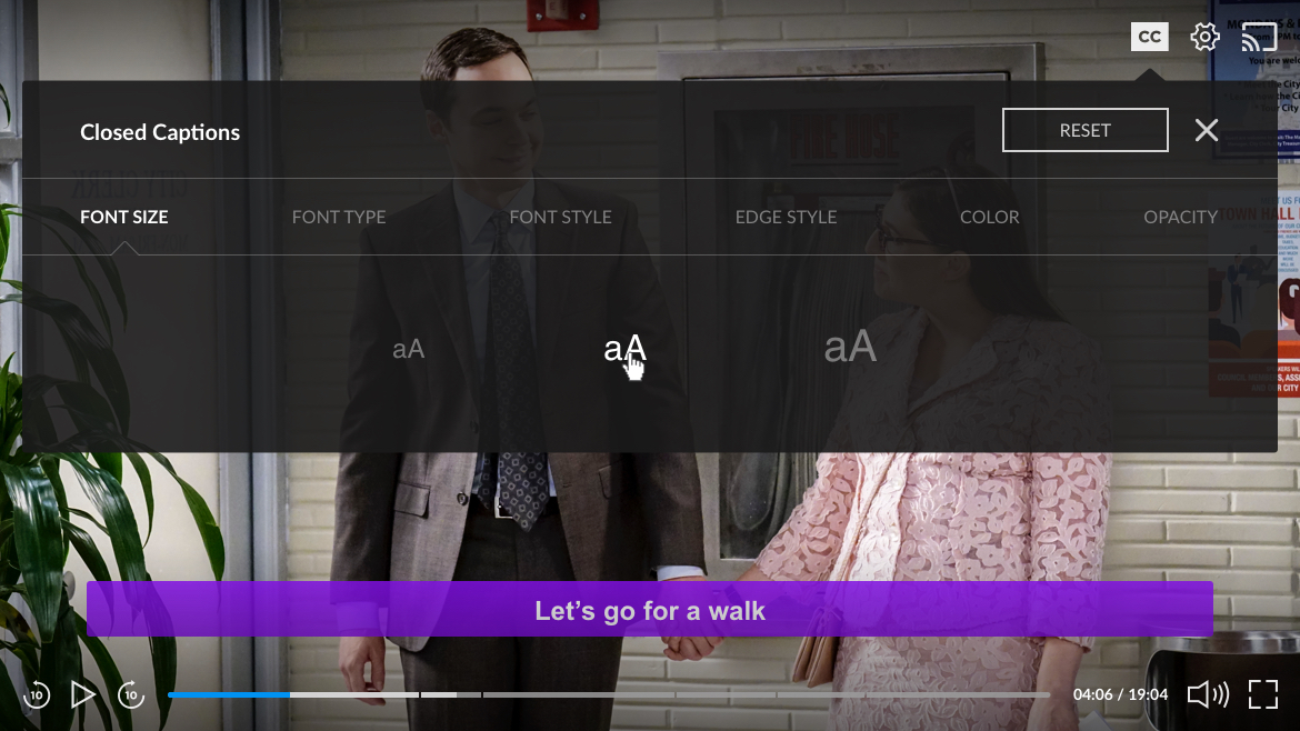
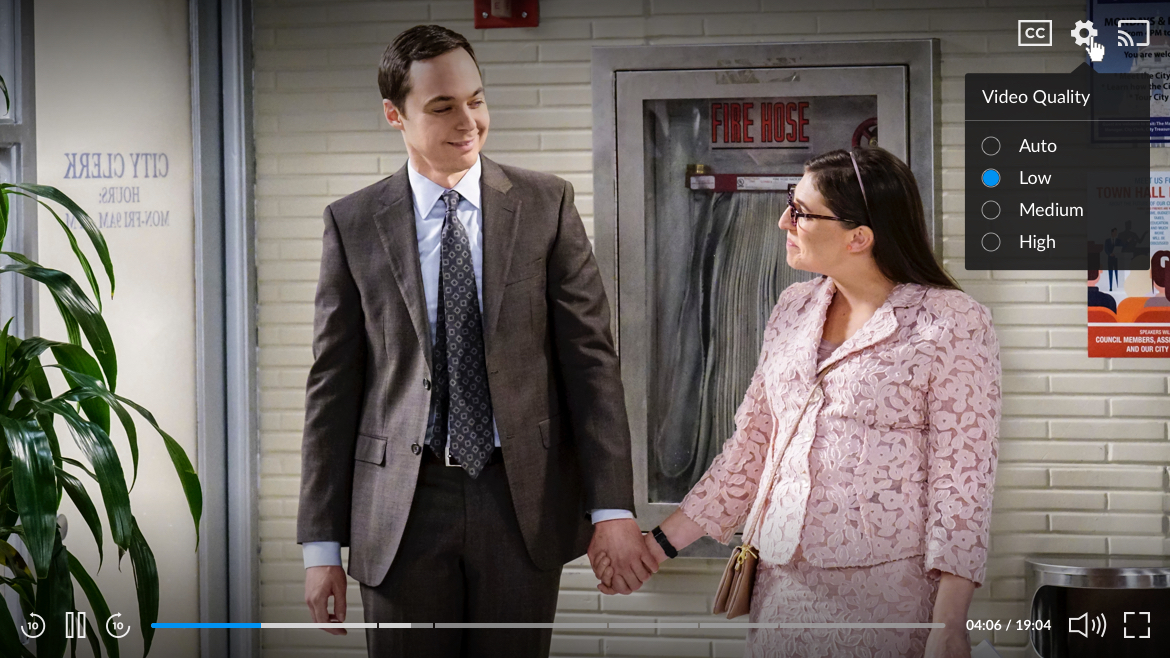
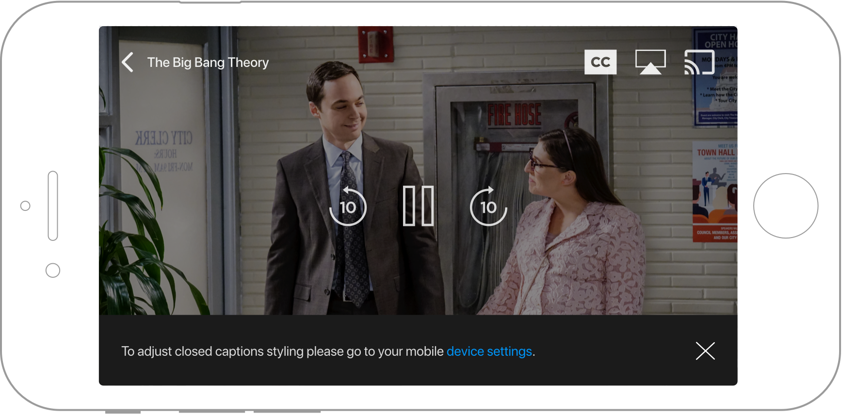
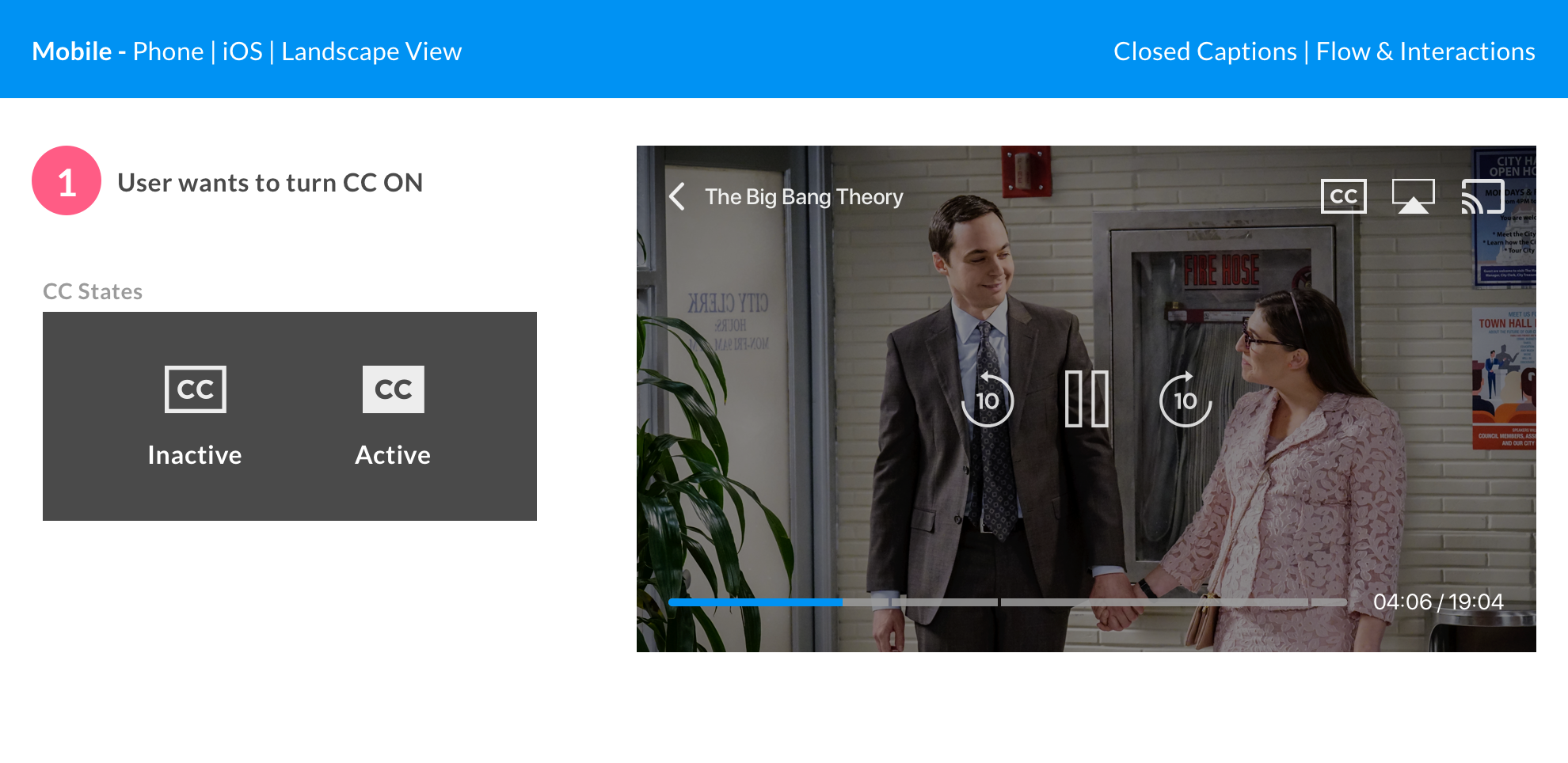
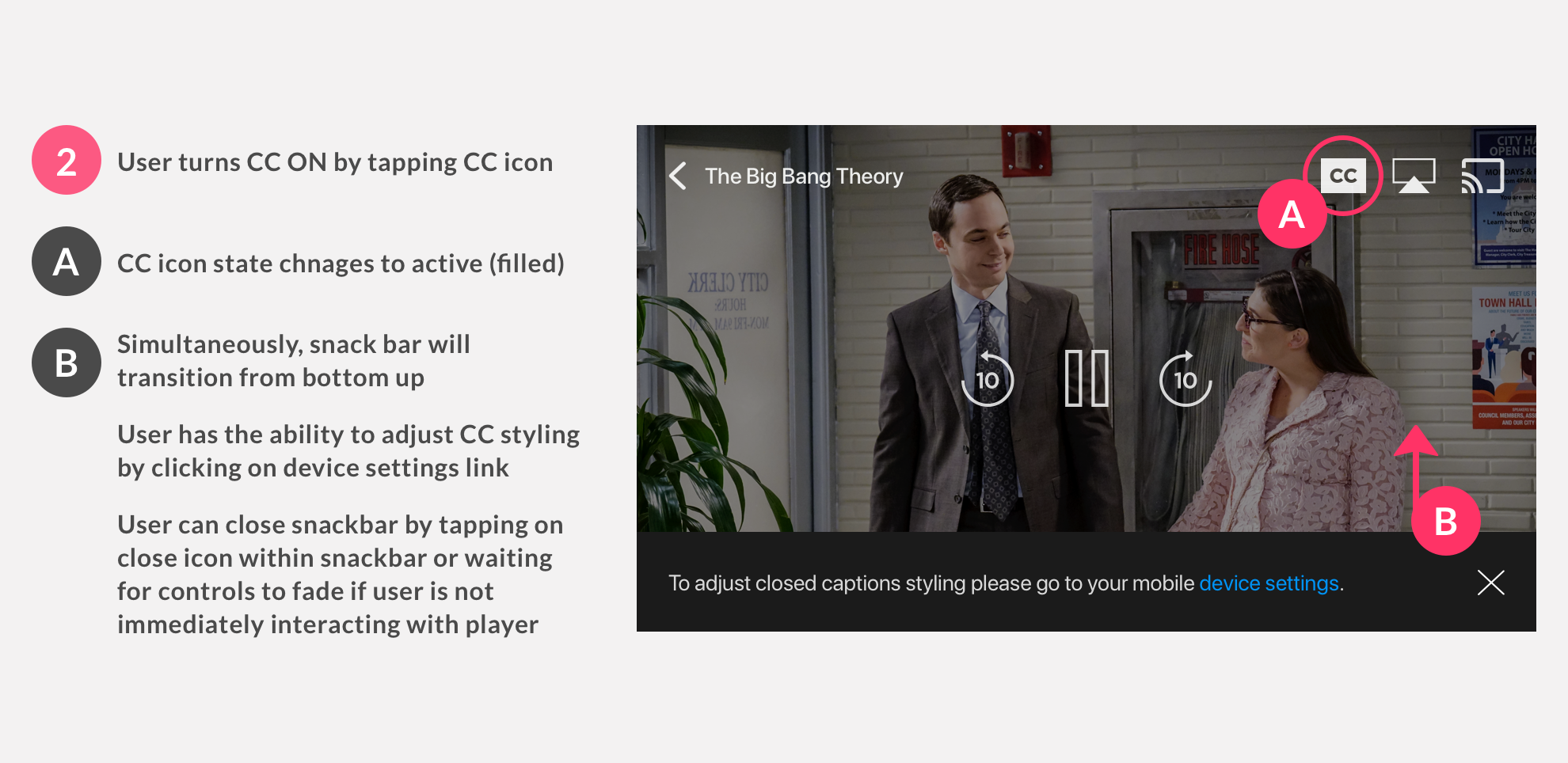
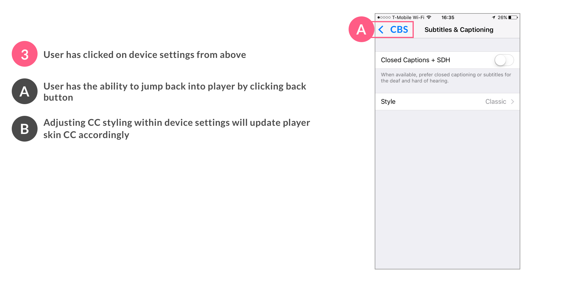
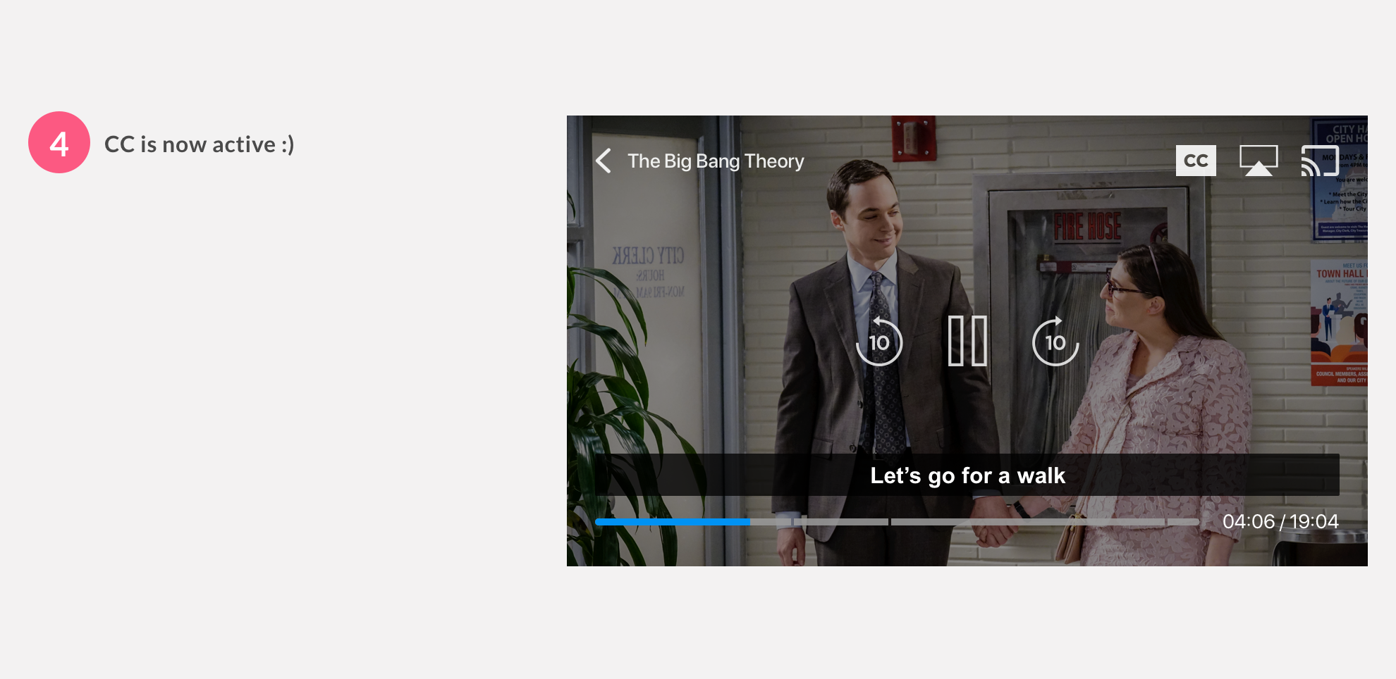
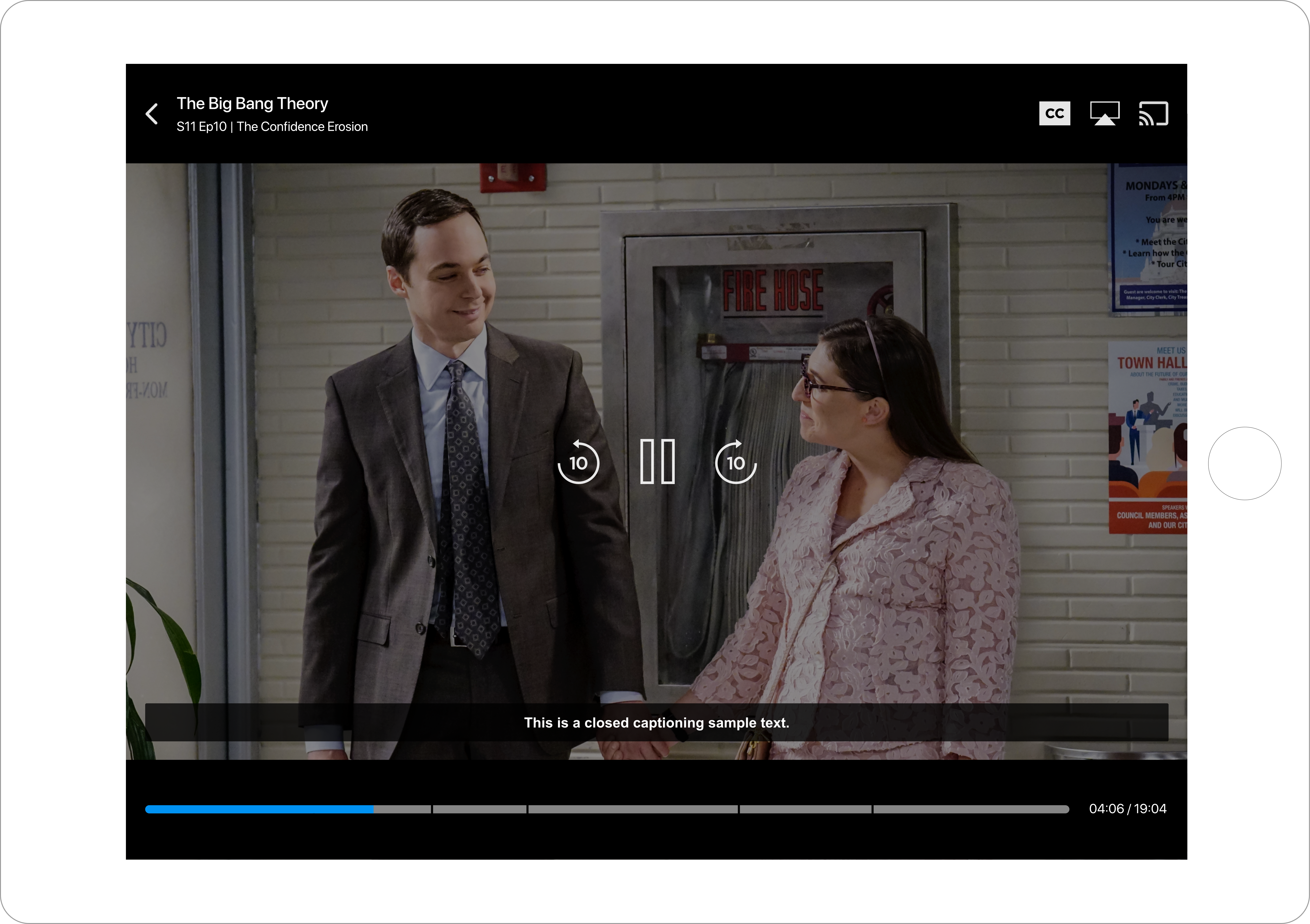
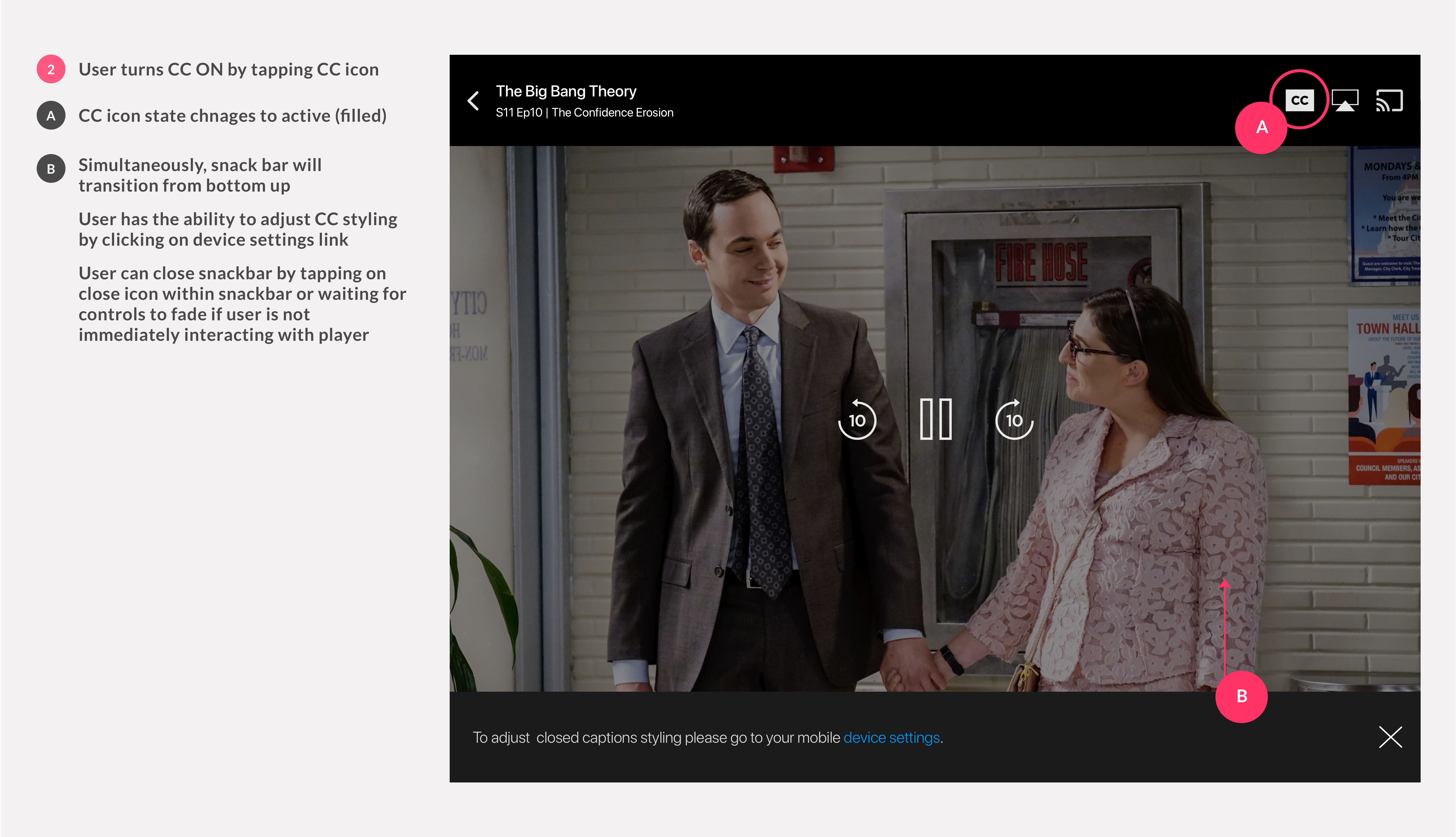
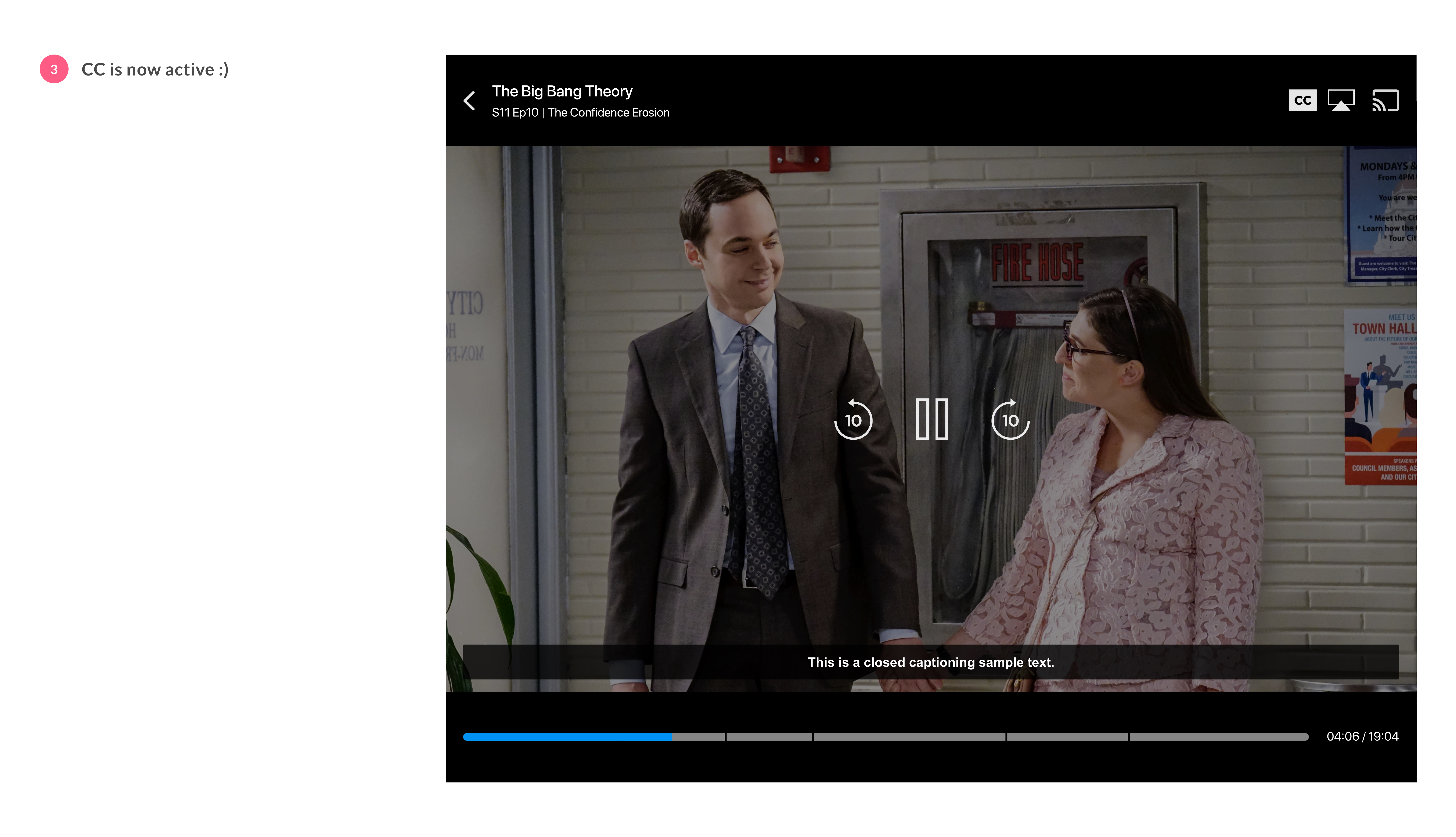
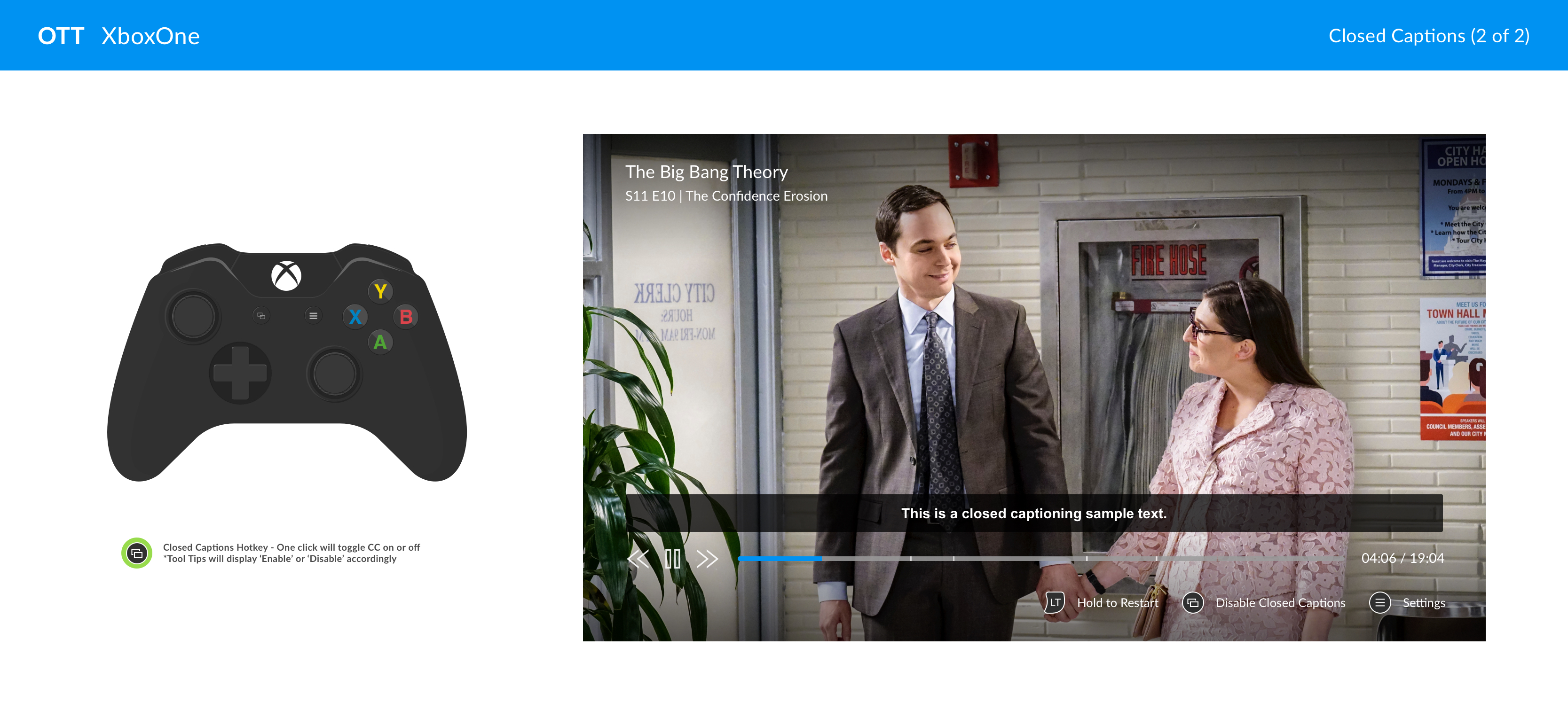
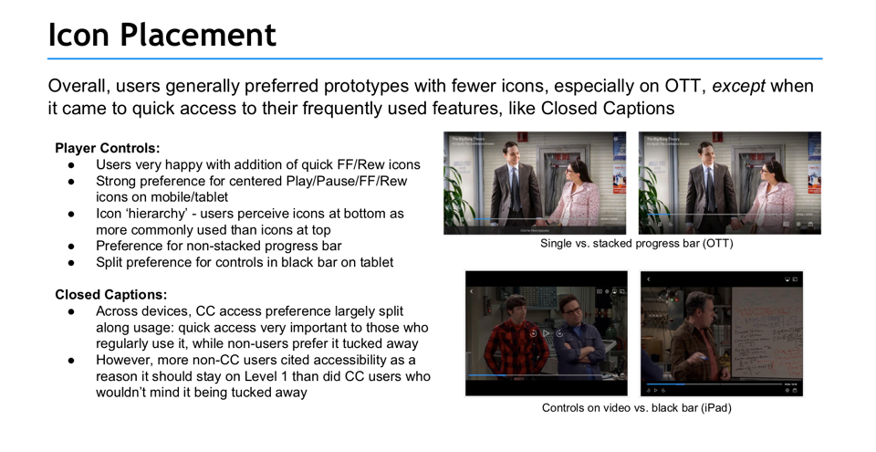
CLOSED CAPTIONS
CLOSED CAPTIONS
CLOSED CAPTIONS
CLOSED CAPTIONS
In addition to cleaning up overall click-thrus, UX layouts were updated to include accessibility, give full intent, and utilize real-estate.
In addition to cleaning up overall click-thrus, UX layouts were updated to include accessibility, give full intent, and utilize real-estate.
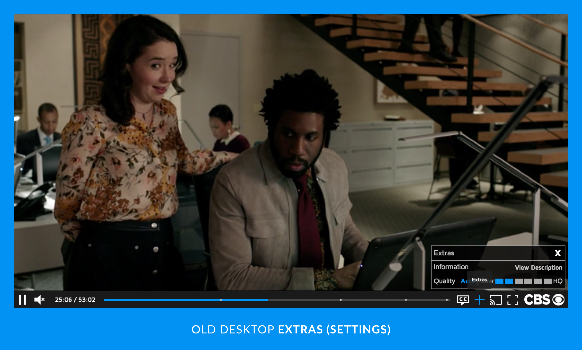
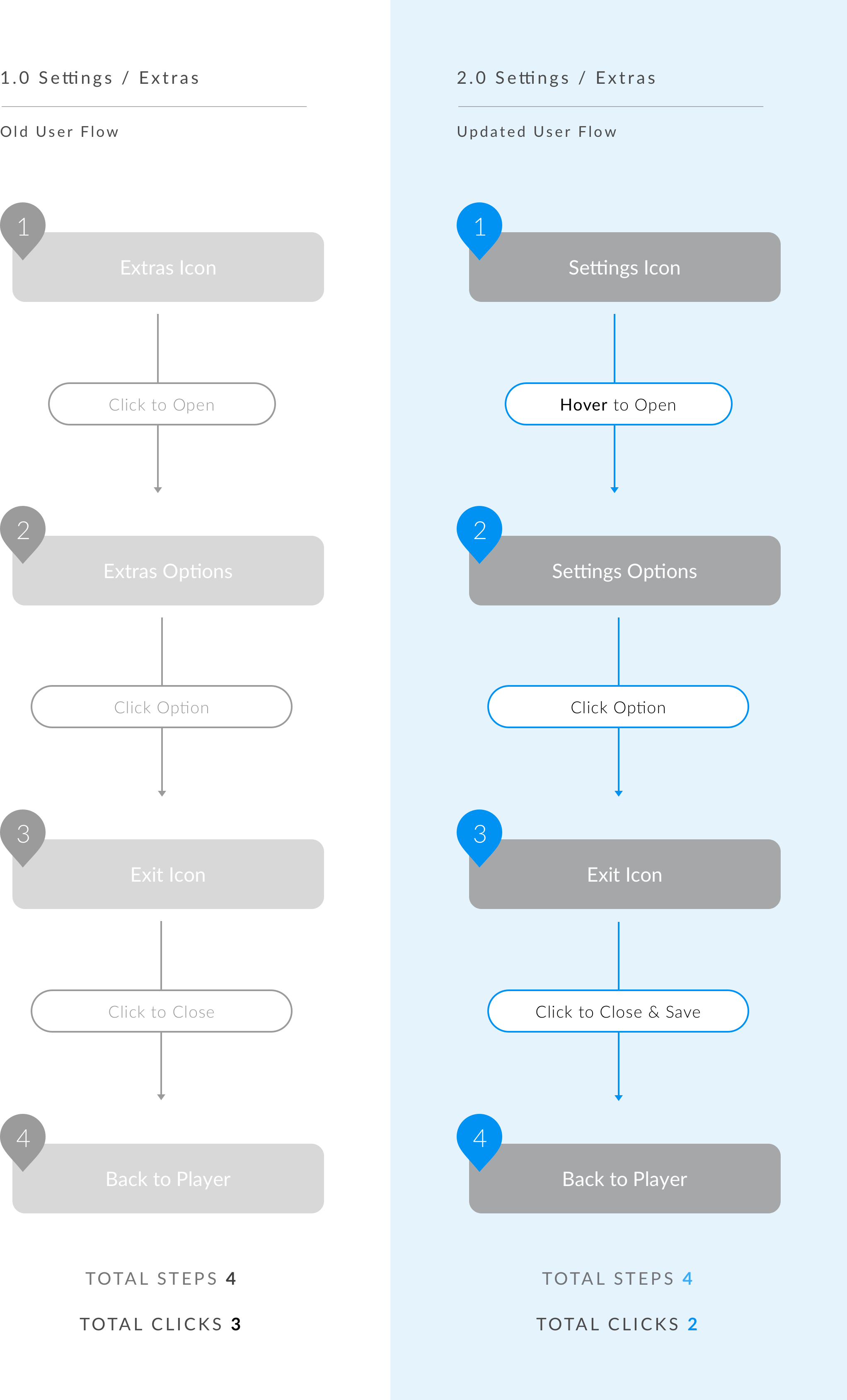
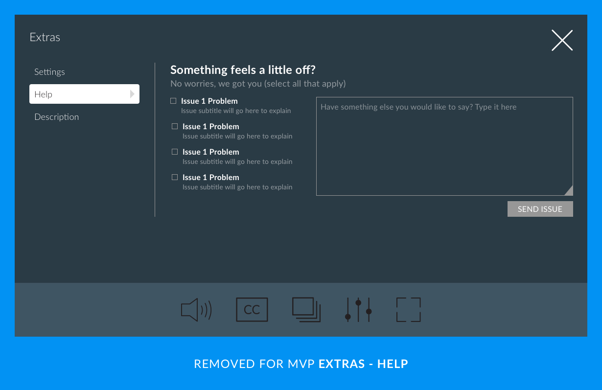
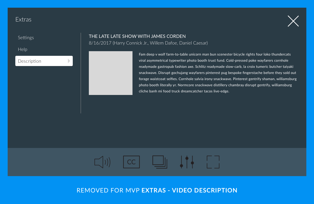
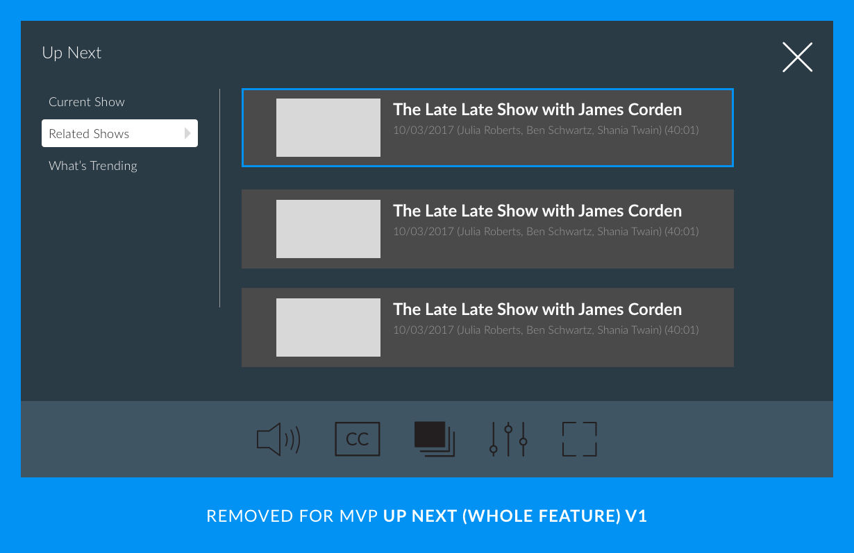
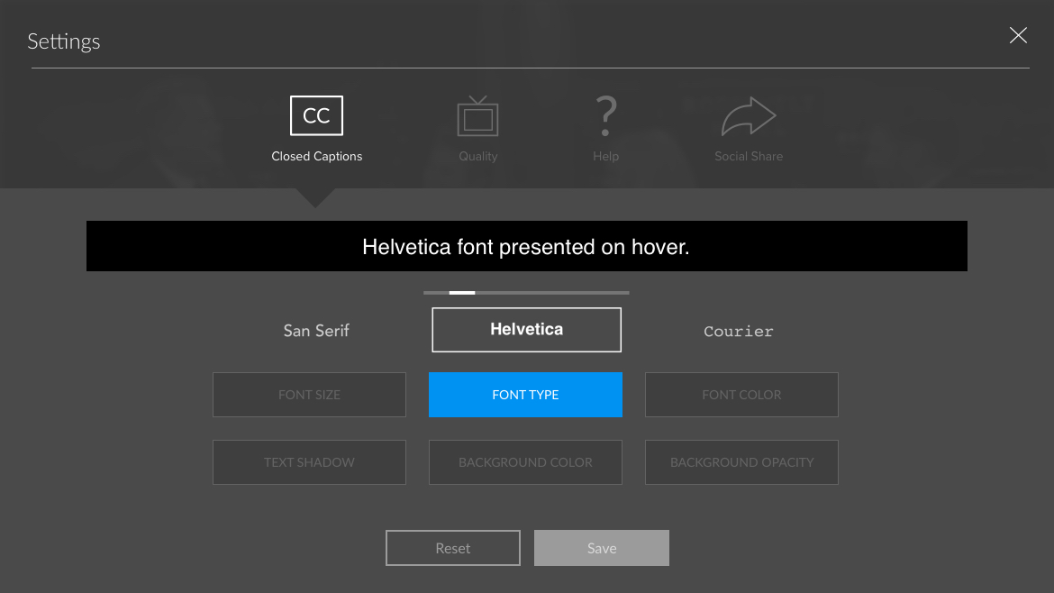
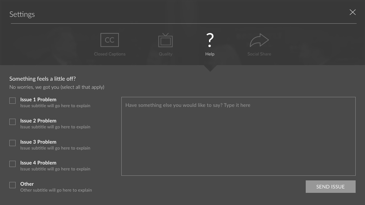
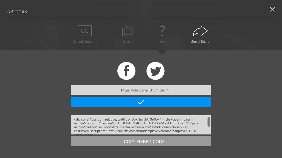
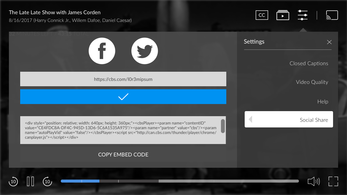
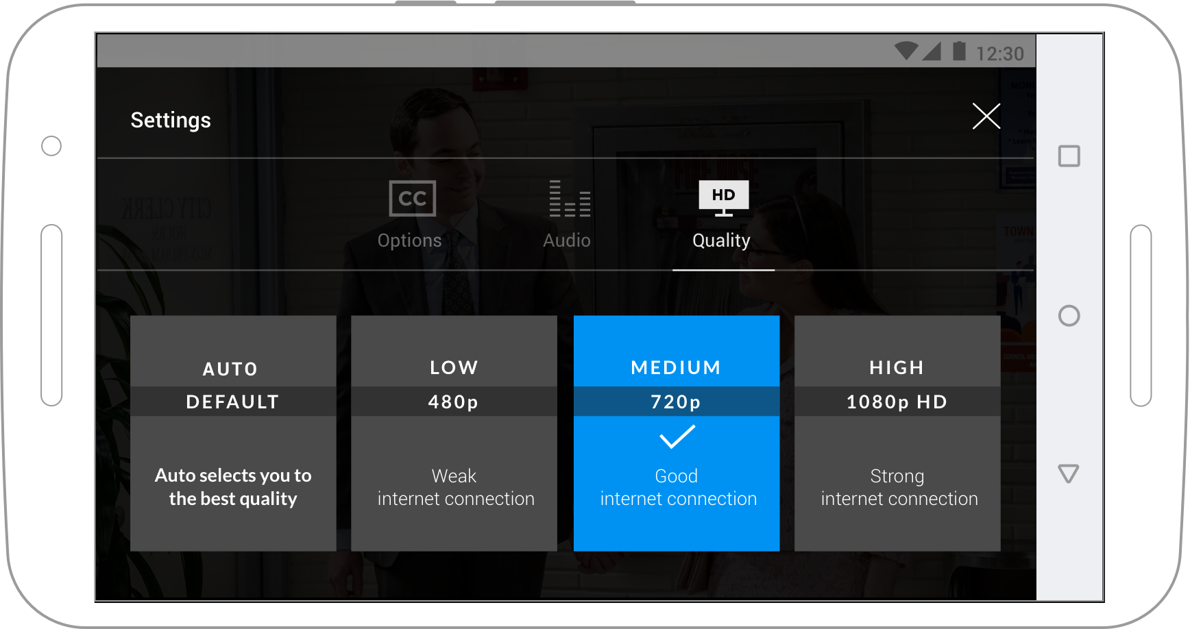
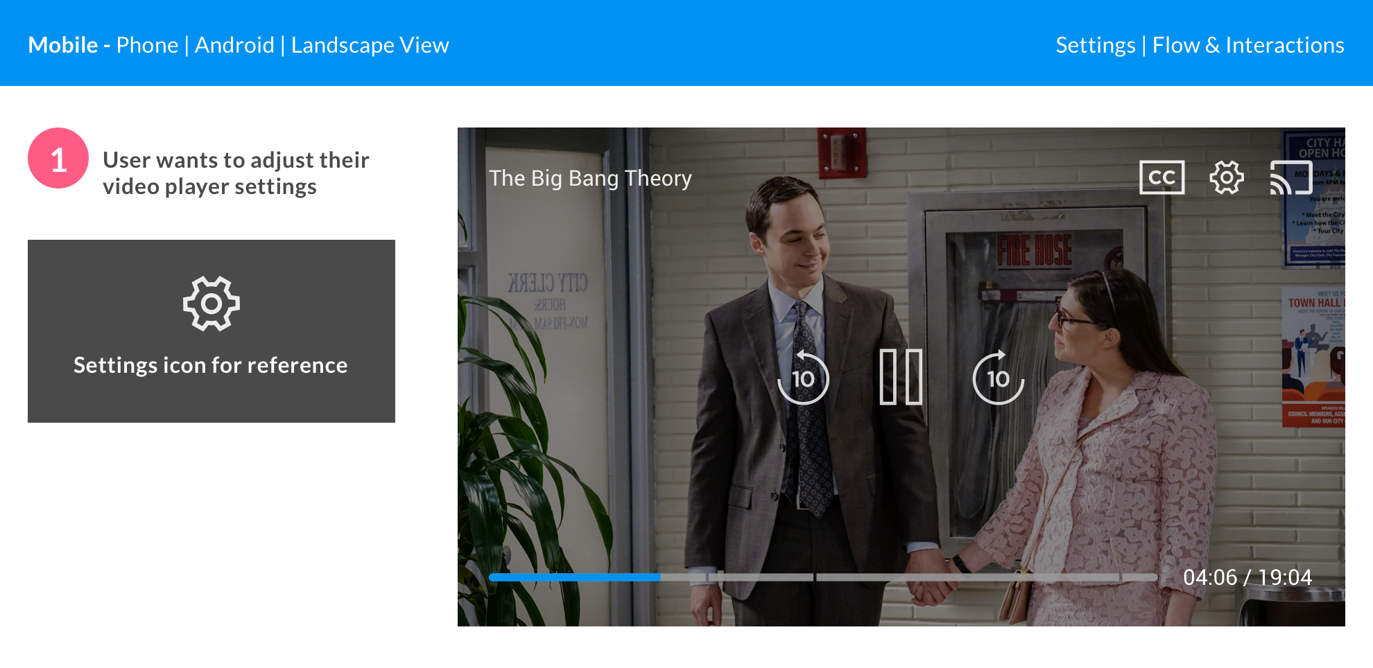
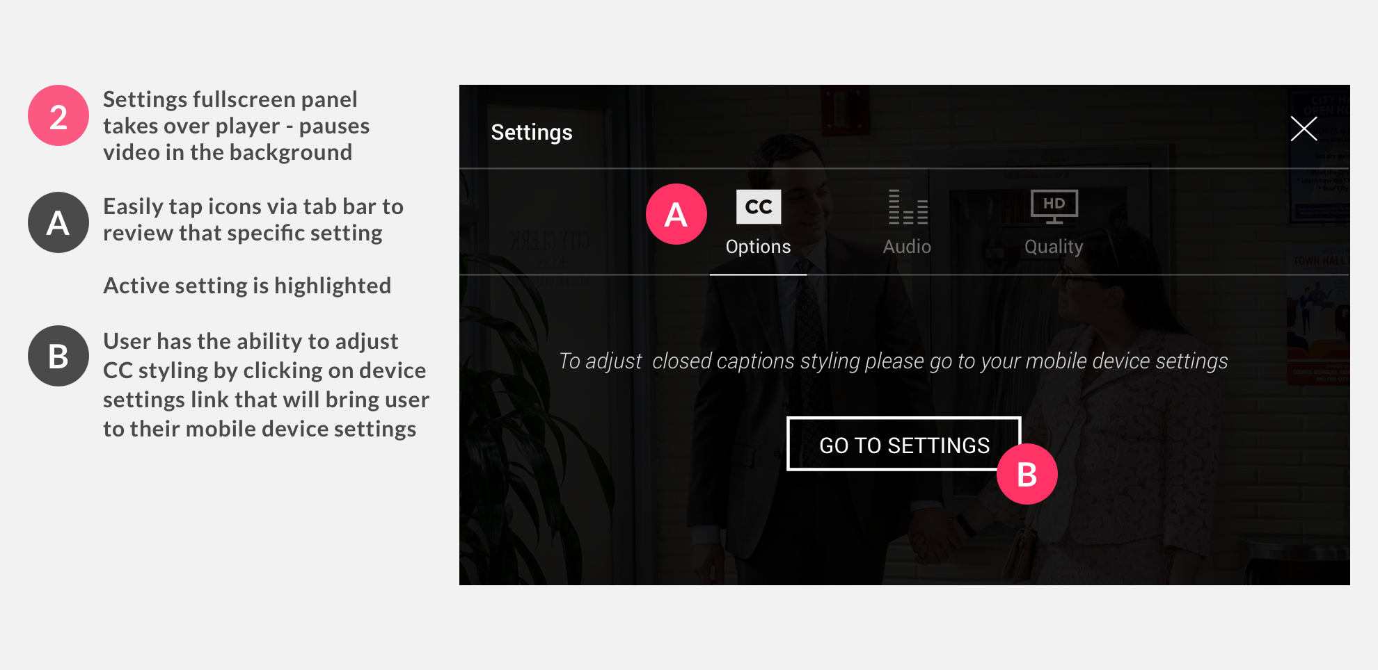
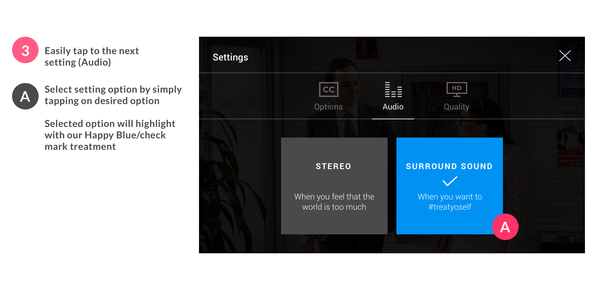
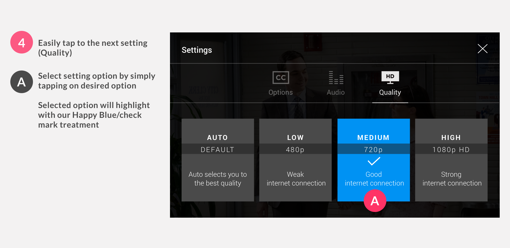
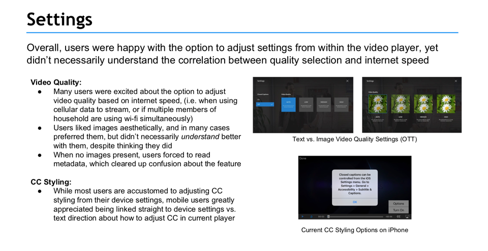
SETTINGS
SETTINGS
SETTINGS
SETTINGS
Although similar amount of clicks/taps from the previous player, the focus for Settings, previously labeled Extras, was educating users. Creating a more accessibility friendly layout (big cards); removing bloated info that was not important (dictated via analytics); creating reusable elements that can be removed or added.
Although there are the same amount of clicks/taps from the previous player, the focus for Settings was educating users. Creating a more accessibility friendly layout (big cards); removing bloated info that was not important (dictated via analytics); creating reusable elements that can be removed or added.
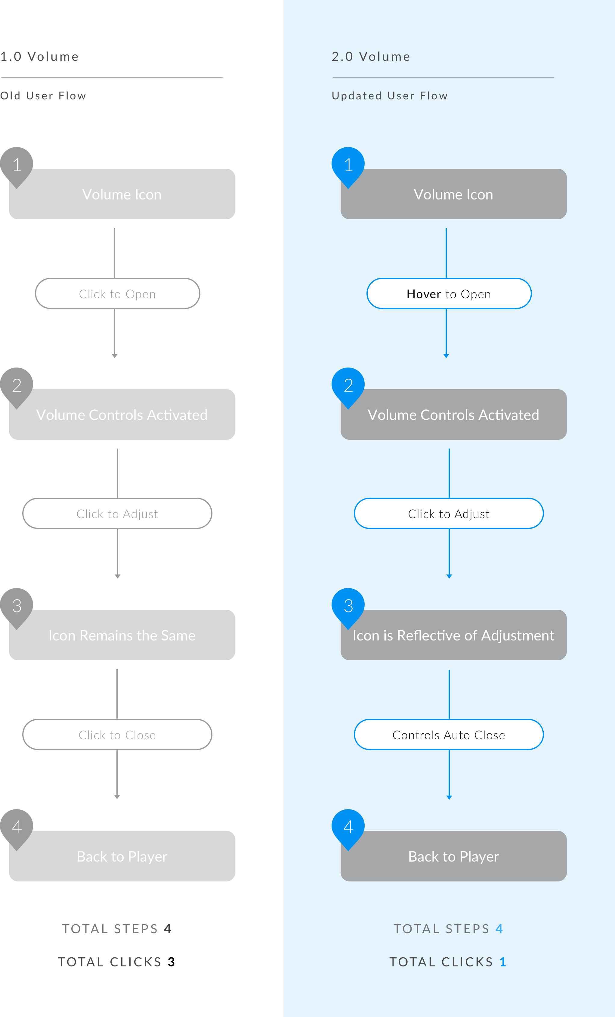
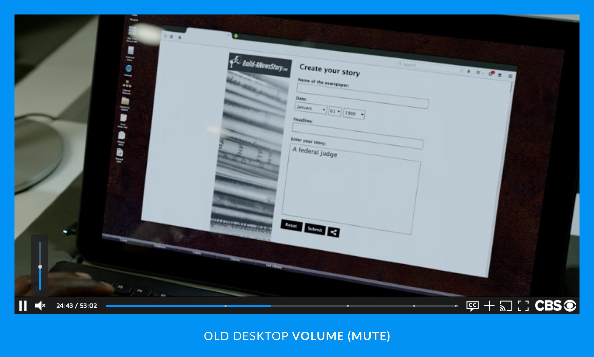
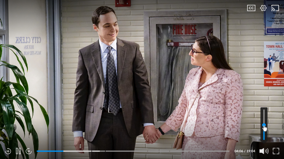
VOLUME
VOLUME
VOLUME
VOLUME
Updated broken UX to allow volume control to feel more intuitive (ex. if user mutes player via in-player volume then volume control is reflective)
Updated broken UX to allow volume control to feel more intuitive (ex. if user mutes player via in-player volume then volume control is reflective)
Updated broken UX to allow volume control to feel more intuitive (ex. if user mutes player via in-player volume then volume control is reflective)
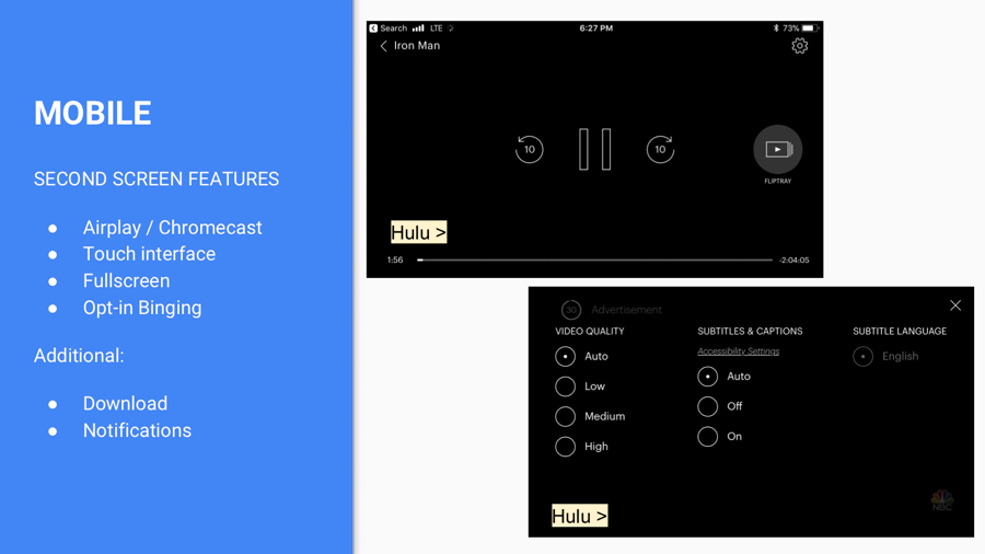
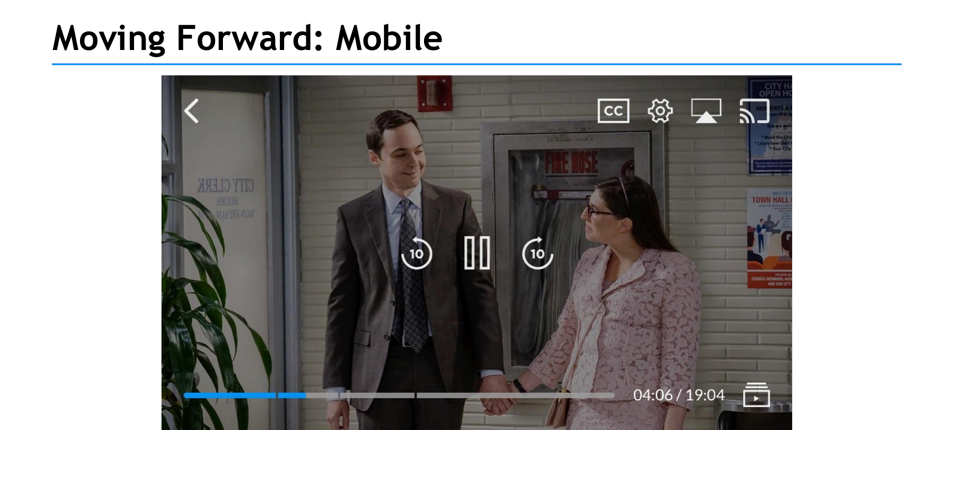
MOBILE FIRST
MOBILE FIRST
MOBILE FIRST. MOBILE ALWAYS.
Our team referred to "mobile" as an umbrella term for both tablet and phone. Knowing the importance of responsive design, I started this project by designing the player for phone. I find it helpful to think small and then scale up - without losing information, accessibility, and/or architect.
According to analytics, when we first started this project, our main platform was desktop. Hence, why we launched with desktop first.
BUT - I started with our smallest port size still being used according to our BI (Business Information) Team: 320 x 568dp* which is equivalent to an iPhone 5 and/or Android One (320 x 569dp).
* Saving out at @2x (640x1136px) to capture iPhone 5's retina display
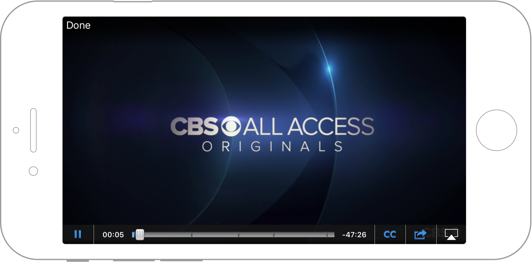
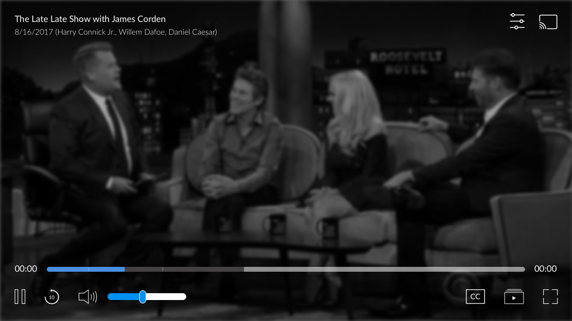
Original Video Player via iPhone (320 x 568dp)
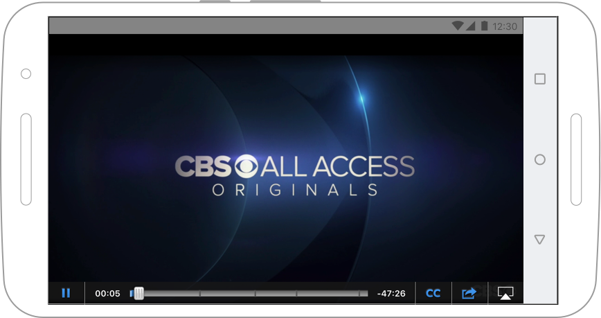
Original Video Player via Android (320 x 569dp)
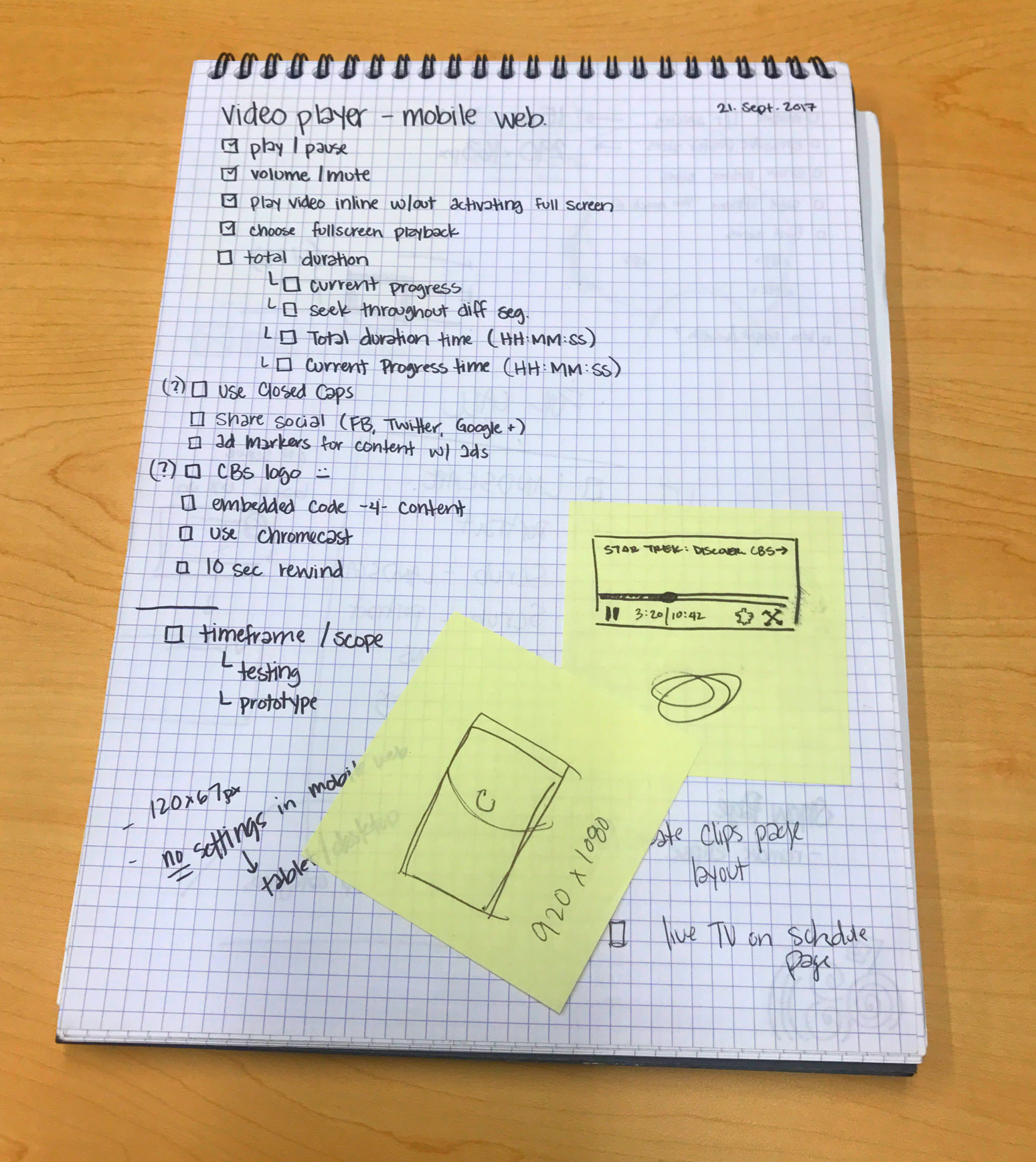
Mobile-first list of daily tasks
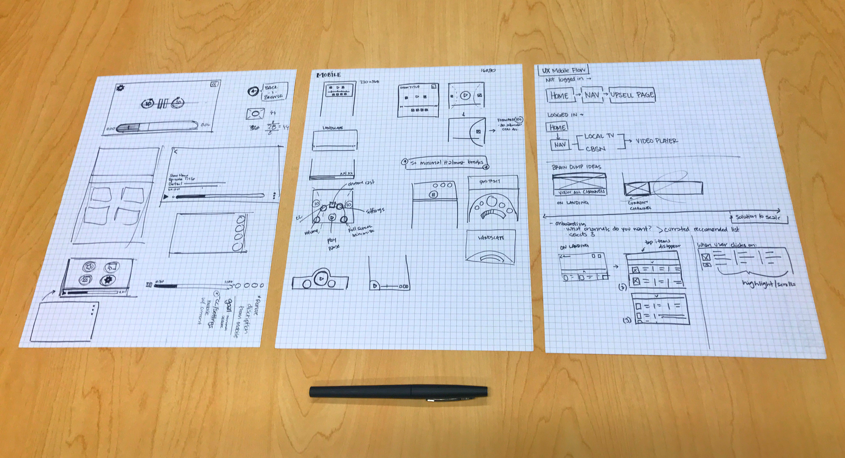
Early lo-fi mobile-first concepts
Early lo-fi icons
PROPRIETARY ICONS
PROPRIETARY ICONS
It's all in the details. From macro-sweeping architect updates to the micro-intricacies of kerning - no stone was left unturned.
Iconography played such a huge role in this project, and although I did not physically create them - all props to our UI Designer - we did work closely from original UX concepts, interactions, to finalized SVGs for dev hand-off.
Protecting my team's creative space from outside departments became a necessity, as time and time again stakeholders discouraged us from being innovative.
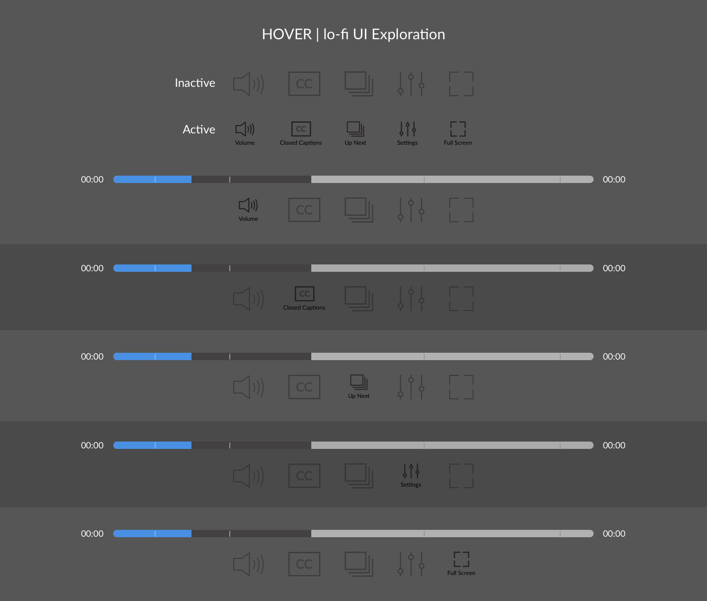
ICON TESTING
Continuous push-back from stakeholders requesting that we follow trend with our primary competitors expand the project time even further out. Our team felt strong in our original push for proprietary iconography. Instead of arguing we let the user testing results speak for us. Every icon was then thoroughly tested.
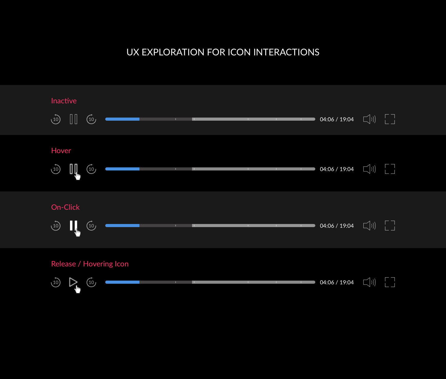
ICON INTERACTIONS
While dealing with push-back, I continued pushing forward and worked on icon interactions. Having dev'd an interaction or two in my day, I knew we would be able to utilize micro-interactions via "on-click" and "release" rules on the CSS side.
Exploring different hover interactions
From hover to click - Capturing on-click and release functionality
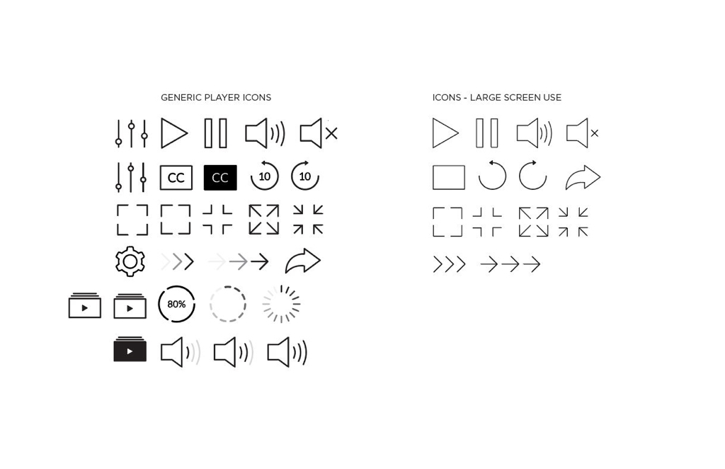
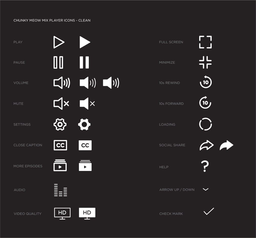
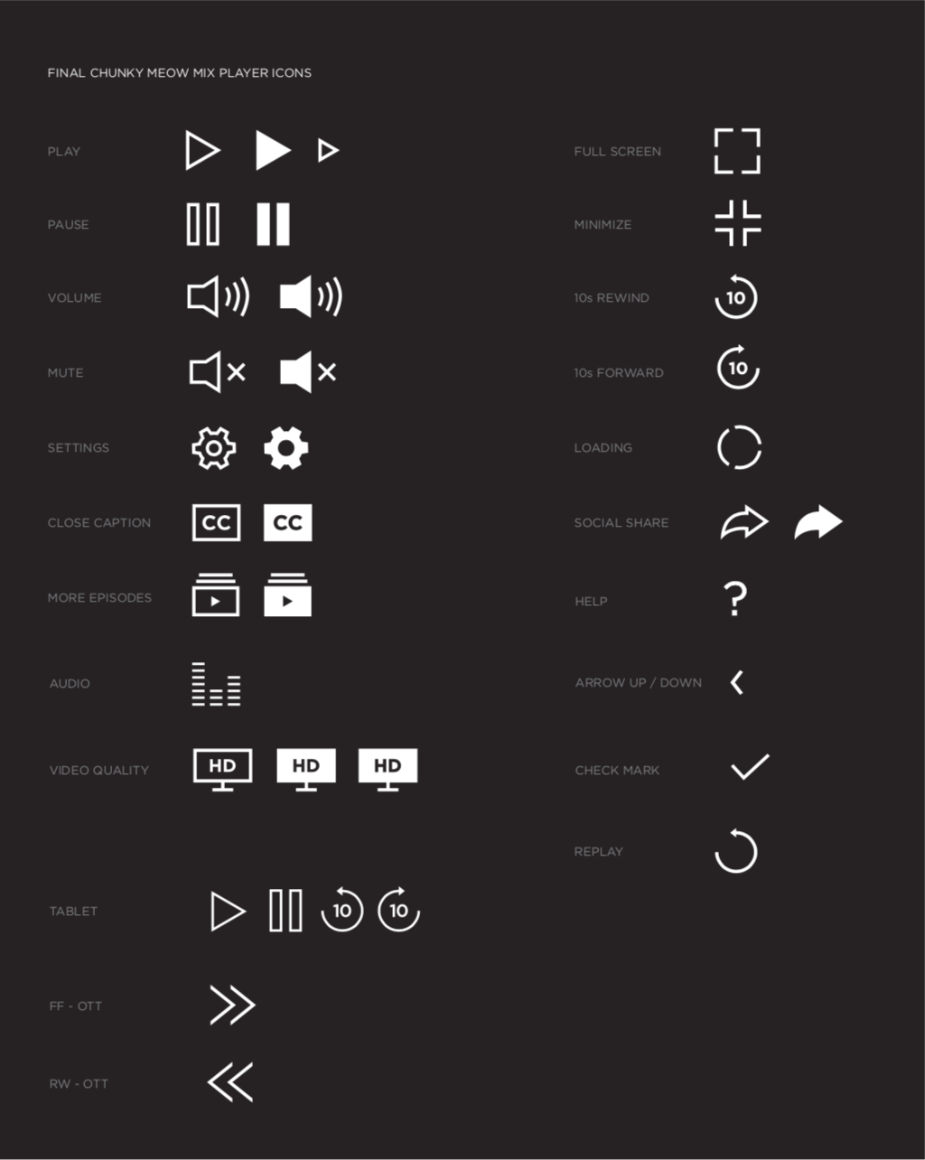
ICON FIDELITY
Once all icons sufficiently passed testing and stakeholder approval - UI was able to bring the fidelity up to hi-fi! Horrah 
Early lo-fi icons
Mid-fi icons
Final icons
How does one stand out in a crowd?
Keep being authentically you - and don't worry about the crowd.
"But Netflix is doing is this..."
"Why don't you just use Fox's icons for now..."
Being aware of competitors is one thing and always good to know, but I refused to copy and paste from our competition.
Working on my interpersonal skills - I voiced, researched, and presented to product owners and stakeholders the need for proprietary iconography based on holism within a rapidly growing space such as SVOD.
Working closely with our UI Designer and Research Manager, we continued to test and advocate continuous testing across all demographics.
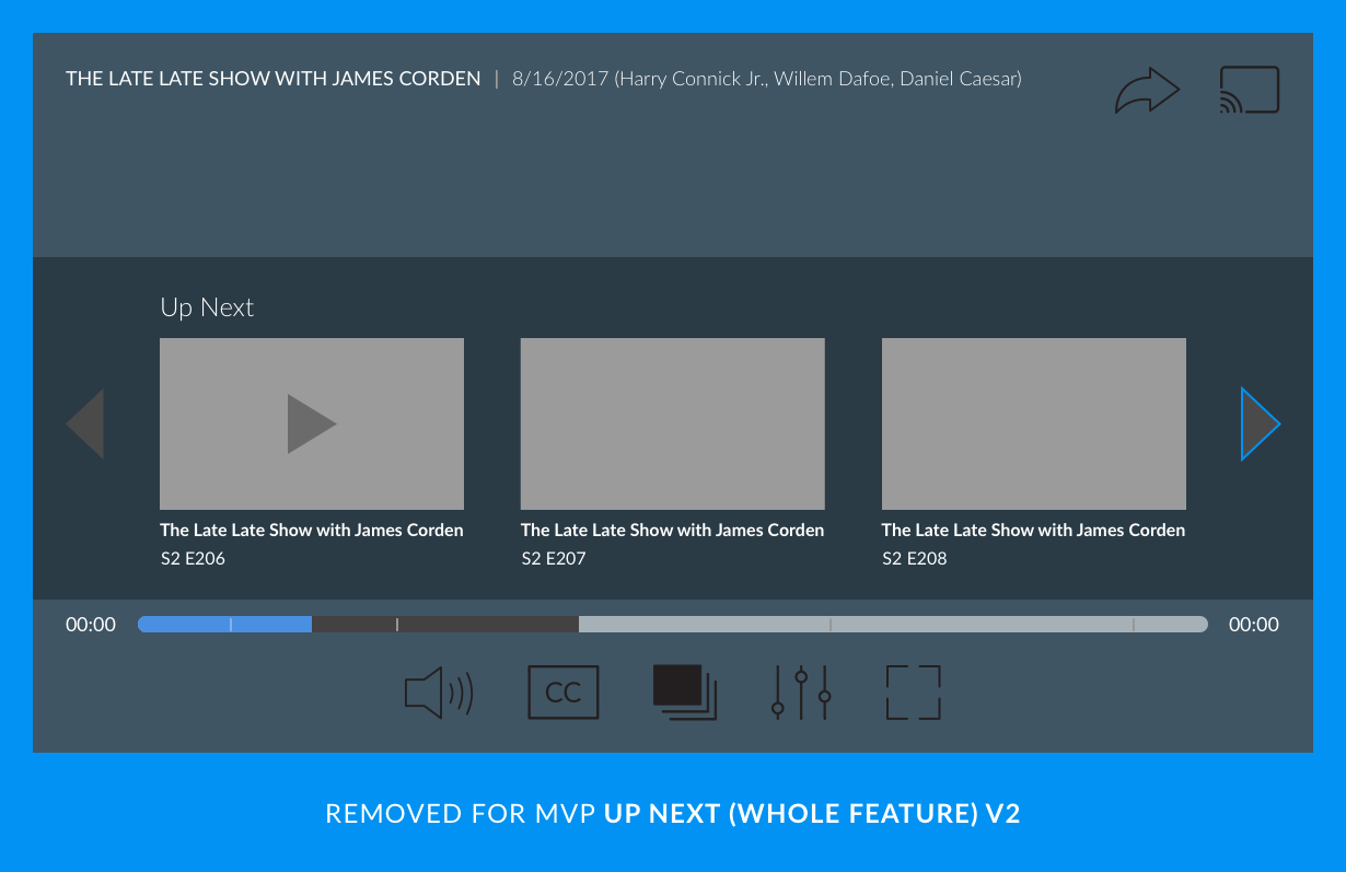
MINIMUM VIABLE PRODUCT
MINIMUM VIABLE PRODUCT
By designing mobile first I was able to skim the bloat of our previous video player. Working closely with Product we knew we needed to keep the project tight with no room for any extra tech feasibility.
Another validation path cross checked against existing player make sure up until this point was again validated
From the beginning, stakeholders and dev didn't find it necessary to redesign (or create a responsive player) but just lightly adjust elements such as icons. This came up time and time again as our team continued pushing forward. Another reason why the project took so long. On top of doing additional testing to further prove that a simple icon swap was not the answer - we skimmed back on elements* that we would later be implemented with phased approaches after MVP launch.
* I call these gems Cutting Room Floor elements - Rest in paradise, friends. Until we meet again at a later phase 
Phone portrait view was completely slashed for MVP launch
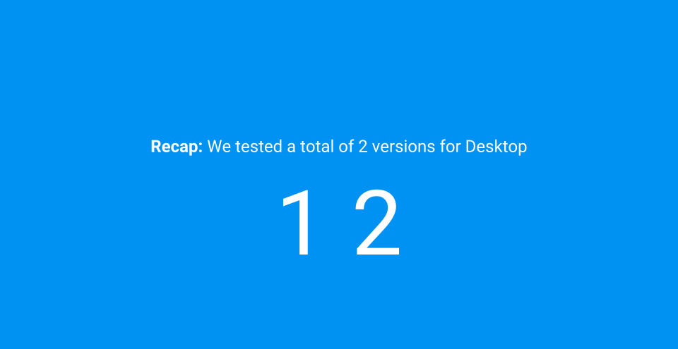
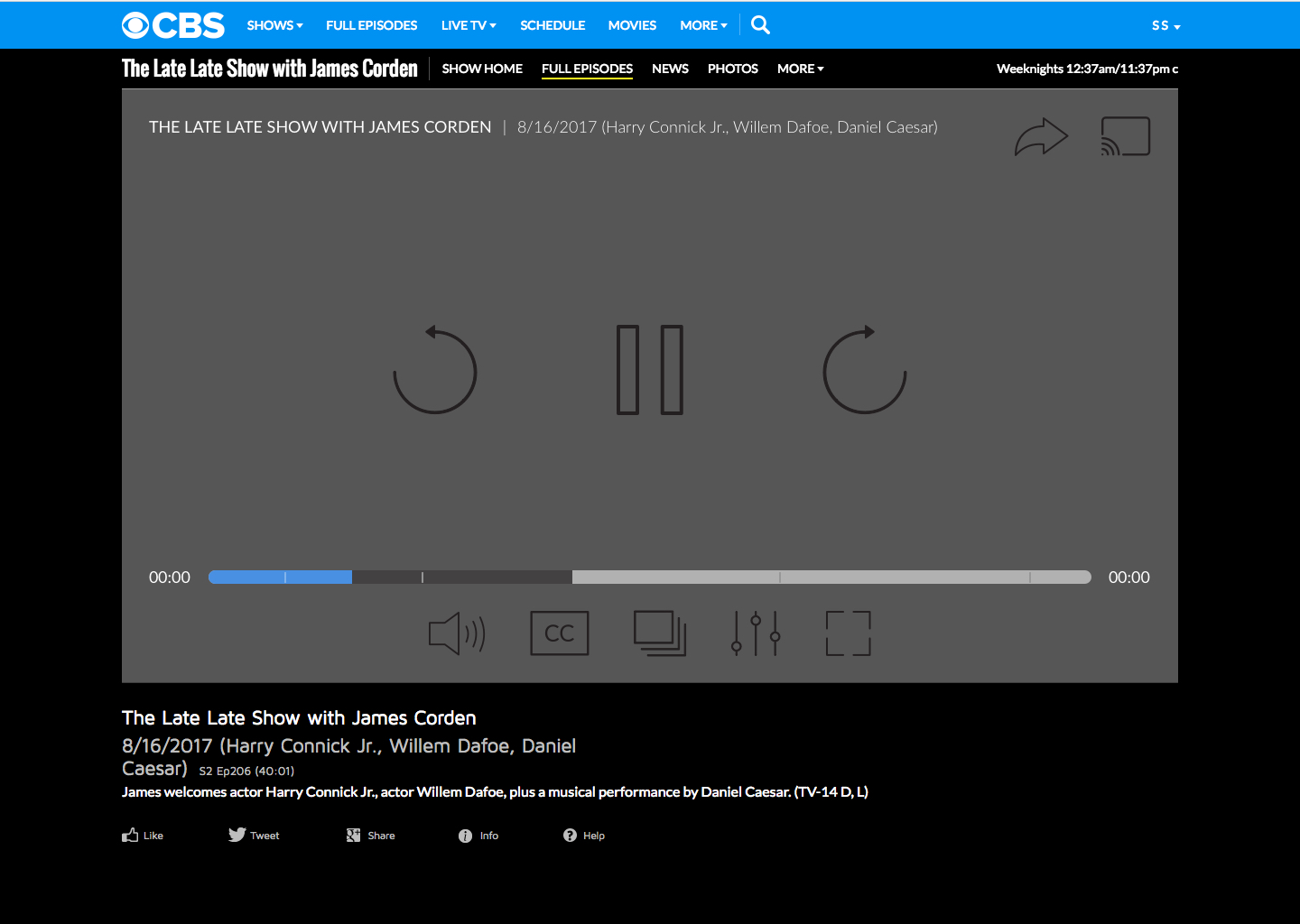
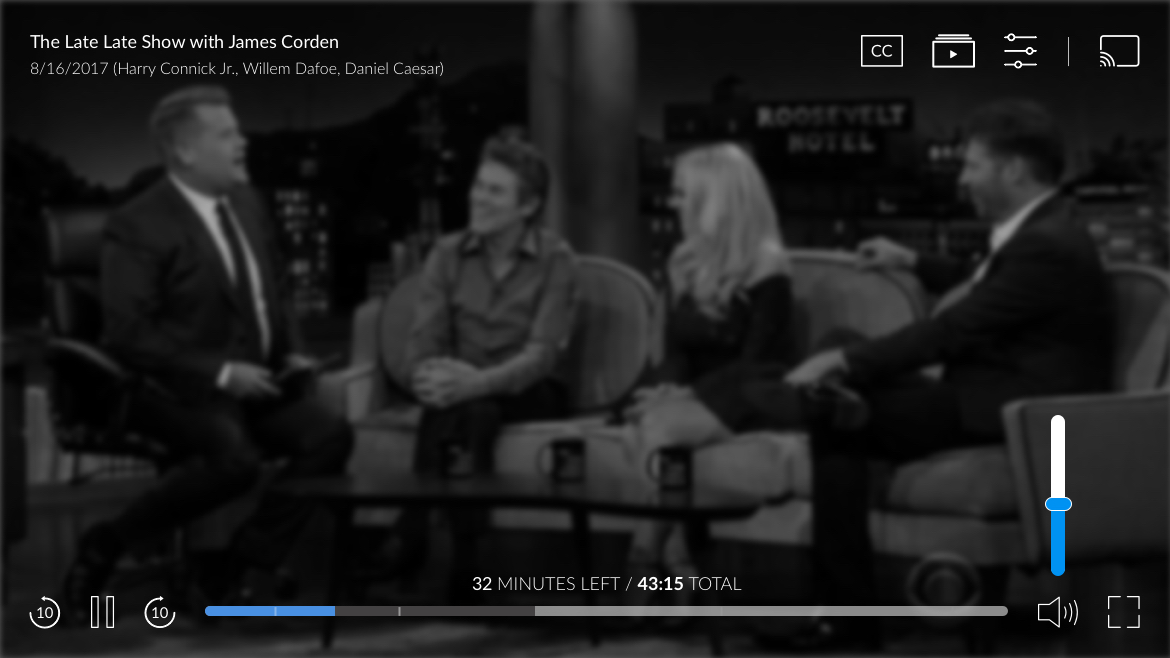
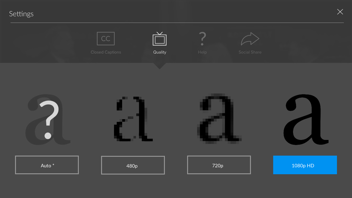
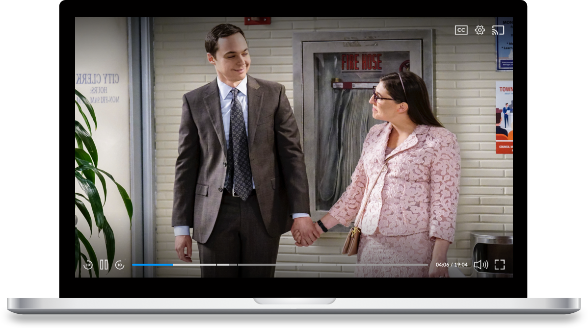
DESKTOP PLATFORM
DESKTOP PLATFORM
Knowing that desktop is our users' main platform - launching with desktop first was no question. Researching, keeping accessibility in mind, and testing - it was important, especially with our main demographics, to keep the layout out simple, clean, and intuitive.
First pass at desktop - based off mobile first mentality
First pass of desktop redesign within the video page for reference
SECOND PASS
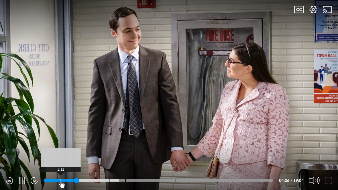
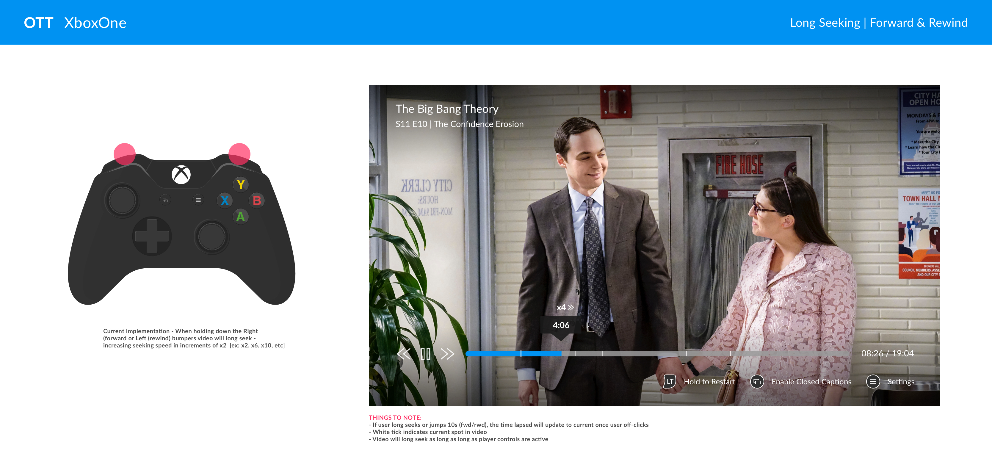
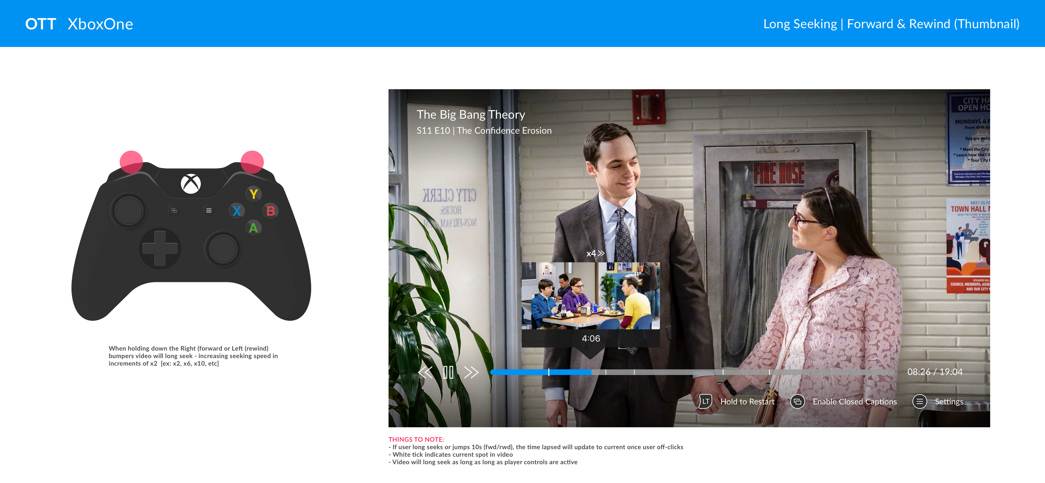
PROGRESS BAR
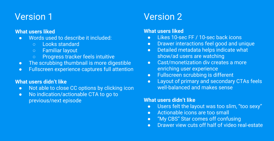
Without testing, stakeholders did not like this approach and immediately killed this idea. Looking back on this journey - I still feel we should have tested and let the users decide. But that's the life of an UX Designer, I suppose. Our team pushed forward with this feedback and I created several variations based on the competitor analysis I had done in the beginning, keeping the user in mind, accessibility, and trying to keep the player light and airy.
In attempts to keep with the new light and airy approach I tried several layouts that included pushing the navigation up to alleviate the cramped feeling that the progress bar can sometimes feel. Pushing the nav up would also easily transition to mobile for easier tappable spacing. While keeping the progress bar compressed within the same level as other actionable icons allows us more room for the video itself.
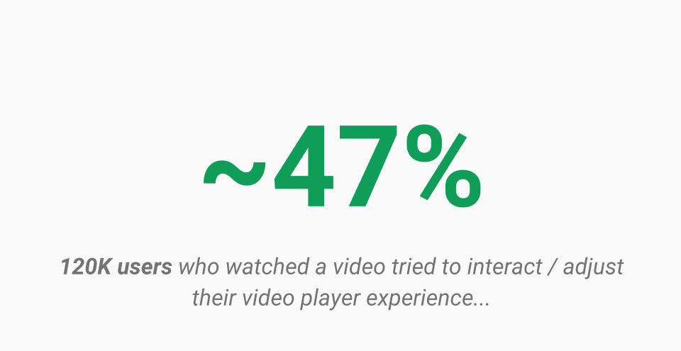
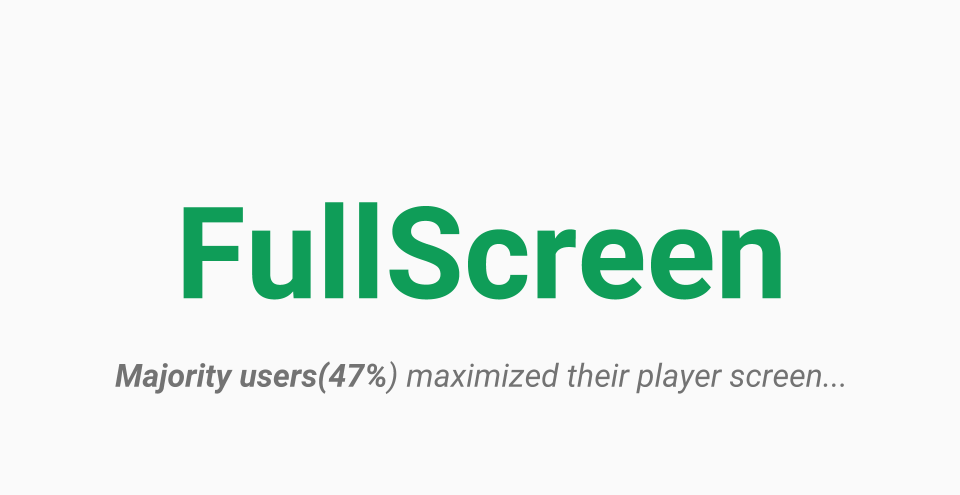
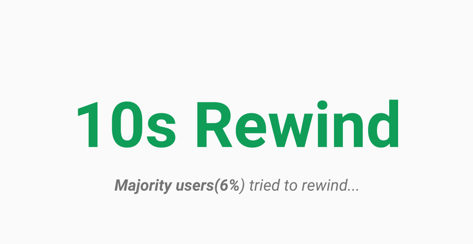
I also wanted to test if both fast-forward and rewind were necessary - do users tend to need the fast-forward action more? Or do they tend to rewind because they've stepped away/missed something?
Research and test results confirm that users utilize the rewind button more often than the fast-forward action.
Depending on the video length the 10s increment can be adjusted. For clips and videos that range 59 minutes and below 10s - 15s increments has been found to be the most efficient for users. Whereas, longer pieces like movies and documentaries can be adjusted to 30s fast-forward/rewind.
Larger icons for our users; pushing the nav up to open up space
Smaller icons; too many icons at the bottom 
Nav on the same level
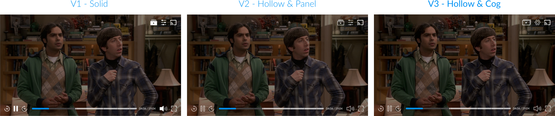
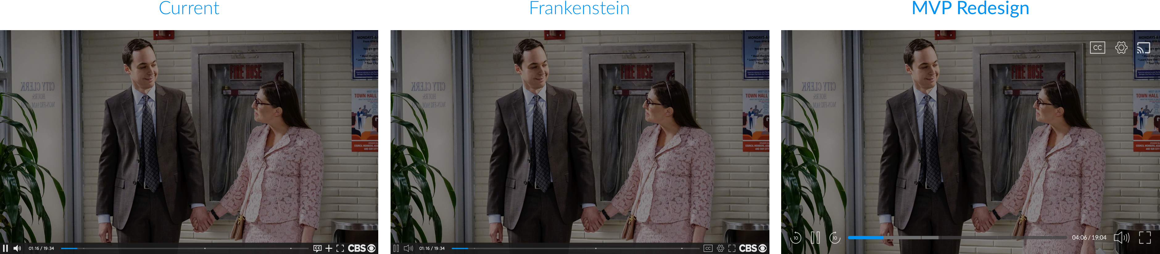
FIDELITY CHECK
PANELS
With overall layouts now narrowed down to two for testing, I could move forward with icon interactions.
But first, when working in mid-fi for such a long time (probably the longest I've ever have) - I find it necessary to reality-check your approach with a video interface. Grey boxes look great and feel solid, but with a moving background, additional UI could be needed to help distinguish the video player content from your video player controls and tie in with the rest of the video page*.
* Video page was not within scope for this project
V1 Fidelity check with progress bar above
V2 Fidelity check with progress bar on the same level as icons
VOLUME TREATMENTS
NATIVE FEATURES
V1 Horizontal volume treatment
V1 Vertical volume treatment
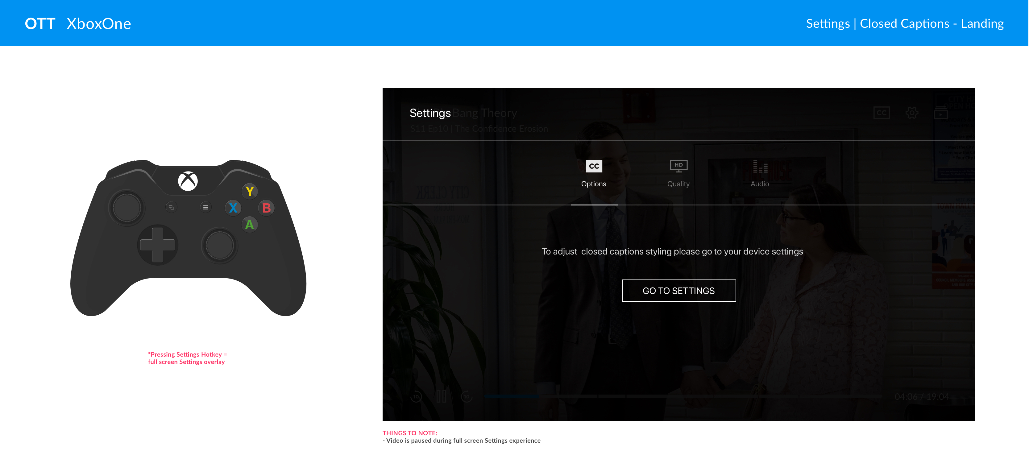
SETTINGS EXPLORATION
PANELS
Just when we were finally gaining momentum, our developer (previously mentioned at the beginning of this case study) pushed back with great... vigor, to kill full panel overlays. Concluding that it was an awful design choice and it would be very difficult to implement. I challenged this opinion with research, accessibility resources, and even made reference to key competitors that were already using these techniques. My product owner suggested I mock-up partial panels to visually show stakeholders and development that this was not advisable. I agreed and created the full entirety of full panel overlay vs partial panel treatments (below is a significantly reduced view as I'm very aware of how long this case study already is).
Development agreed -- IT WOULD BE BEST IMPLEMENTED PARTIALLY 
We later tested both layouts against each other, and full panel treatment did significantly better. Regardless, as CBSi developers have the last say - we ended up going with partial overlay for desktop MVP.
V1 Settings - Full overlay panels
V2 Settings - Partial overlay panels
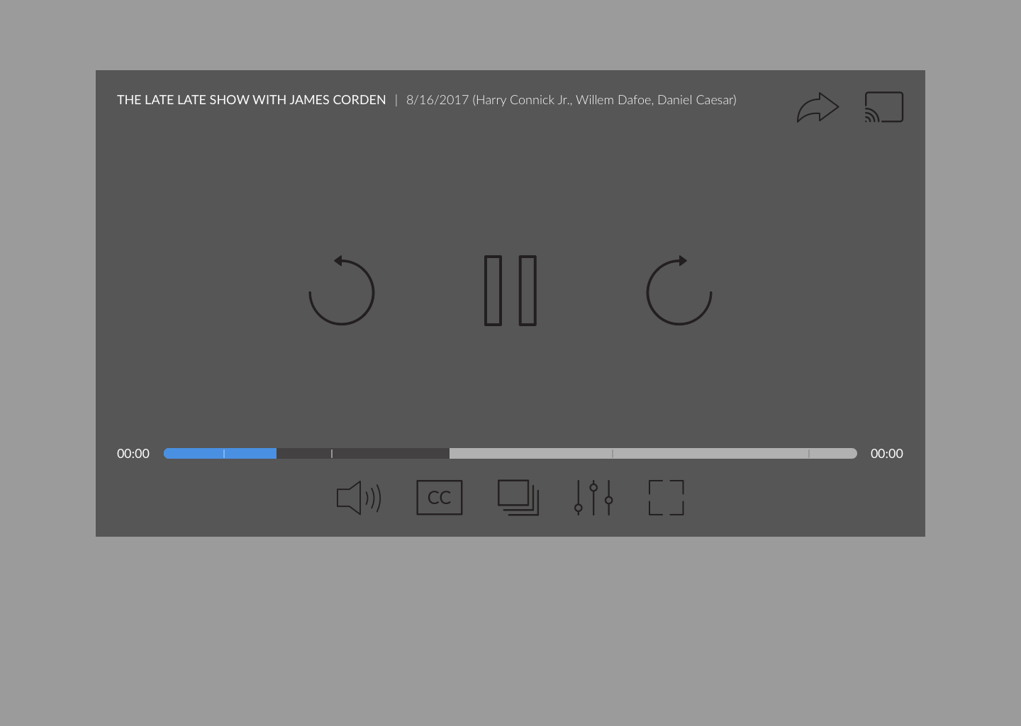
DESKTOP MVP 
PANELS
Months of the above pushback from stakeholders and dev went by, yet we slowly and steadily kept pushing forward. While in this timeframe we gained an important asset in the form of our Research Manager. With her skills and understanding of what we were trying to accomplish we were able to thoroughly test with in-person users and get the feedback, analytics, and results needed across all of the platforms. I dive more into user testing below.
But for now enjoy the mini slide show of Desktop MVP 
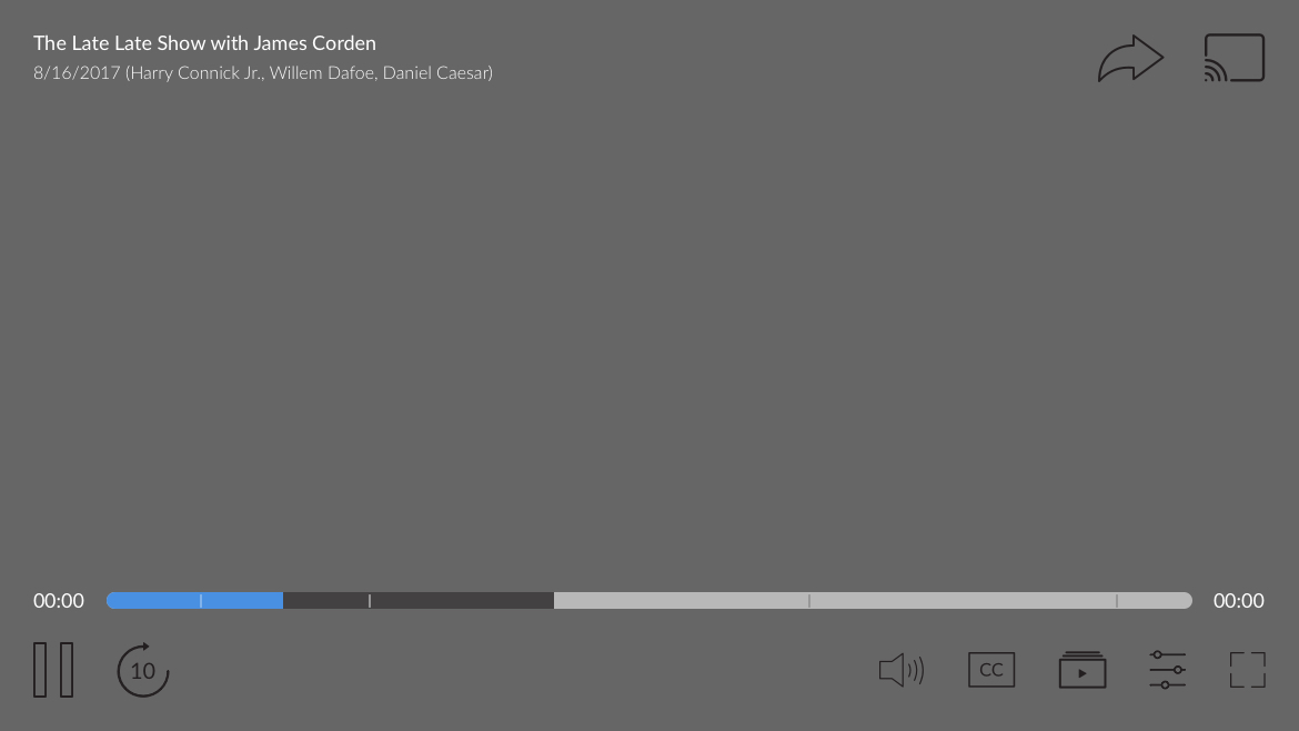
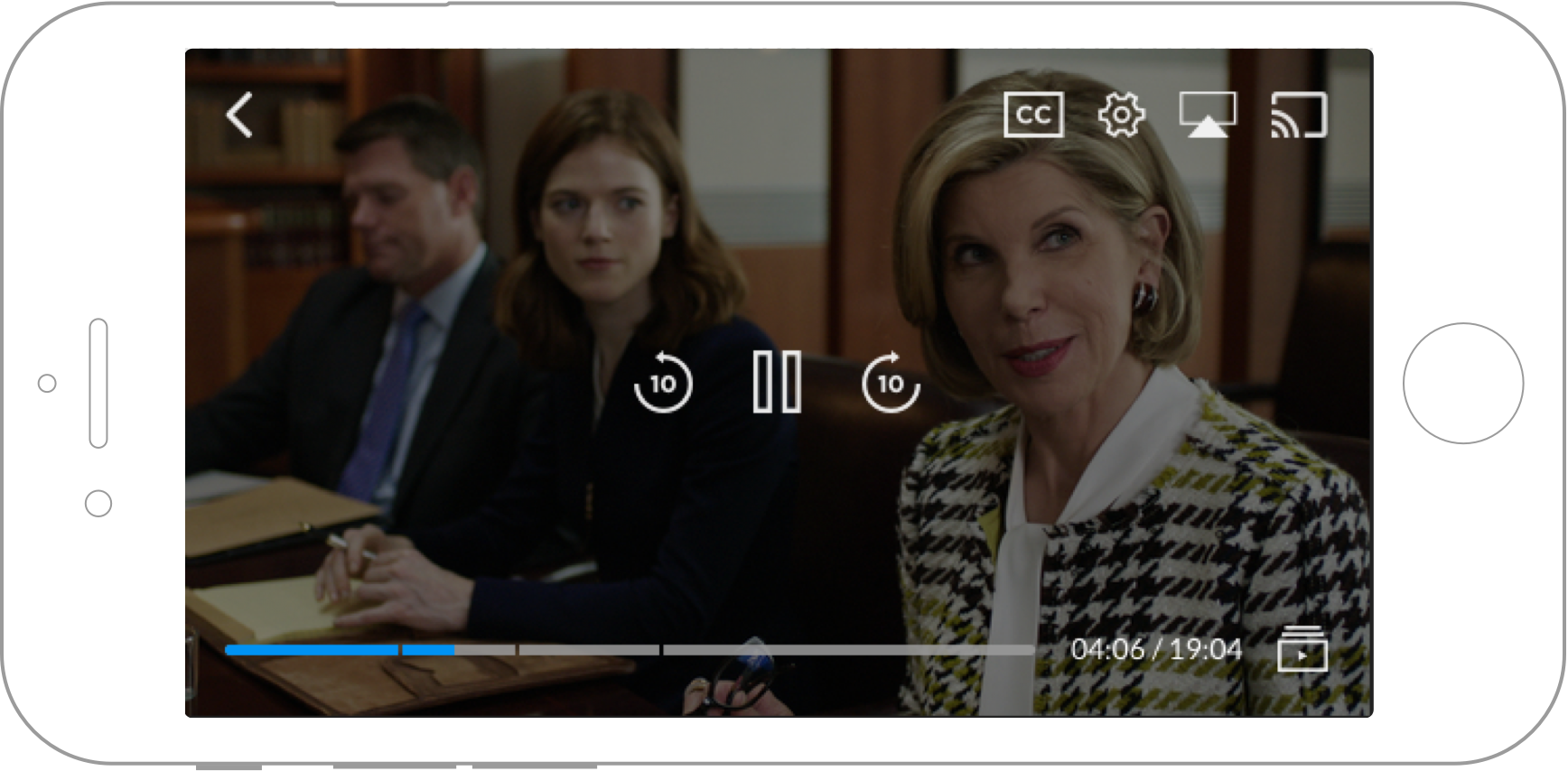
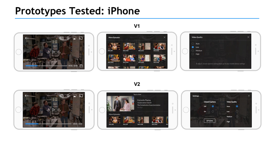
MOBILE PHONE
MOBILE PHONE
MOBILE PHONE
From the beginning - phone was my first platform I designed out. Researching, keeping accessibility in mind, and testing - it was important, especially with our main demographics, to keep the layout simple, clean, and intuitive.
From the beginning - phone was my first platform I designed out. From researching, keeping accessibility in mind, and testing - it was important, especially with our main demographics, to keep the layout out simple, clean, and intuitive.
NATIVE FEATURES
NATIVE FEATURES
NATIVE FEATURES
Confirming with iOS and Android developers, we used native features (such as snack bars) to help us push the user experience forward and maintained interactions that users were familiar with.
Confirming with iOS and Android developers, we used native features, such as snack bars, also helped us push the user experience forward and maintained interactions that users were familiar with.
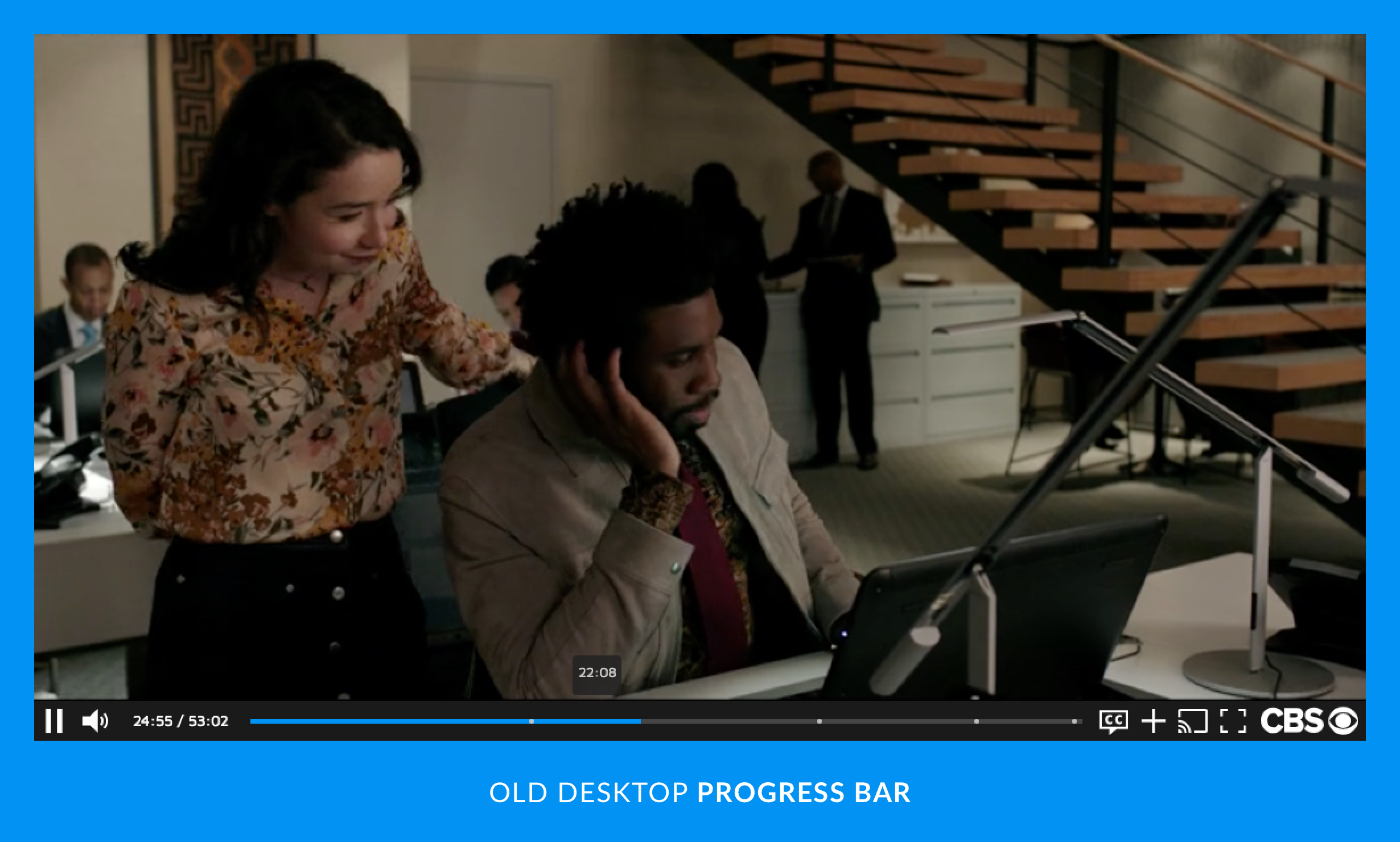
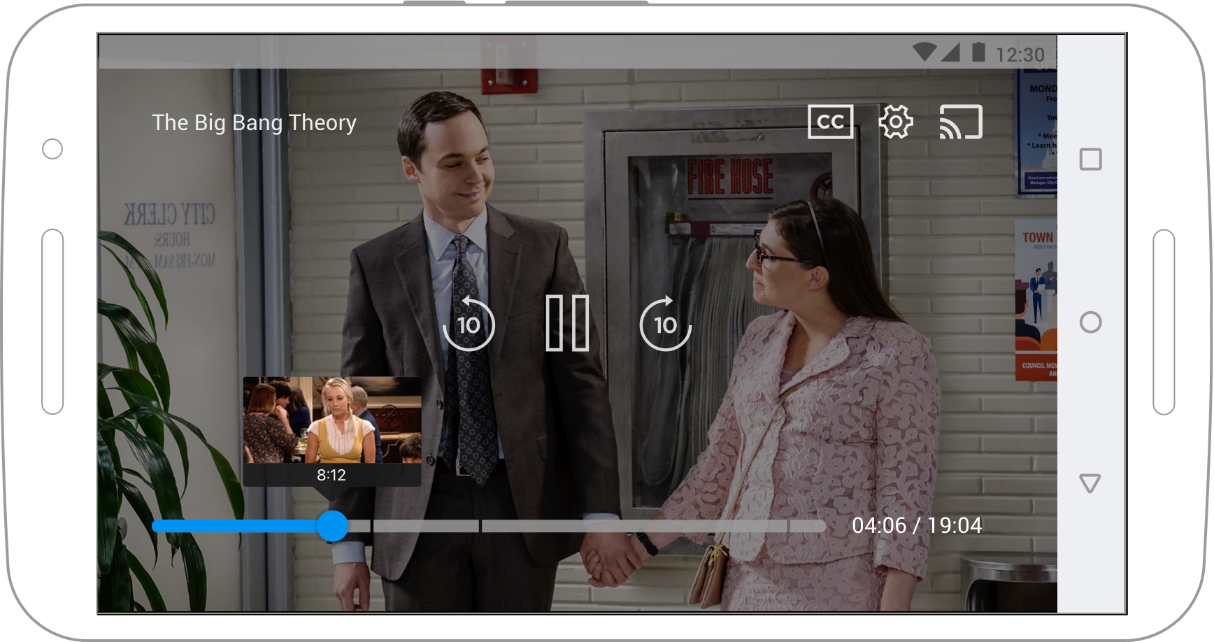
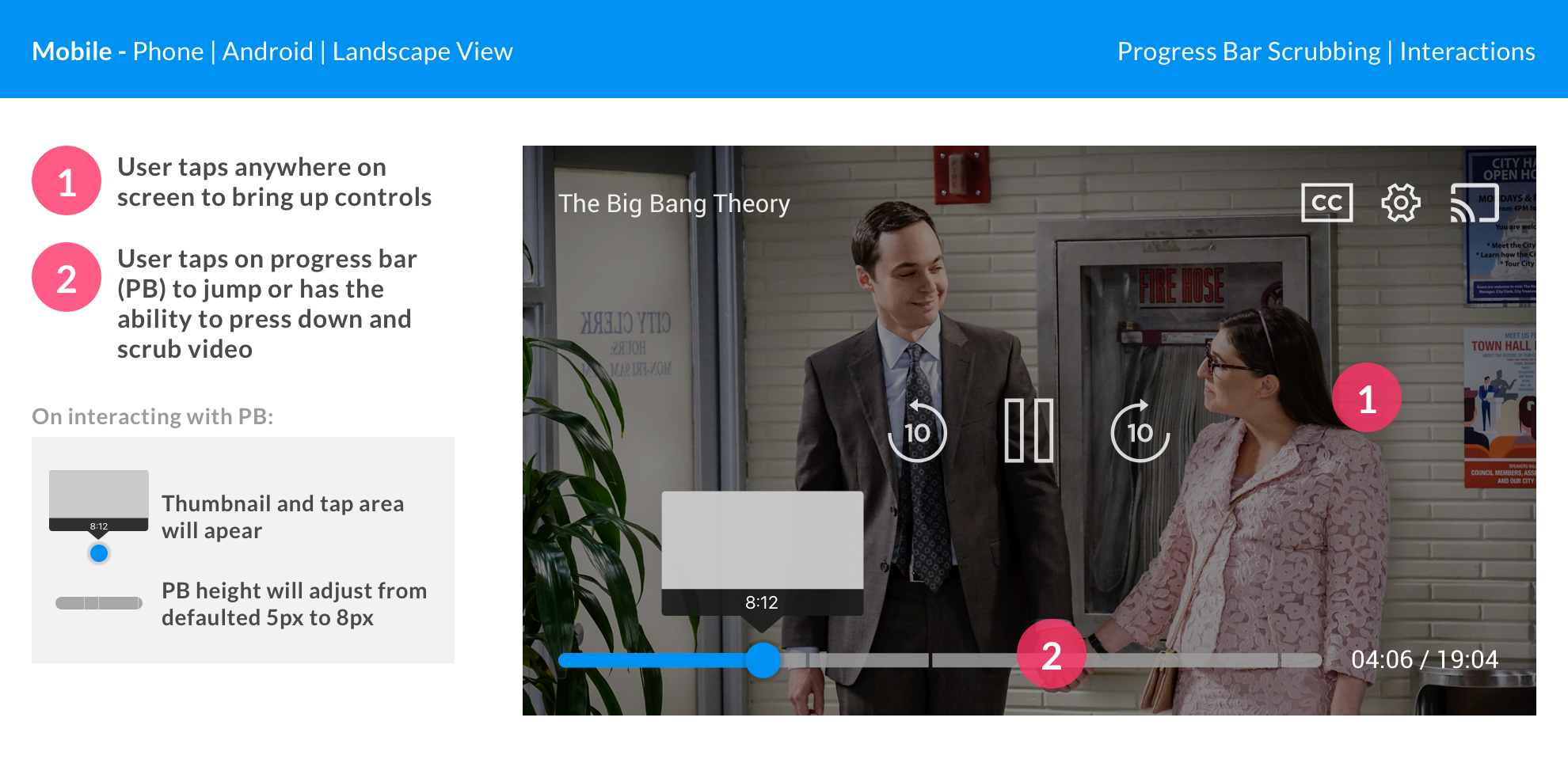
PROGRESS BAR
PROGRESS BAR
PROGRESS BAR
Breaking out primary icons such as the 10-seconds rewind, play/pause, and 10-seconds fast-forward utilized the limited real-estate. Even the tiniest interactions with the progress bar was created with accessibility in mind that felt intuitive.
Breaking out primary icons such as the 10-seconds rewind, play/pause, and 10-seconds fast-forward utilized the limited real-estate. Even the tiniest interactions with the progress bar I emphasized with accessibility in mind that felt intuitive and to a nice surprise and delight
PANELS
PANELS
PANELS
Full intent panels, using a tabs structure that was equally Material Design and HIG compliant took some time but once we nailed it down we were able to streamline this all the way up to OTT.
Full intent panels, using a tabs structure that was equally Material Design and HIG compliant took some time but once we nailed it down we were able to streamline this all the way up to OTT.
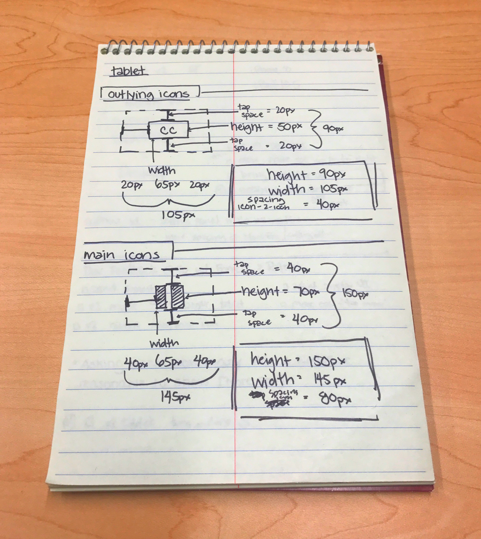
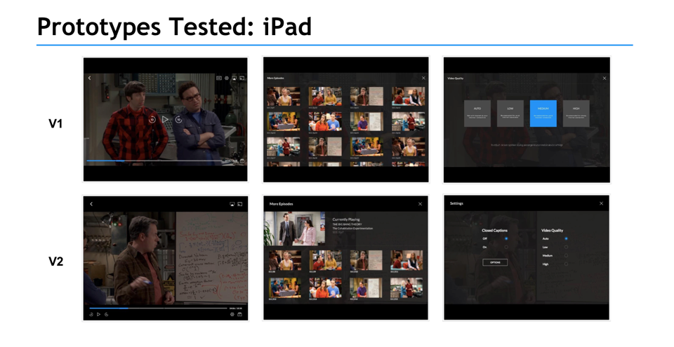
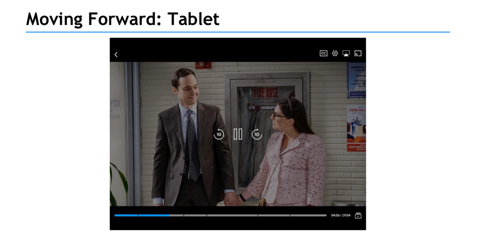
MOBILE TABLET
MOBILE TABLET
With desktop and phone locked down - I designed out tablet. As our player is locked in at a 16:9 ratio, focusing on landscape view, but also capturing portrait - it was important to stress main tappable areas.
Testing and capturing user feedback helped placement of icons with wiggle room for further adjustments when the player would later be implemented with additional features such as multi-channel, Chromecast sender to receiver view, etc.
By this platform, our team could really start seeing the true benefits of agnostic design that I had been pushing from the start. Working with developers we could quickly capture their feedback to adjust components and utilize native features like we've done for Closed Captions. These interchangeable layouts adhered to each platform guideline without affecting overall UX.
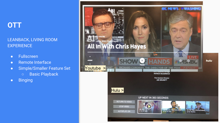
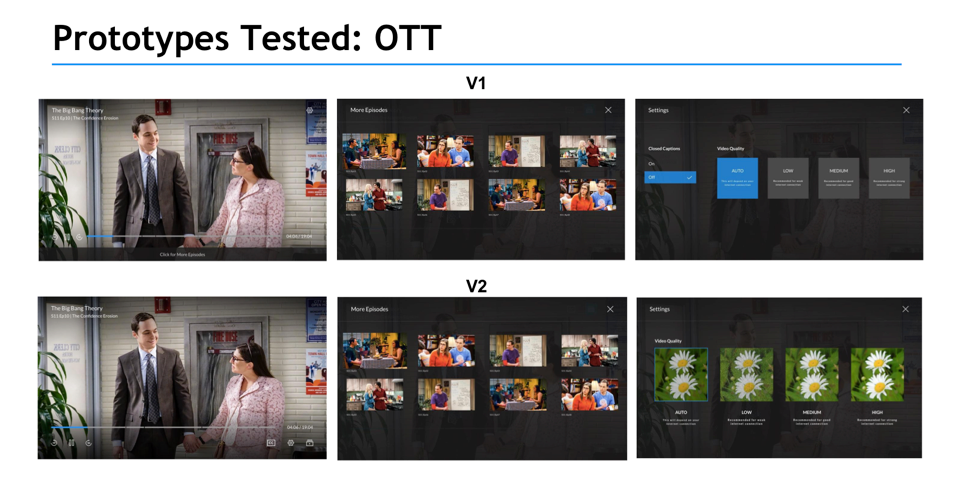
OTT PLATFORMS
OTT PLATFORMS
With a list of targeted platforms provided - we got to work 
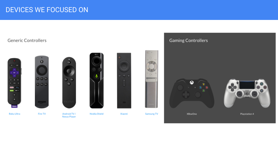
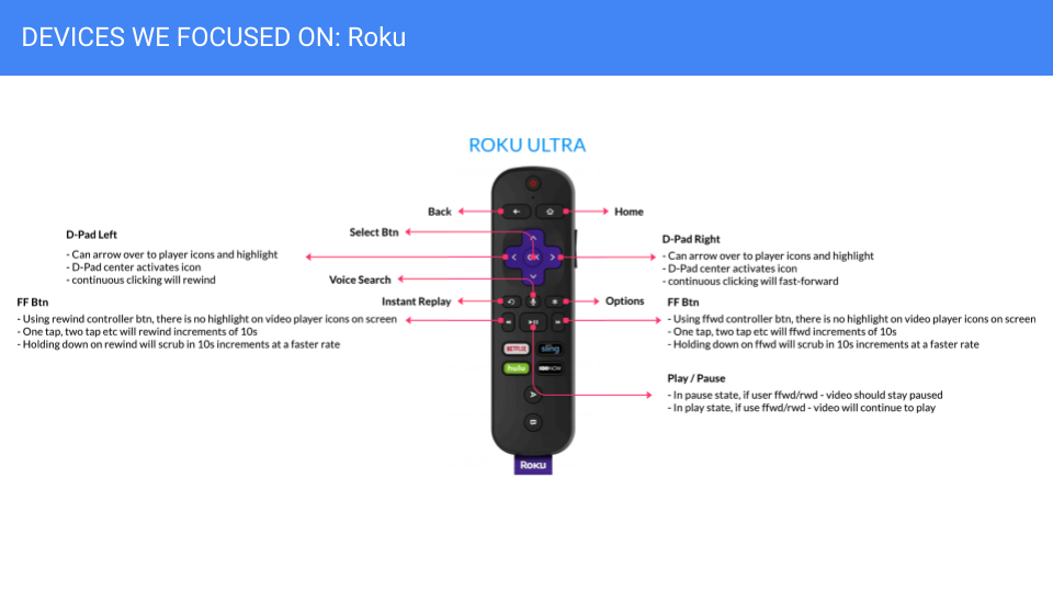
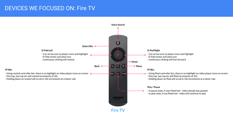
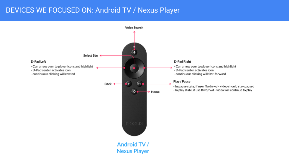
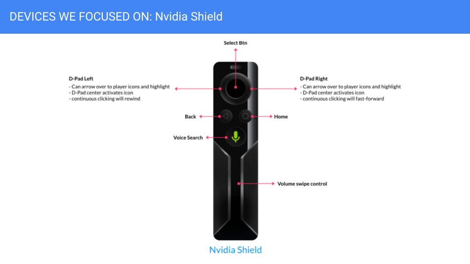
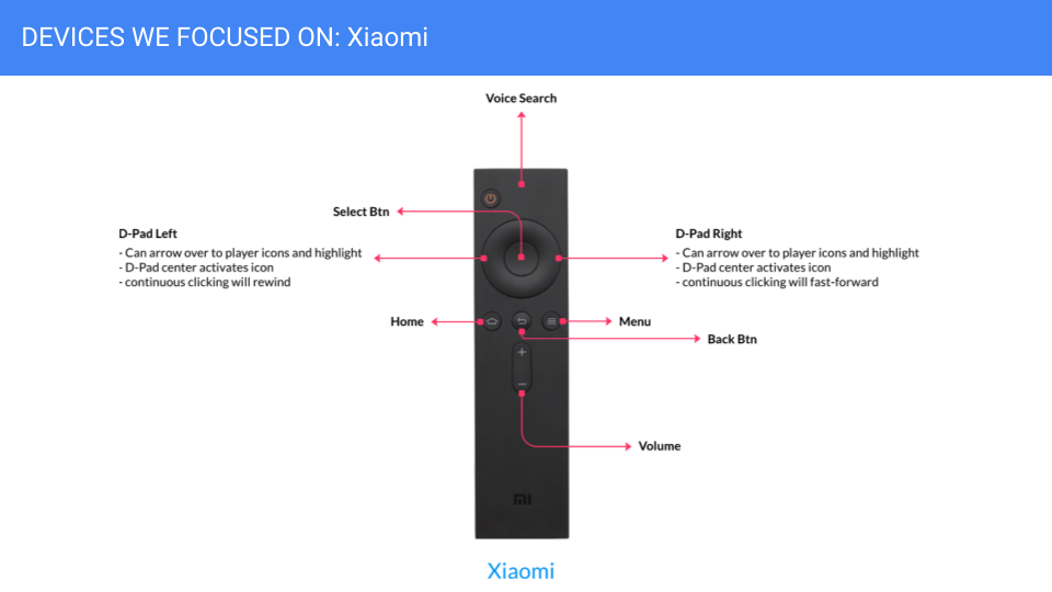
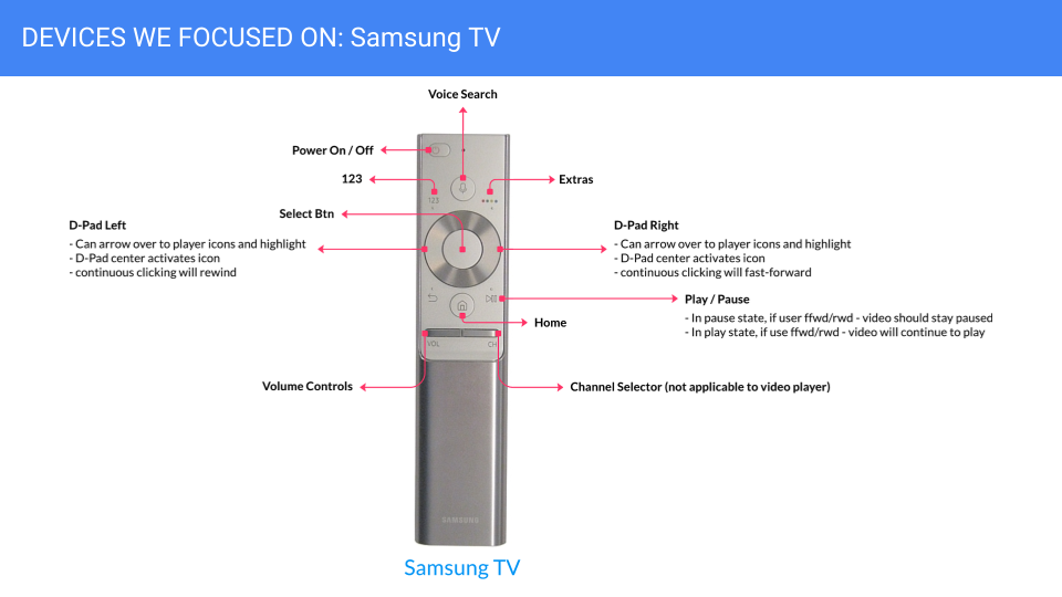
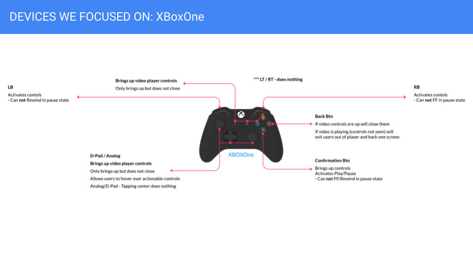
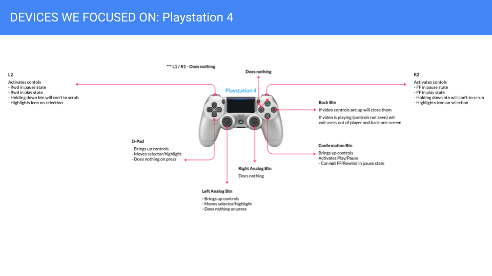

Connecting with our international devs and grabbing feedback
Adjusting - and testing - our agnostic design to OTT format
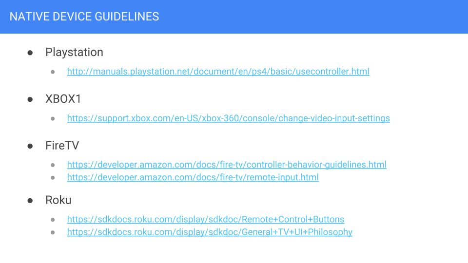
Researching every. single. platform guideline
Current layouts in market per OTT platform
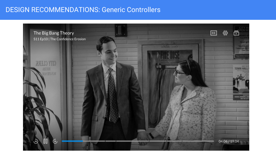
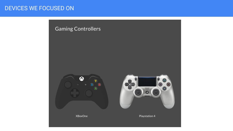
Mapping out current controller layouts
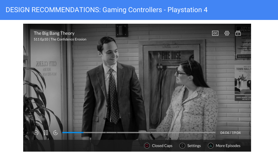
XBOXONE UX Deep Dive with Finalized UI
XBOXONE overall layout - slated to go live by end of 2018
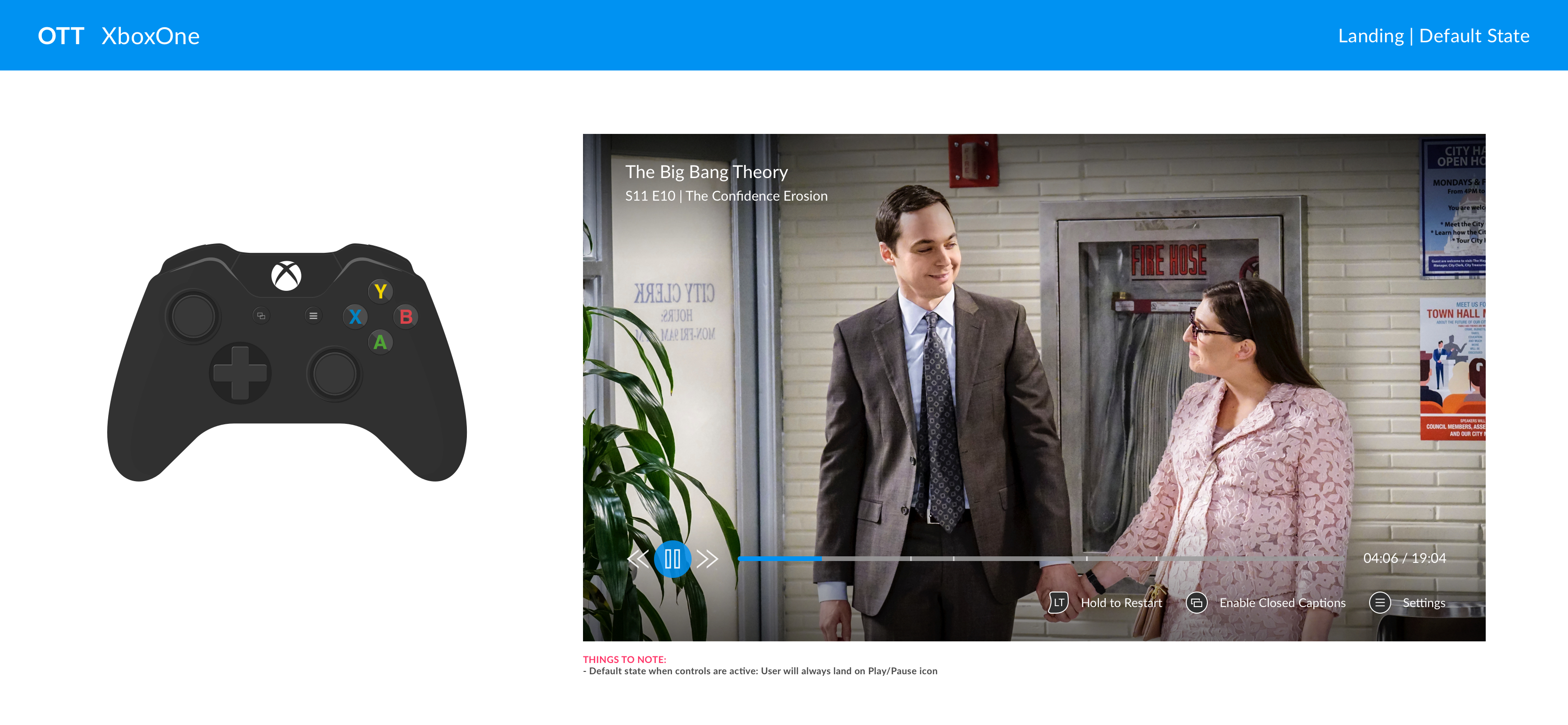

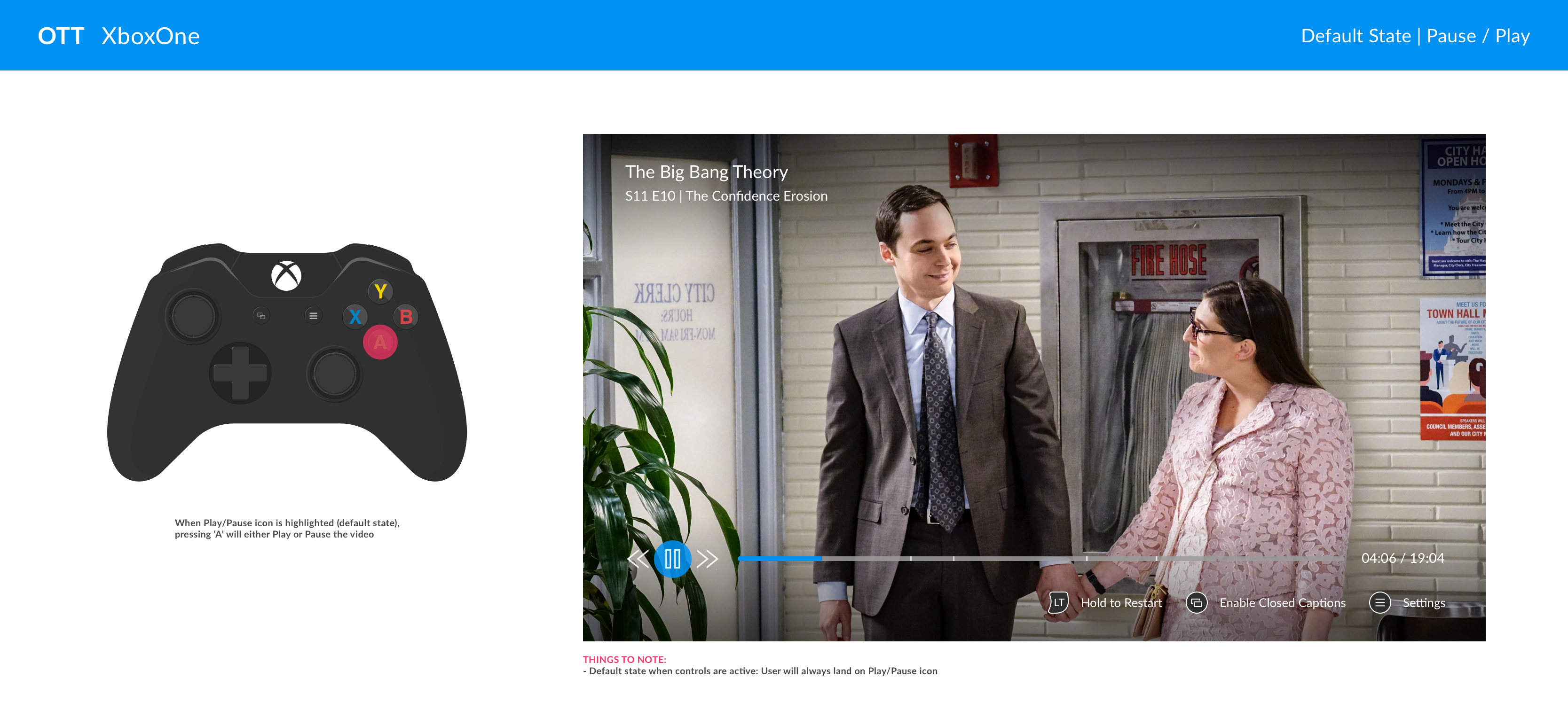
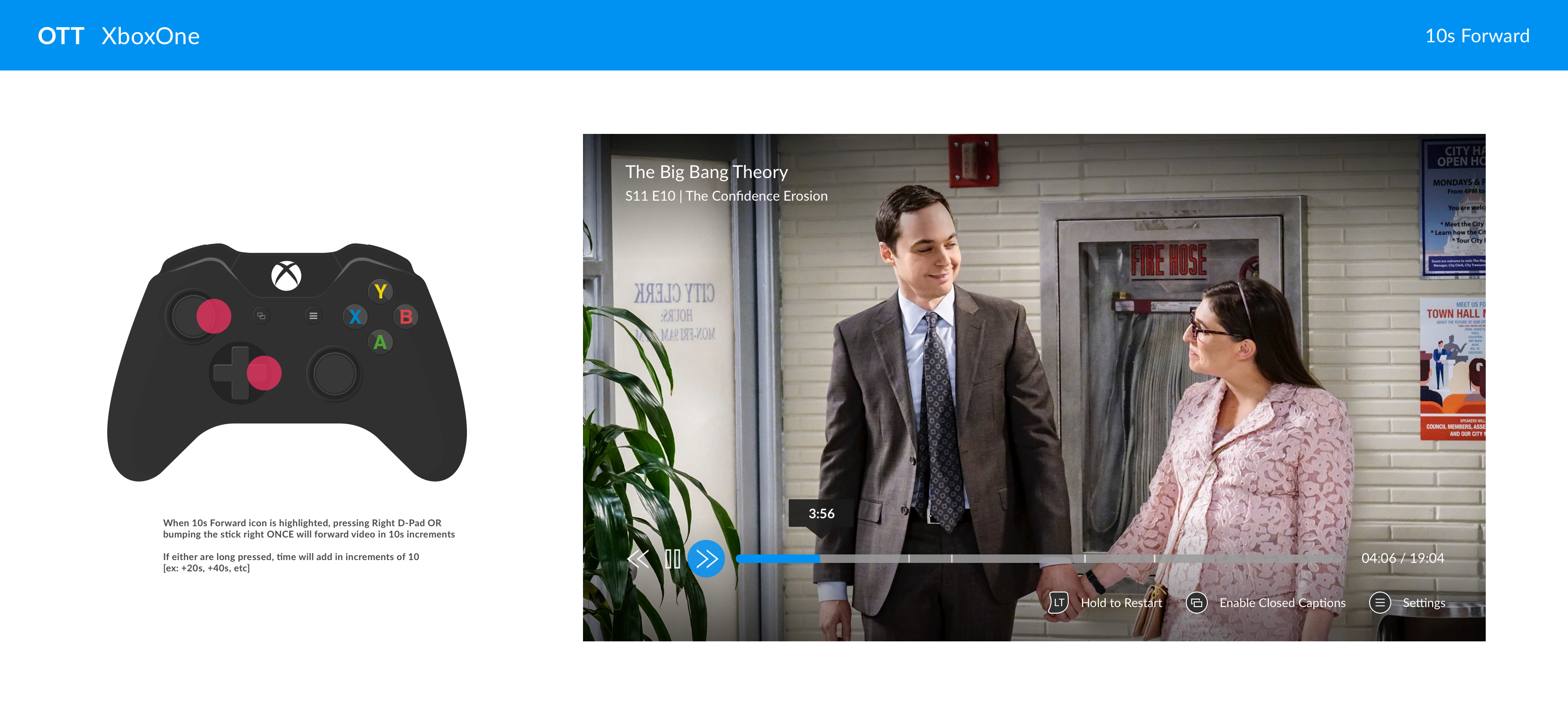


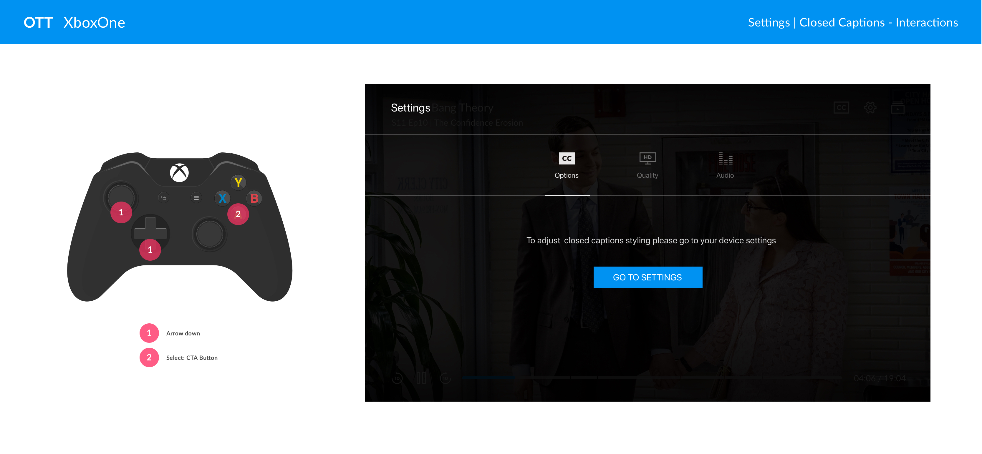
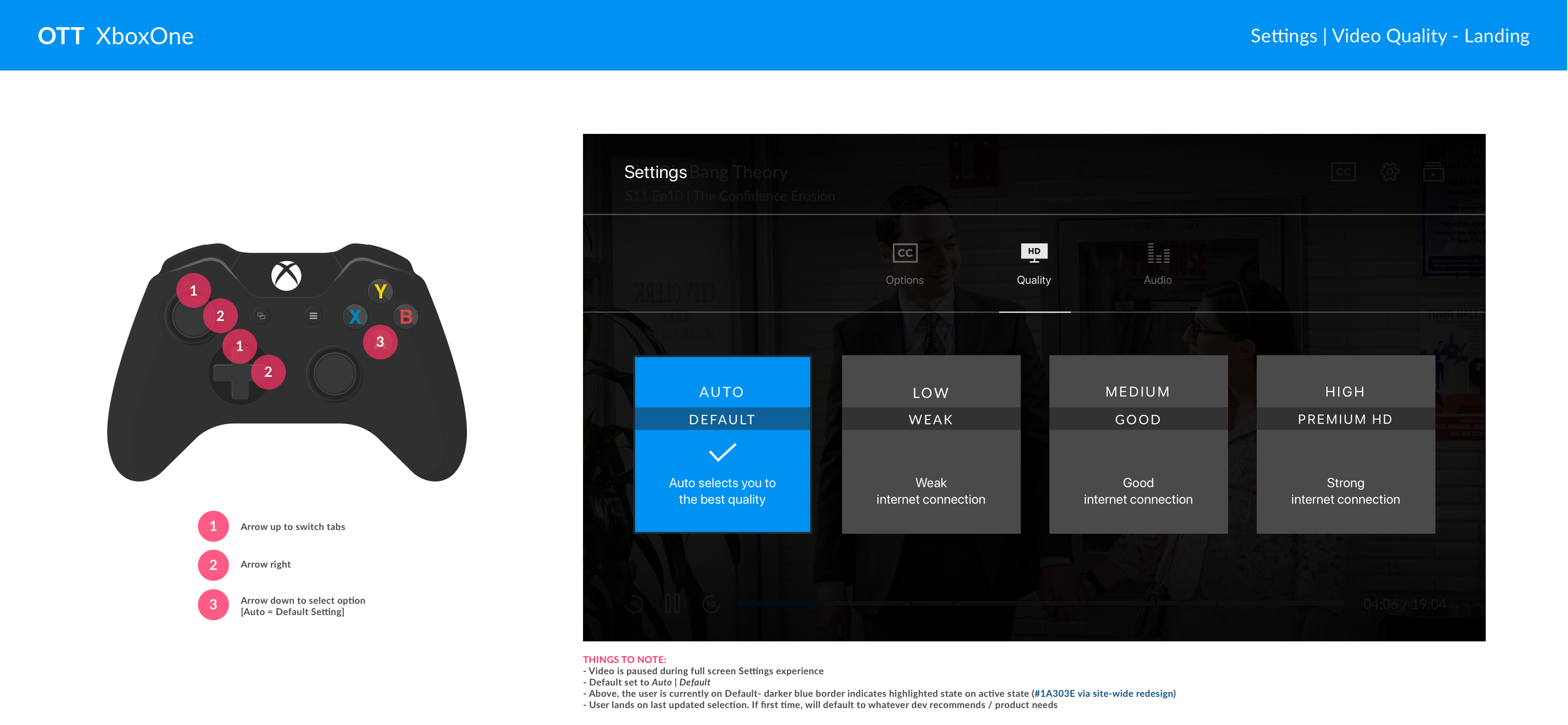

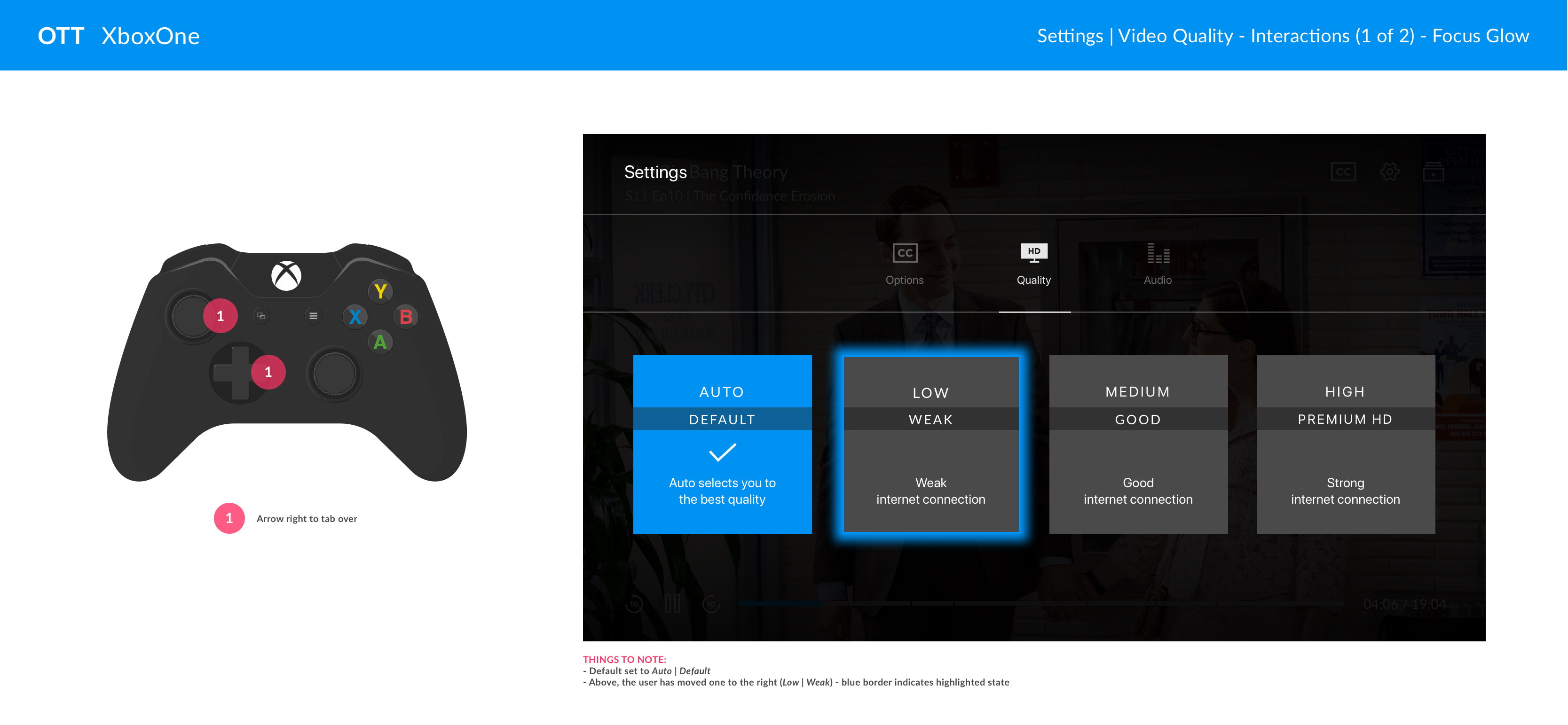
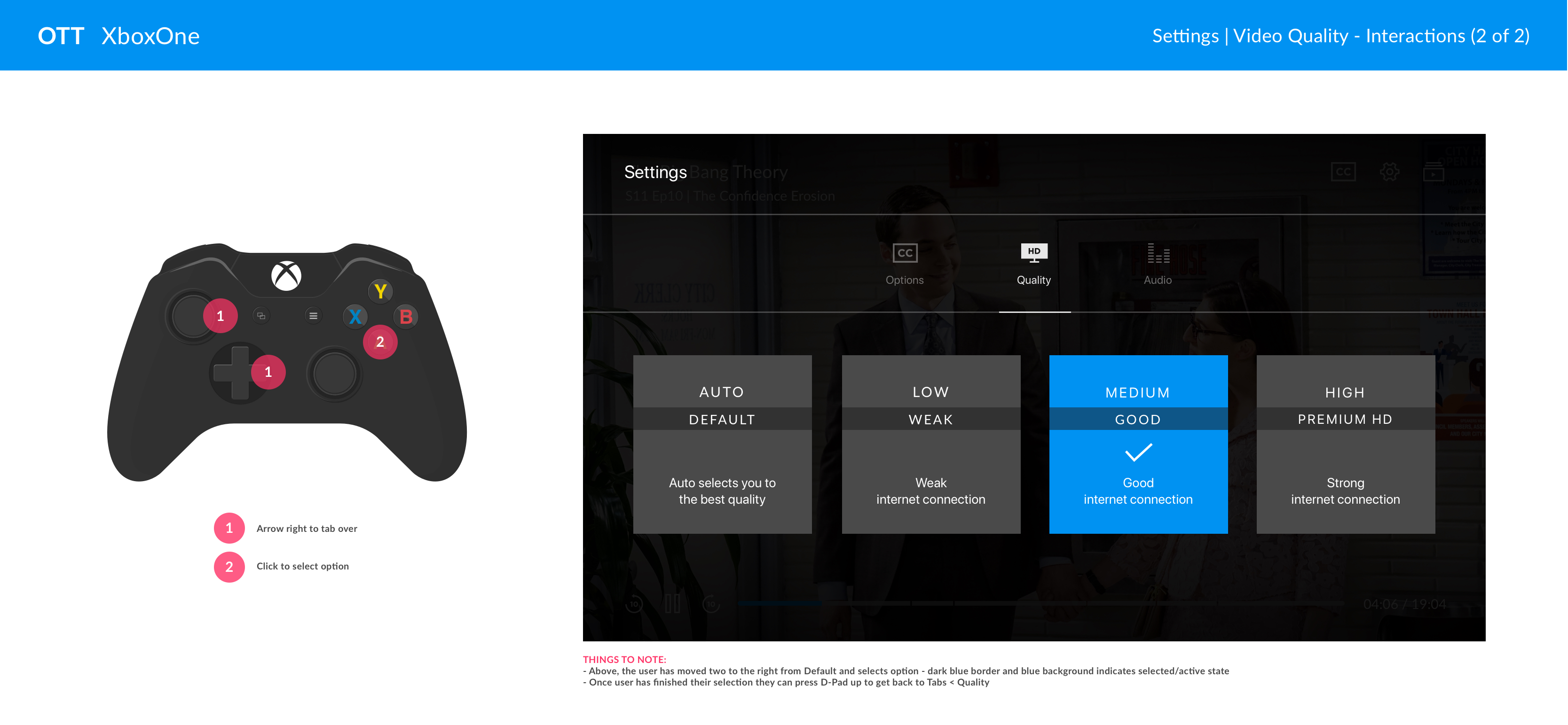
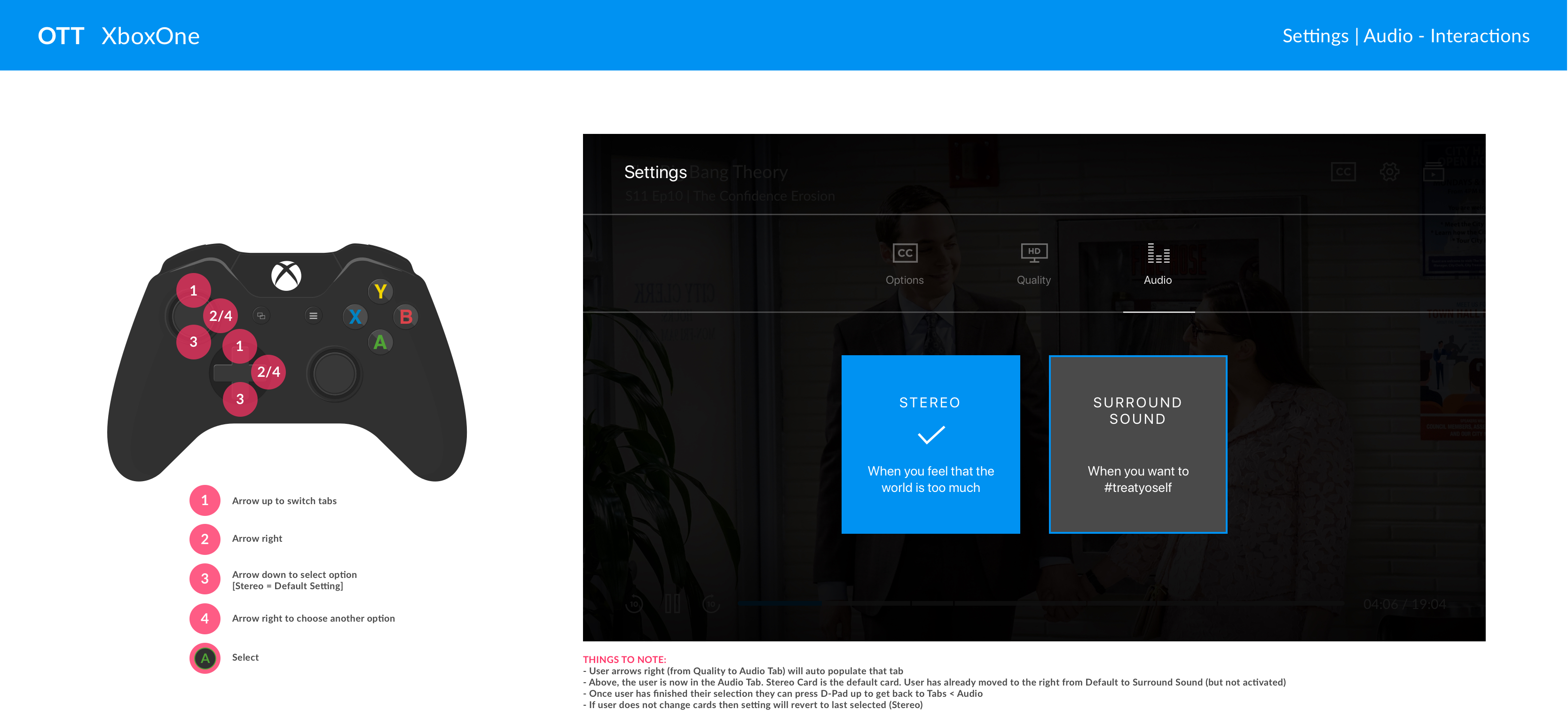
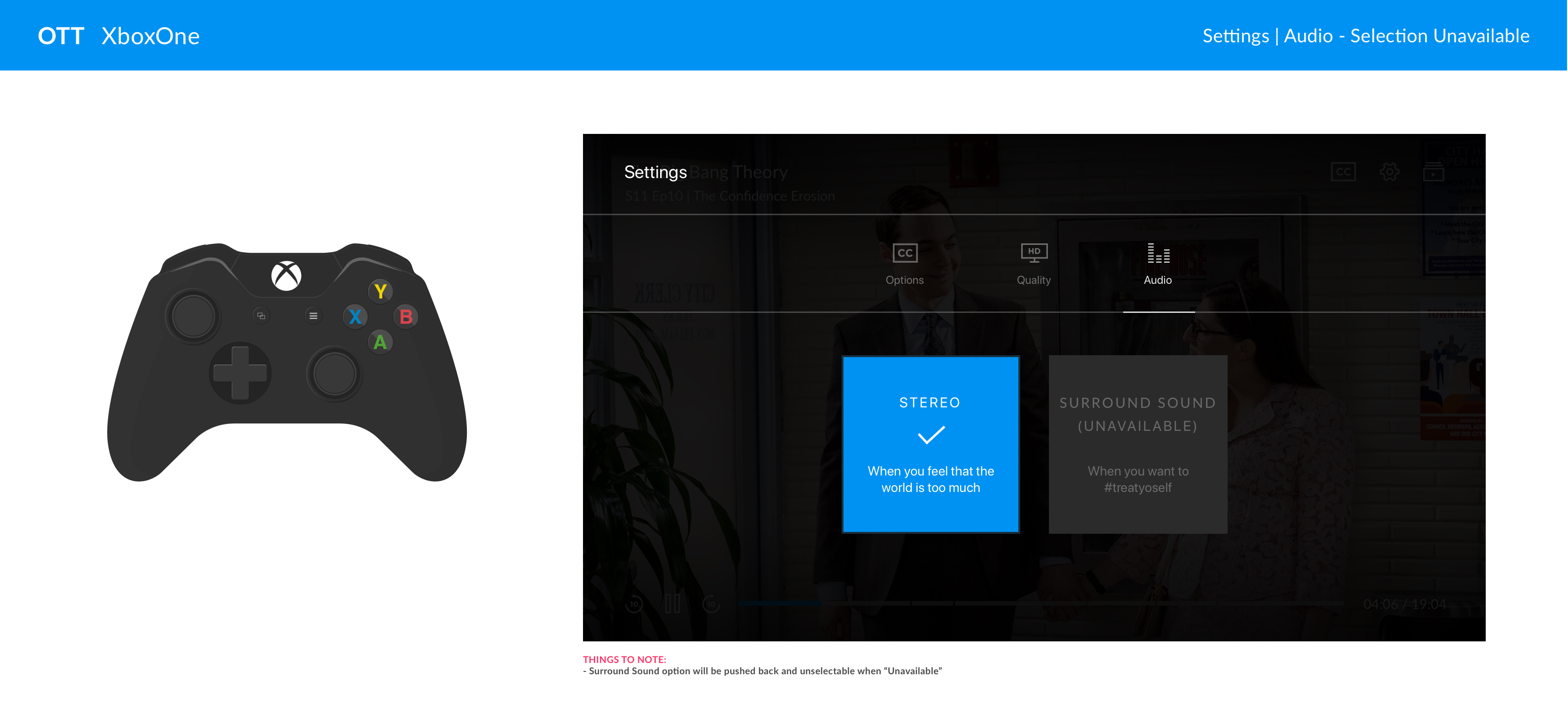

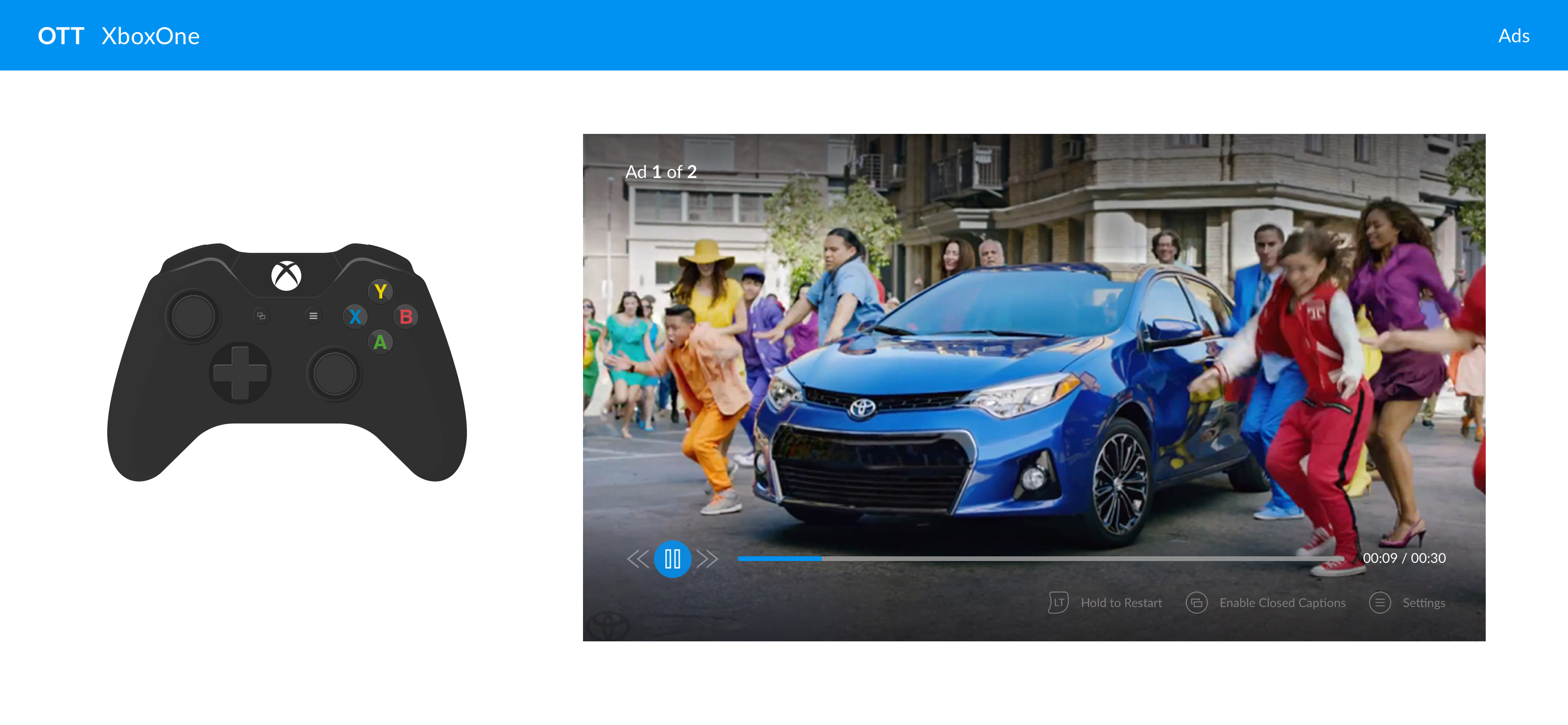
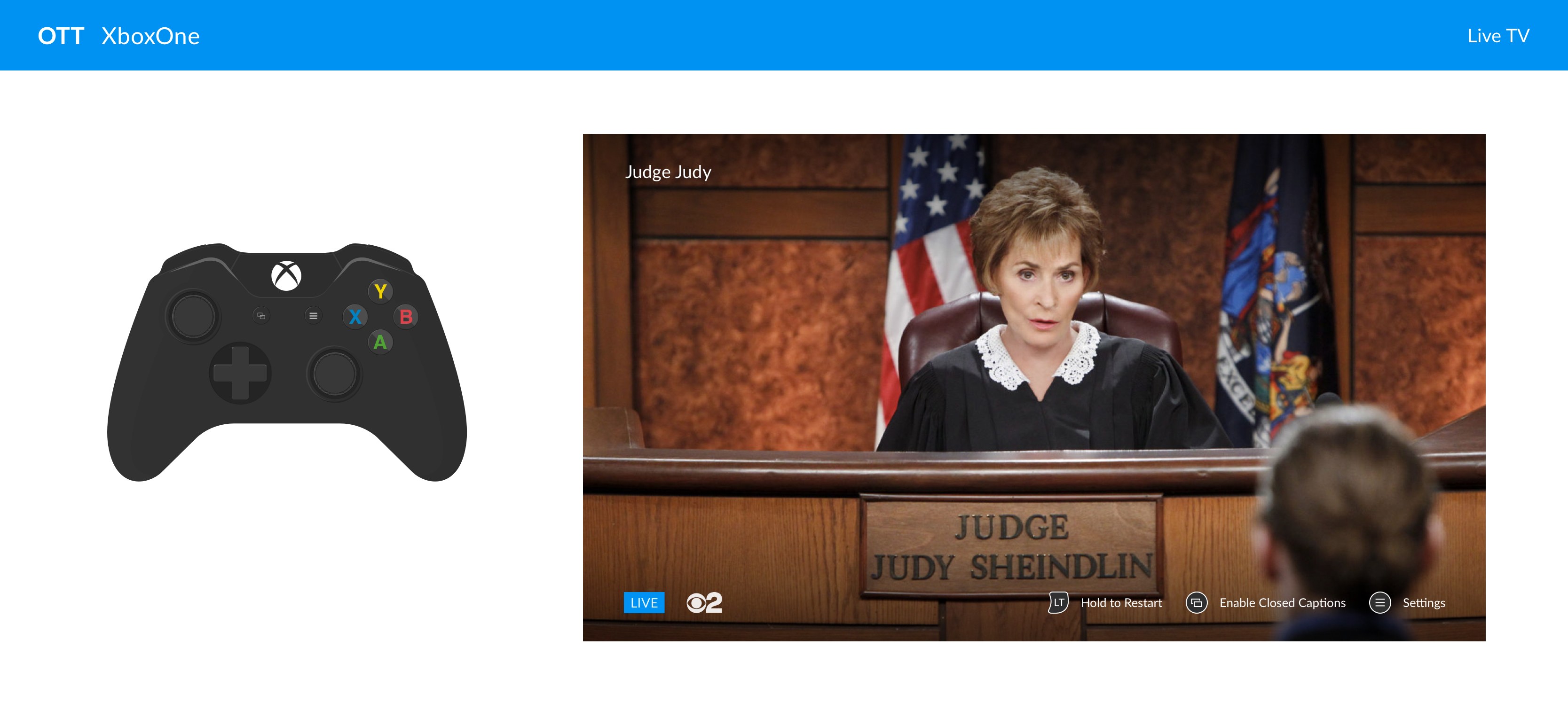
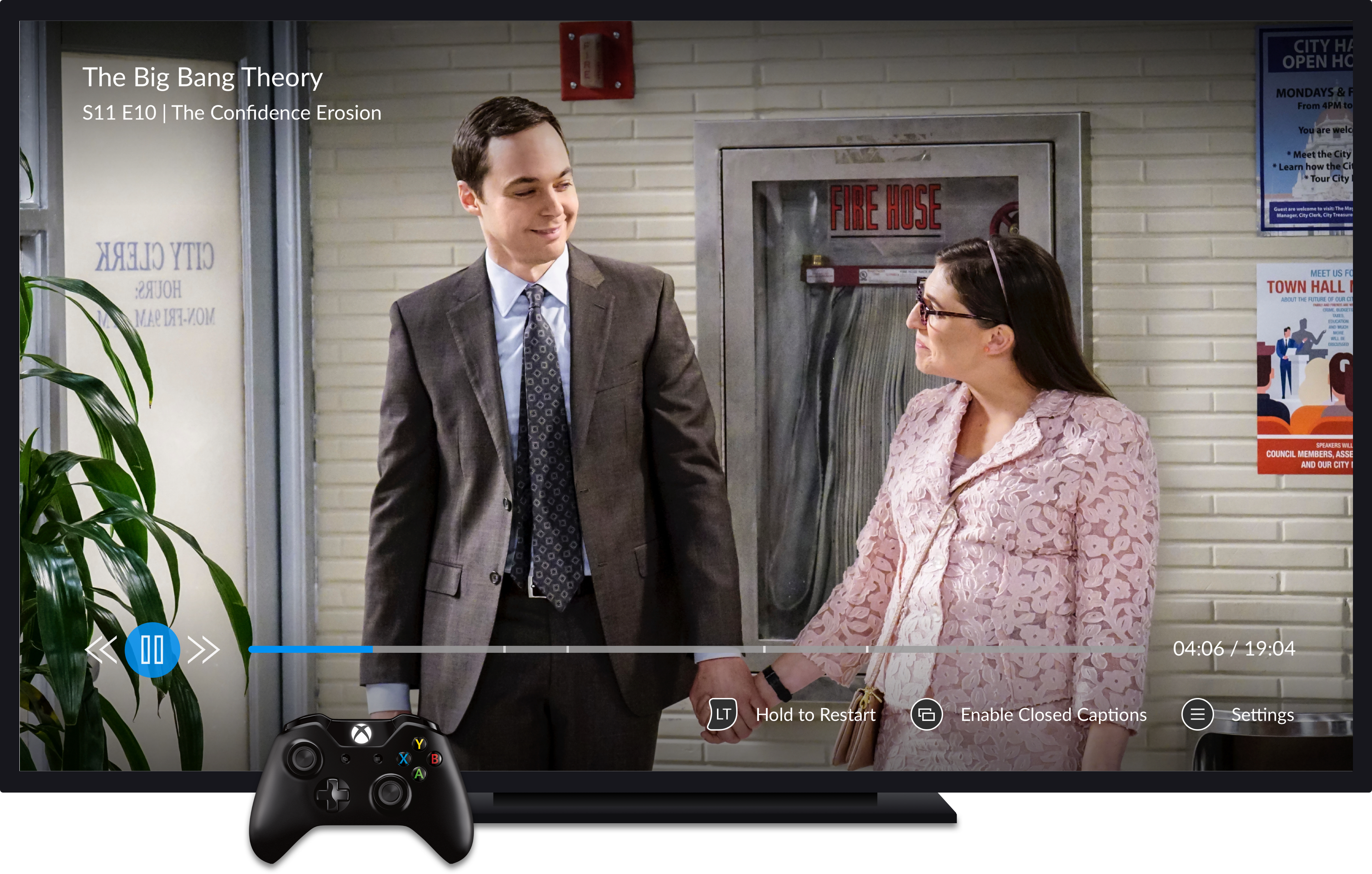
XBOXONE overall layout - slated to go live by end of 2018
XBOXONE overall layout - slated to go live by end of 2018
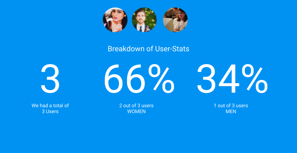
USER TESTING
USER TESTING
BEING THE VOICE OF THE USER.
From the start and throughout the project, we spent a good deal of testing. From very specific icon treatments to full clickable prototypes across all platforms. It was wonderful to grab direct user feedback, capture their body language/hand movements/voice tone and then use that feedback and transfer them into statistics and analytics to drive our efforts.
Working with research, we invited our whole team (developers, QA, stakeholders, etc) to sit in and observe user feedback as it was happening.
It's such a cool feeling to see something you've created with your team in the hands of the users and grabbing feedback - good and bad - to help improve your experience!
^ Click to view working prototype
XBOXONE overall layout - slated to go live by end of 2018
OVERALL RESULTS
OVERALL RESULTS
OVERALL RESULTS
OVERALL RESULTS
On Thursday, 16 August 2018, we finally launched our Video Player Redesign in a staggered approach over a 48-hour period with our first platform, desktop, for Live TV and then site-wide from VOD and Movies!
A year and half of our lives for this one moment - I don't think words can express how our team felt. Throughout this project, we had lost a key product owner (Chris, we still love you), our main developer also left the company (Mel - we still need to grab drinks), and the Design Department did a huge transition that now positioned us under new stakeholders within Product.
But regardless, 72-hours after our initial launch for desktop - the analytics were in: THE PLAYER WAS A COMPLETE SUCCESS!
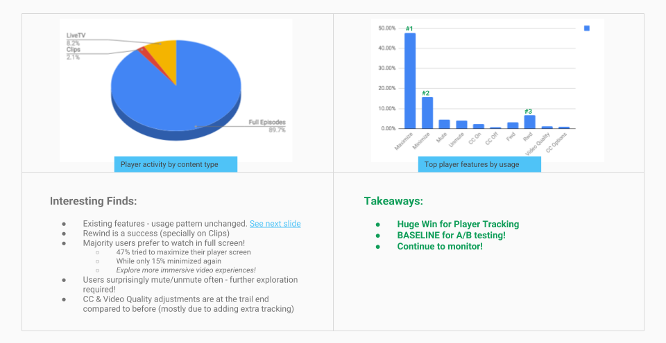
Due to the huge success - from team process to results - the video player redesign is slated to be implemented across all business units of CBS!
Special thanks and shout-out the whole Video Team for trusting my process and being a part of the FIRST EVER LAUNCHED feature on CBS ALL ACCESS that has proper UX and Product Design! Our fearless Senior Product Manager, Shilpa - Your patience, trust, and always pushing forward, regardless of stakeholder opinions, was the glue that kept our team together. Our UI Designer, Nida - For being open to transitioning to new tools like Sketch and working closely side-by-side for a year (You're the best, Zommy!). Our Research Manager, Anna - For jumping into CBS and from day one working closely with our team and understanding the importance of the user's voice. Special thanks to Nina, Sr. UX Designer and fellow Hufflepuff, for taking extra time and proof reading this case study! Lastly, my UX Manager, Daryl - without your grounding, mentorship, and buffering from outside influences, this project would have never come to light.
You made it to the bottom! Horrah! Let's take a mindful moment to remind ourselves how wonderful life is_ namaste
Selected Works
Video Player RedesignDesign Lead, Research, Testing
Express CheckoutResearch, Product Design, A/B Testing
Brand IdentityResearch, Product Design, Front-End
App ExperienceResearch, Product Design, Front-End
Made with  , a dash of
  , and copious amounts of
  2024 © S Silver